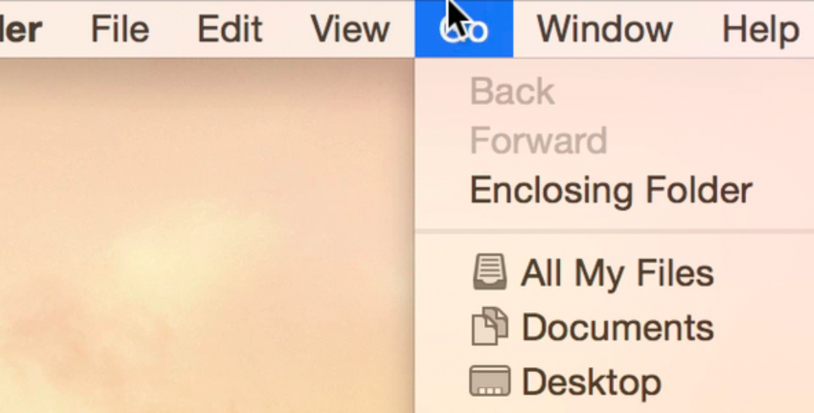
One of the most striking changes that you will notice when you first fire up OS X Yosemite is the system-wide font change. Apple’s previous desktop operating system releases, since 1999, used Lucida Grande as the system font.
Lucida Grande worked well on lower resolution screens, but as high resolution Retina Displays become more common, it’s starting to look out of place. To address the issue, Apple decided to adopt iOS’ system font of choice—Helvetica Neue—and make it the system font for OS X Yosemite.
Long time Mac users will see it as a striking change, but I believe it’s a change for the better. It looks much cleaner as a system font on Retina displays, which are slowly but surely displacing lower resolution displays. As a bonus, it provides more consistency between Apple’s mobile and desktop offerings.
What do you think about the striking typeface change? Do you like it, or do you wish Apple would have stuck with Lucida Grande?
This post is an excerpt from iDB’s Yosemite Interactive Starter Guide. To learn about some of OS X Yosemite’s most outstanding new features, and to support iDB, you can download it on the iBooks Store for $0.99.
View all of the OS X Yosemite Interactive Stater Guide topics:
- Helvetica Neue Typeface
- 2D Dock
- New Resize Controls
- Translucency
- Dark Mode
- Spotlight Search
- Notification Center Today View
- iCloud Password
- iCloud Drive
- Extensions
- Recording the iPhone’s Screen
- AirDrop with iOS
- Handoff
- Make and Take Phone Calls
- Instant Hotspot
- Text Message Forwarding
- Do Not Disturb for Messages
- Managing Group iMessages
- Send Quick Voice Messages
- Predictive Text
- Safari Enhancements
- Annotating Mail Attachments
- Mail Drop Sends Large Attachments
- Calendar’s Day View
- A Revamped iTunes