The Dock in OS X Yosemite has ditched the 3D look and has gone back to its 2D roots. This results in a much “flatter” appearance, which harkens back to the earlier versions of OS X. Icons now appear to be a part of the Dock instead of hovering it.
Check past the break as we break down this and other Dock changes on video.
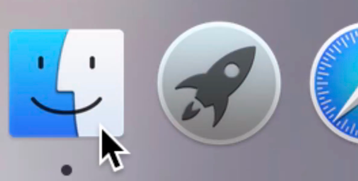
Something that you’ll immediately notice are the new running indicator lights—the little dots below each app that indicates that the app is active. The running indicators have ditched their white glow for a simple black dot. This, again, helps to simplify the look of the Dock. If you miss the white indicator lights, you can always venture into Dark Mode to get them back, although they still lack the glow of the lights on previous iterations of OS X.
Another thing that might stand out to long-time Mac users are the refinements made to the Finder icon. The blue in the Finder icon is a different hue, and the lines that make up its face and smile have been rounded and are thinner.
In my opinion, the Dock in Yosemite looks much more modern and accessible. It matches up well with the other changes in OS X Yosemite.
This post is an excerpt from iDB’s Yosemite Interactive Starter Guide. To learn about some of OS X Yosemite’s most outstanding new features, and to support iDB, you can download it on the iBooks Store for $0.99.
View all of the OS X Yosemite Interactive Stater Guide topics:
- Helvetica Neue Typeface
- 2D Dock
- New Resize Controls
- Translucency
- Dark Mode
- Spotlight Search
- Notification Center Today View
- iCloud Password
- iCloud Drive
- Extensions
- Recording the iPhone’s Screen
- AirDrop with iOS
- Handoff
- Make and Take Phone Calls
- Instant Hotspot
- Text Message Forwarding
- Do Not Disturb for Messages
- Managing Group iMessages
- Send Quick Voice Messages
- Predictive Text
- Safari Enhancements
- Annotating Mail Attachments
- Mail Drop Sends Large Attachments
- Calendar’s Day View
- A Revamped iTunes