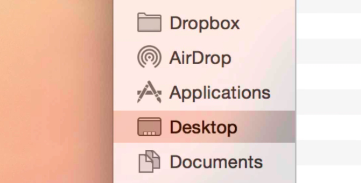
Translucency is everywhere in OS X Yosemite. In Safari, you can see the subtle colorful translucent glow of a website behind its toolbar. In the Finder, you’ll see apps and wallpaper glow behind your list of favorites, and in the Dock, you’ll see the translucent visuals of any apps that are moved behind it.
Check inside, as we explore OS X Yosemite’s translucent effects in our video walkthrough. We’ll also show you how to disable translucency if you’re not a fan of the effect.
Personally speaking, I like the translucent effect. It’s enjoyable to see how the different assets change and glow as a variety of colors subtly shine through their translucent elements. In the presence of the flatter redesign, the translucency adds some much-needed depth to the interface.
I understand that not everyone will be a fan of translucency, though. If you happen to fall into that camp, you can disable translucency by going to System Preferences → Accessibility → Display, and checking Reduce transparency.
What do you think?
This post is an excerpt from iDB’s Yosemite Interactive Starter Guide. To learn about some of OS X Yosemite’s most outstanding new features, and to support iDB, you can download it on the iBooks Store for $0.99.
View all of the OS X Yosemite Interactive Stater Guide topics:
- Helvetica Neue Typeface
- 2D Dock
- New Resize Controls
- Translucency
- Dark Mode
- Spotlight Search
- Notification Center Today View
- iCloud Password
- iCloud Drive
- Extensions
- Recording the iPhone’s Screen
- AirDrop with iOS
- Handoff
- Make and Take Phone Calls
- Instant Hotspot
- Text Message Forwarding
- Do Not Disturb for Messages
- Managing Group iMessages
- Send Quick Voice Messages
- Predictive Text
- Safari Enhancements
- Annotating Mail Attachments
- Mail Drop Sends Large Attachments
- Calendar’s Day View
- A Revamped iTunes