Learn how to insert charts in the Apple Pages app and format them with data to make your documents stand out on Mac, iPad, or iPhone.

We mostly think about using charts when working in an application like Numbers. After all, that’s where we use a lot of numerical data and perform data analysis. But if you’re creating a report, proposal, or similar document where a chart could be beneficial, Pages has you covered.
What’s nice about the chart feature in Pages is that you can just pop in a chart, add a small amount of data, and you’re done. If you want to spruce it up, you can, but you don’t have to.
If your document could use a visual to display a small amount of data, consider using a chart in Pages to make your next document a little more eye-catching. It’s easy enough to insert, adding your data is simple, and you can format it per your preference.
Insert a chart in Pages on Mac
Just like when adding a table in Pages, you can insert a chart from either the toolbar or the menu bar. Place your cursor where you want the chart and do one of the following.
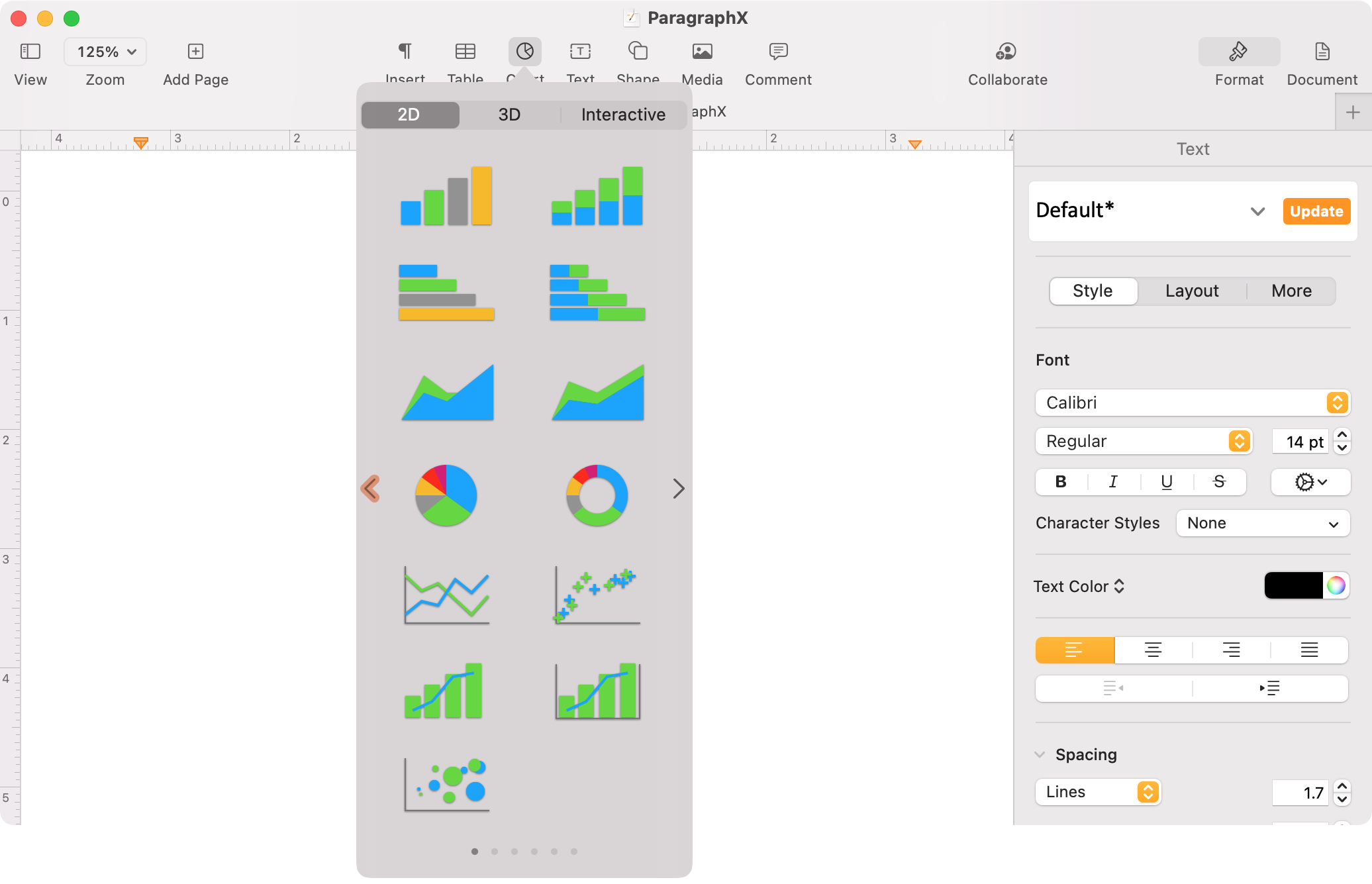
- Click the Chart button in the toolbar and select from a 2D, 3D, or interactive chart. Use the arrows on either side to view different color schemes.
- Click Insert > Chart from the menu bar and pick the chart type.
The advantage of using the button in your toolbar is that you can see a visual of the chart you select, whereas the menu bar simply lists the chart types.
Add your chart data
After you insert the chart in Pages, you may see some sample data, which can be helpful for adding your own. Click the Edit Chart Data button that appears at the bottom of the chart.
A small chart data window will pop open with a table for you to enter your own data. Click the arrows in the headers to add or remove columns and rows. Use the buttons on the top right to swap the series between columns and rows.
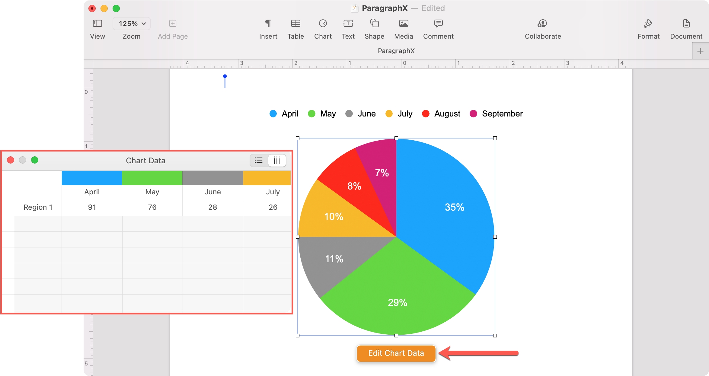
When you finish adding your data, you can close the Chart Data window and then format your chart if you like.
Format your chart
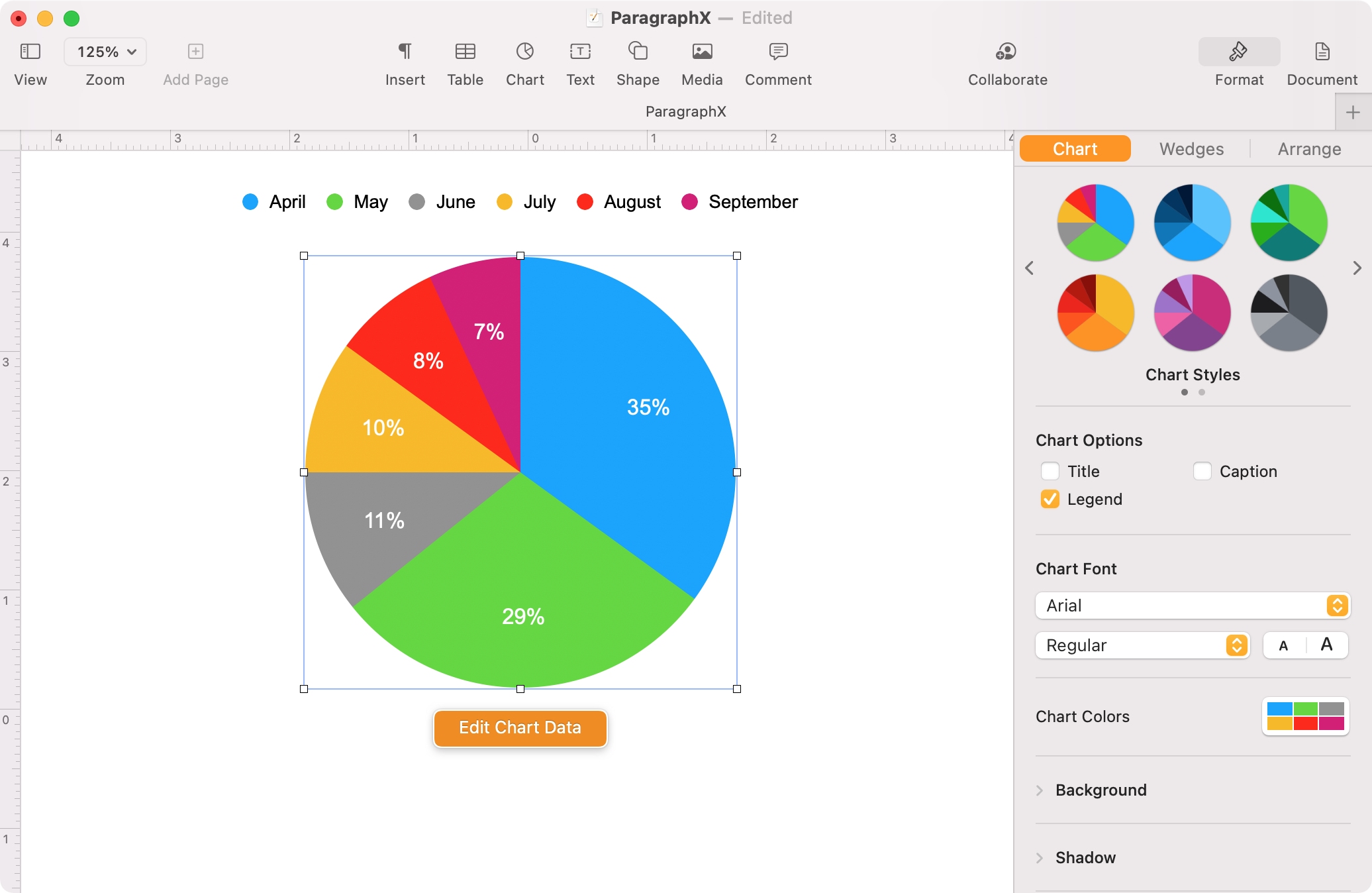
Select the chart in your document and click the Format button on the top right. Use the Chart tab at the top of the sidebar for the overall appearance.
Depending on the chart type you pick, you’ll see different tabs next to Chart. For example, if you use a pie chart, you’ll have a Wedges tab, and for a column chart, you’ll have Axis and Series tabs. These additional tabs let you customize the display of those particular chart items.
Insert a chart in Pages on iPhone and iPad
You can insert a chart in Pages on iPhone and iPad just as easily as you can on Mac.
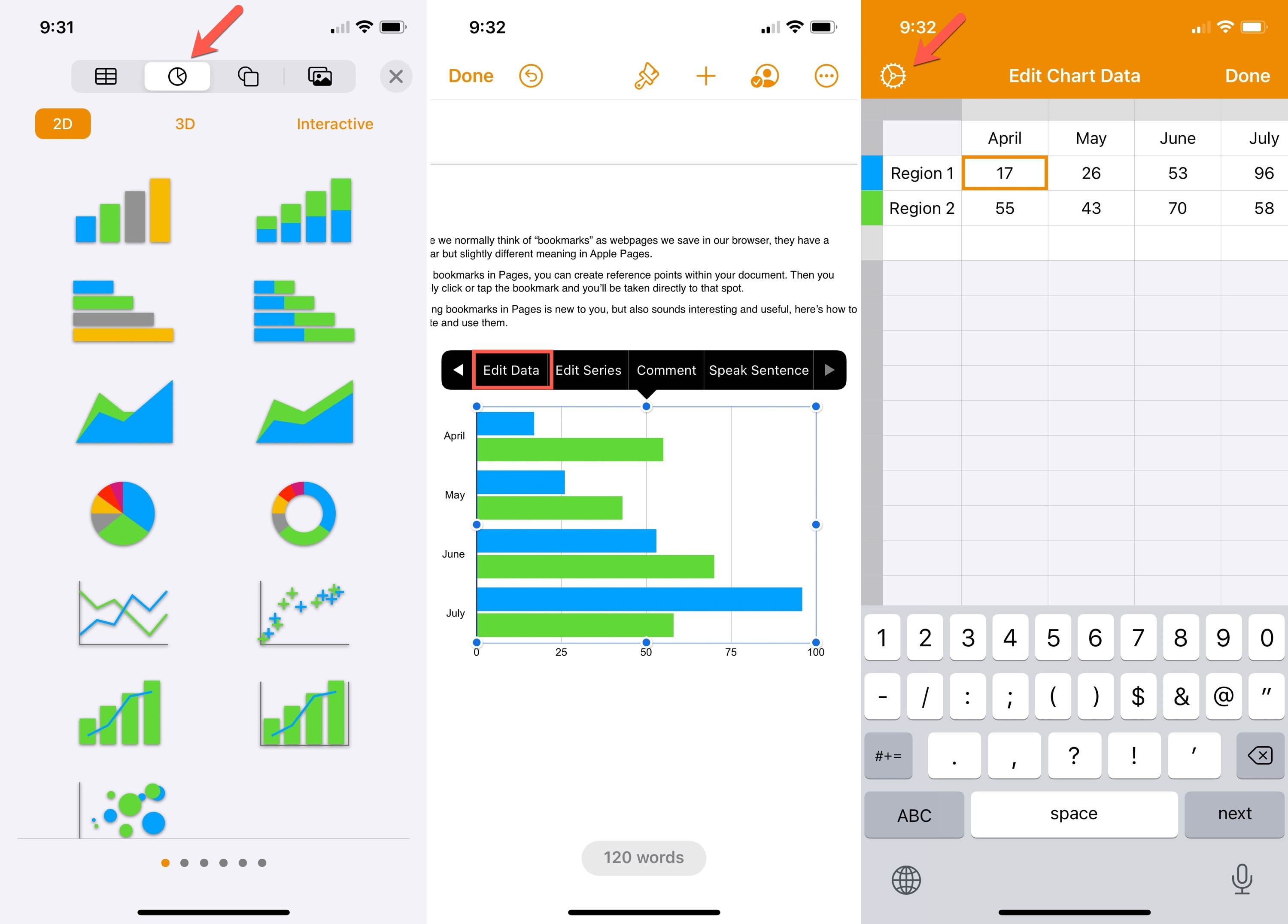
- Open your document and move your cursor to the spot where you want the chart. Tap the purple square-like icon or the plus sign at the top.
- Select the Chart icon.
- Choose from a 2D, 3D, or Interactive chart. Swipe left and right to view different color schemes.
- After your chart pops in, select it to display the shortcut menu and tselectp Edit Data.
- The Edit Chart Data table displays for you to enter your own data. Use the gear icon on the top left to switch between columns and rows for your series.
- Tap Done.
Format your chart
Select your chart and tap the Format icon (paintbrush) at the top to adjust the appearance and chart items. Use the Chart tab to customize the overall chart and the tabs to the right for specific chart items. Like on Mac, those Format tabs will vary depending on the type of chart you’re using.
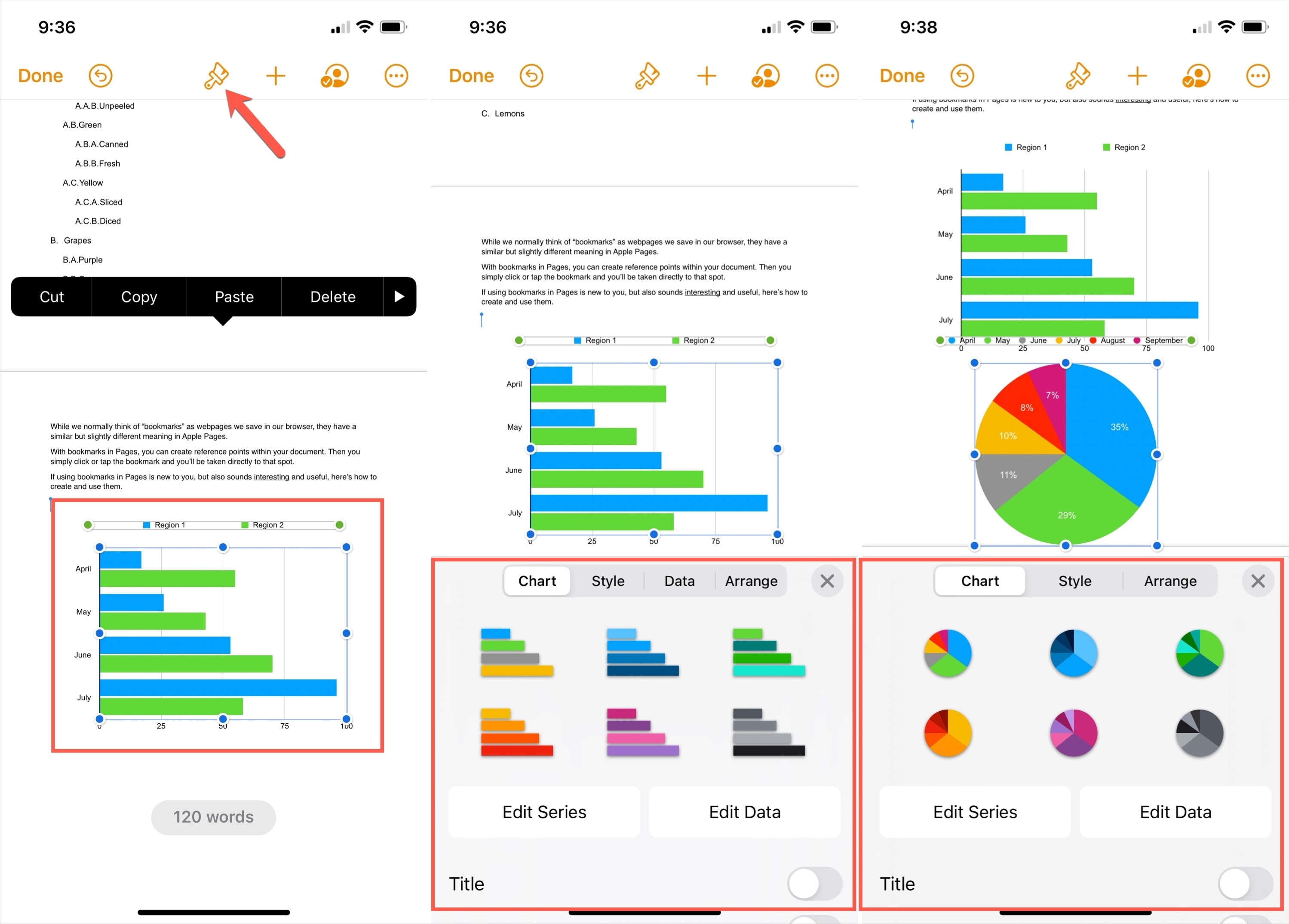
You also have an Edit Data button on the Chart tab. So you can adjust your data in the table from here as well.
What do you think of the chart feature in Pages? Are you going to give it a try?
Check out next: How to convert an Apple Note into a Pages document on iPhone, iPad, and Mac