Learn how to insert, format, and edit graphs and charts in the Apple Numbers app on your iPhone, iPad, and Mac to present your information clearly and make your spreadsheets stand out.

Graphs and charts give you terrific ways to display data. Rather than reading row after row, visuals let you see data at a glance, compare it, and even put it into perspective. What’s nice about spreadsheet applications like Numbers is that all you have to do is select your data, pick out a chart, and the app will create it for you.
Once you have your chart, you can change its appearance and add items like a title, labels, and a legend. This gives you the flexibility to display a graph or chart that shows your data exactly as you like.
Insert a chart in Numbers on Mac
While you can insert a graph or chart before selecting your data, it’s best to select the data first. This gives you a quick view of how your data will look in the type of chart you choose, and you can adjust from there.
1) Select the data for your chart by dragging your cursor through the cells, columns, or rows.
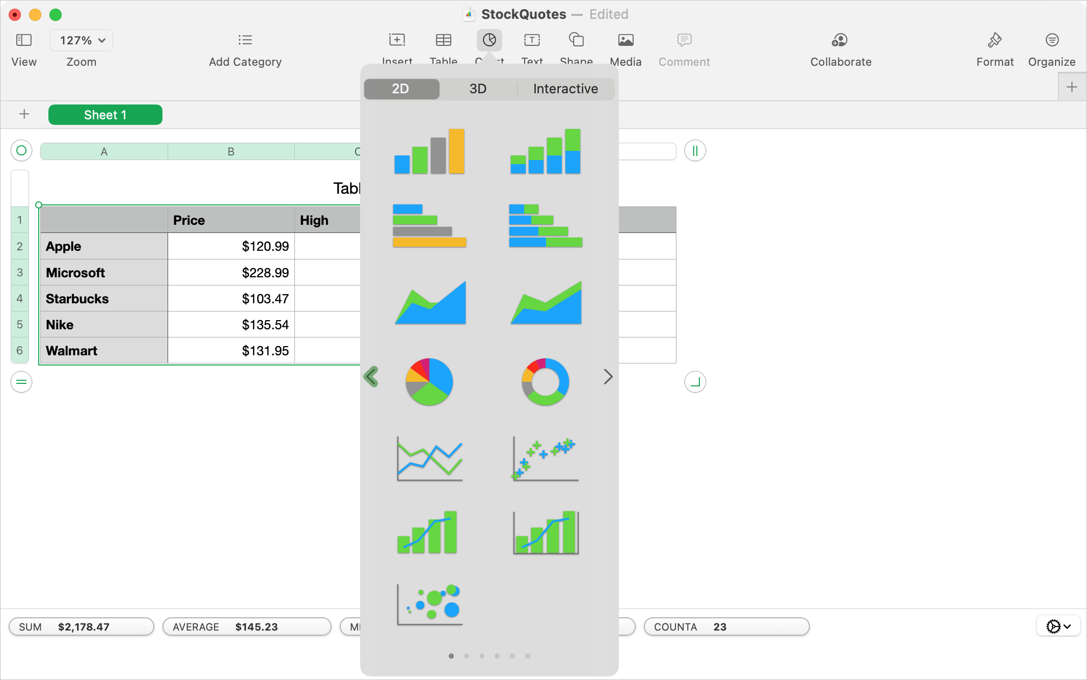
2) Click the Chart button in the toolbar or Insert > Chart from the menu bar and choose the type of graph or chart to display.
You can pick from 2D, 3D, and Interactive chart styles. We have a separate tutorial for working with Interactive charts in Numbers you can check out for that specific type. Here, we’ll use a simple 2D chart.
Choose from bar, column, line, area, pie, and other types of charts that will show your data well. If you use the Chart button in the toolbar, you can use the arrows to pick a color scheme from the start.
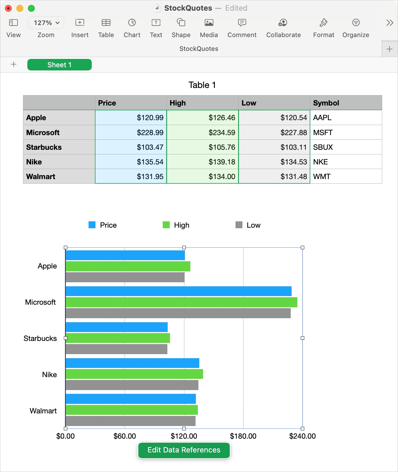
3) Once you select a style, the chart will plop right into your sheet. Click on the chart to drag it to a new spot or drag a corner to resize it.
If you’re happy with the chart as-is, then you’re all set! But if you’d like to make some adjustments to the formatting or data references, read on.
Format a chart on Mac
Numbers gives you many ways to format your chart. From adding a title and rounding the corners to adjusting the axis scale and displaying tick marks, you have plenty of flexibility.
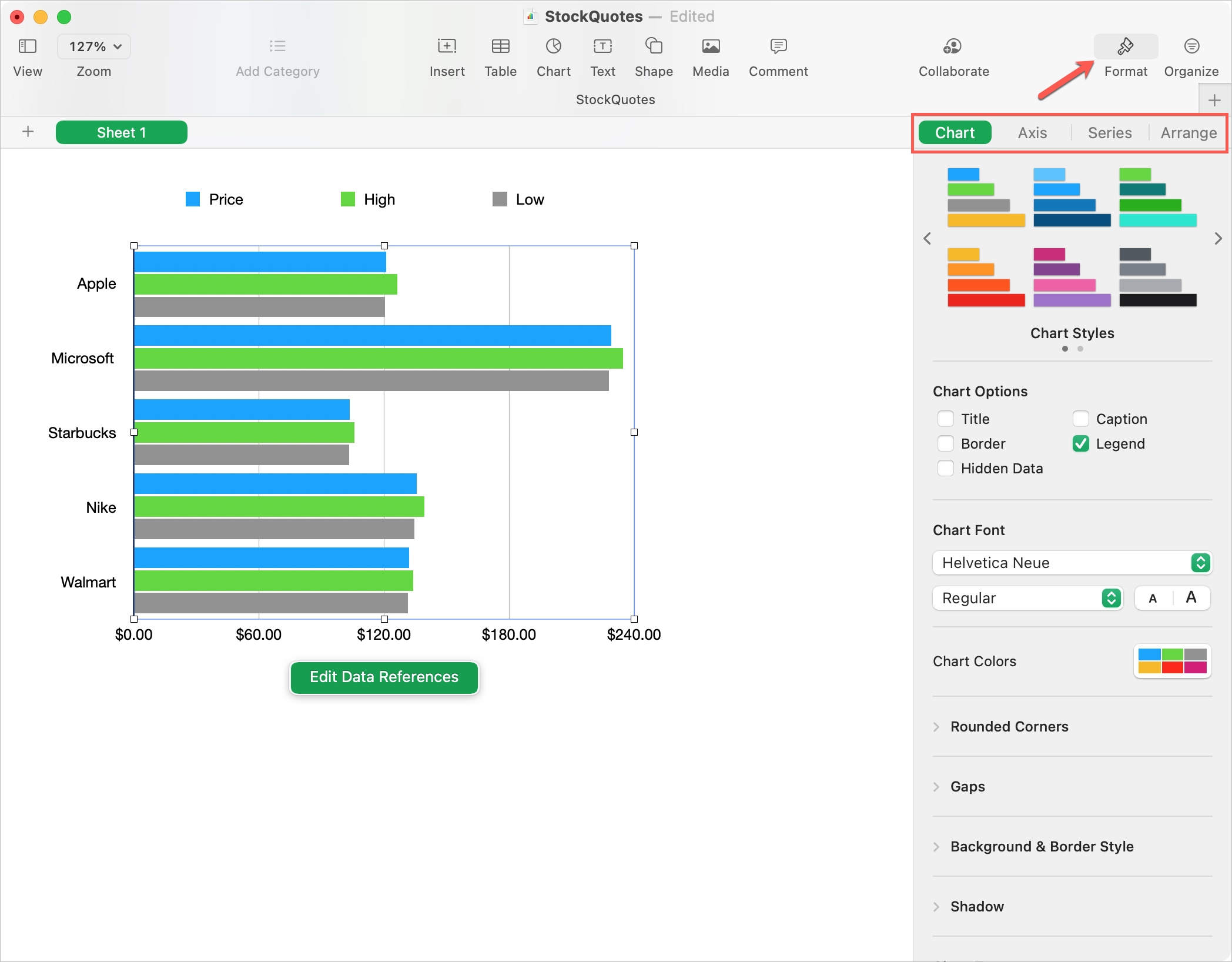
Select the chart and click the Format button on the top right. This opens the sidebar with tabs at the top for each formatting category: Chart, Axis, Series, and Arrange.
- Chart: Change the color scheme, add a title or legend, adjust the font style, size, and color, add a background or border, apply shadow, round the corners, and adjust the gap size.
- Axis: Display the axis name and line, choose a different axis scale, adjust the labels, include reference lines and tick marks, and format the gridlines.
- Series: Include and choose the value labels, trendlines, and error bars.
- Arrange: Move the chart backward or forward, adjust the alignment, size, and position, and lock the chart.
Edit a chart on Mac
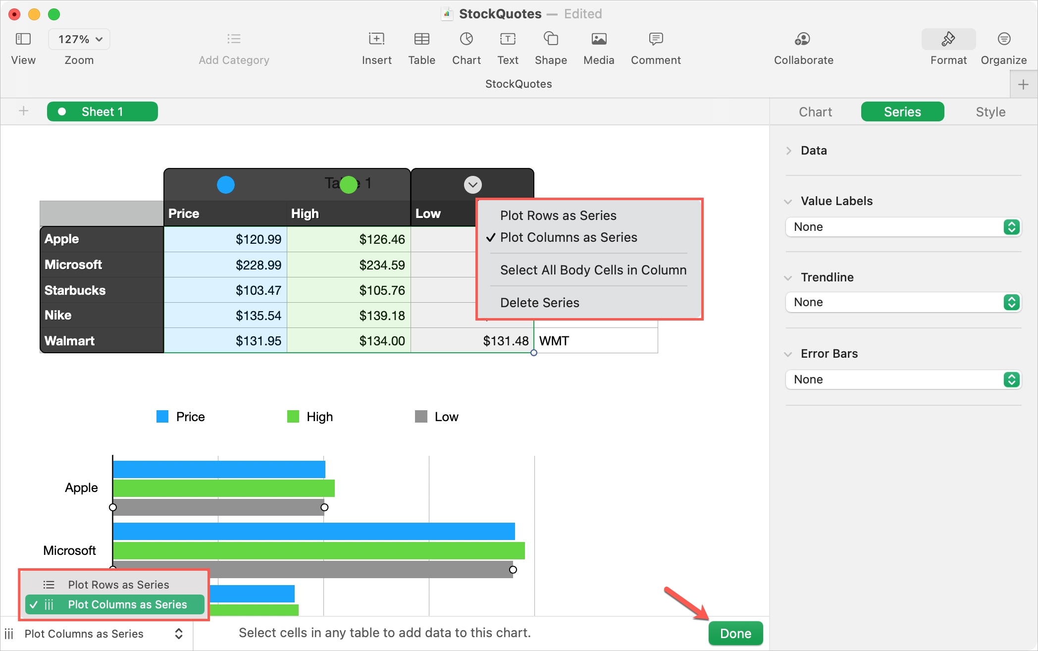
If you want to change the data you’re using in the chart or plot the rows versus the columns as the series, or vice versa, it’s simple to make these changes.
Select the chart and click the Edit Data References button that displays with the chart. This will highlight the chart data on your sheet.
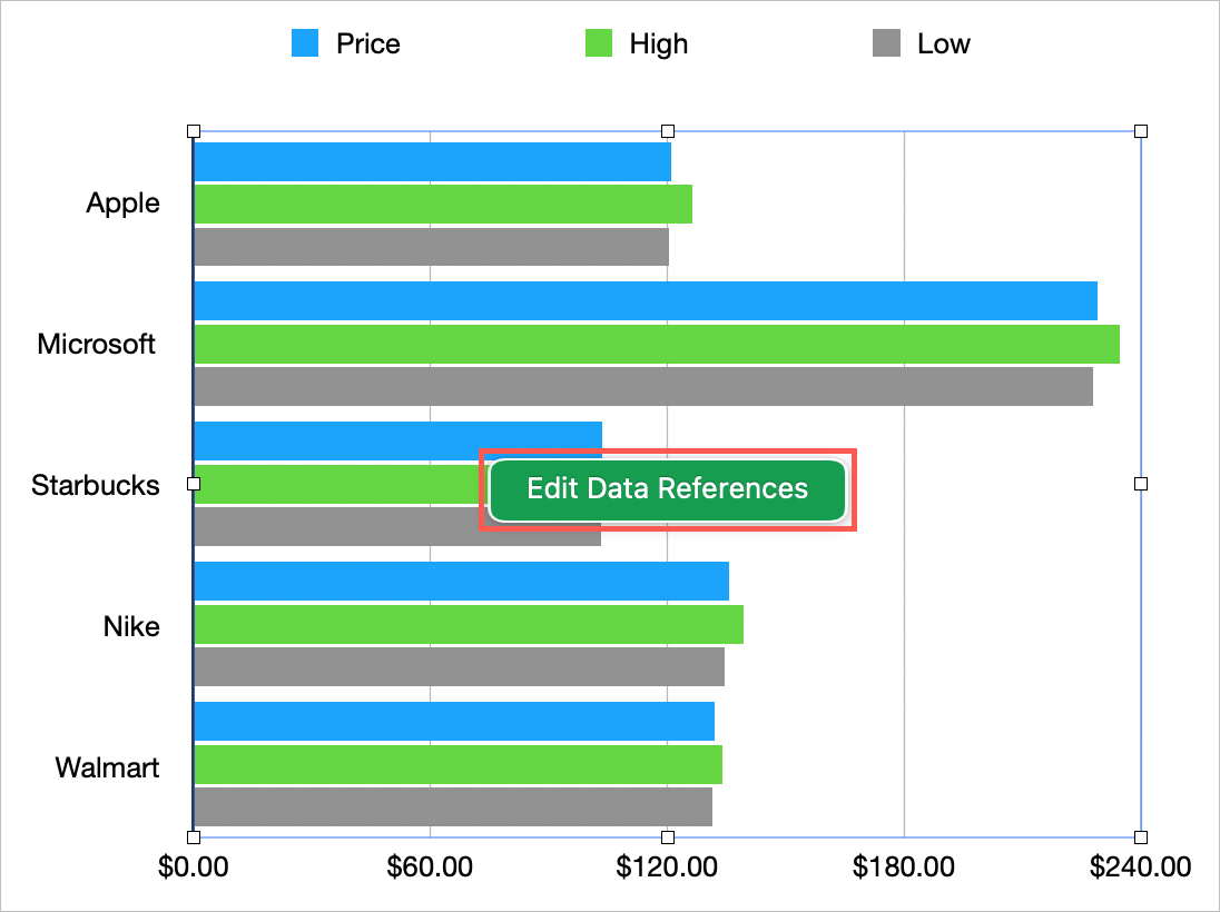
- Click the arrow for a column or row header to change the plot series or delete that series from the chart.
- Select additional cells to add data to your chart.
- Use the drop-down on the bottom left to switch between columns and rows for the plot series.
When you finish making changes to the chart data, click Done at the bottom of the window.
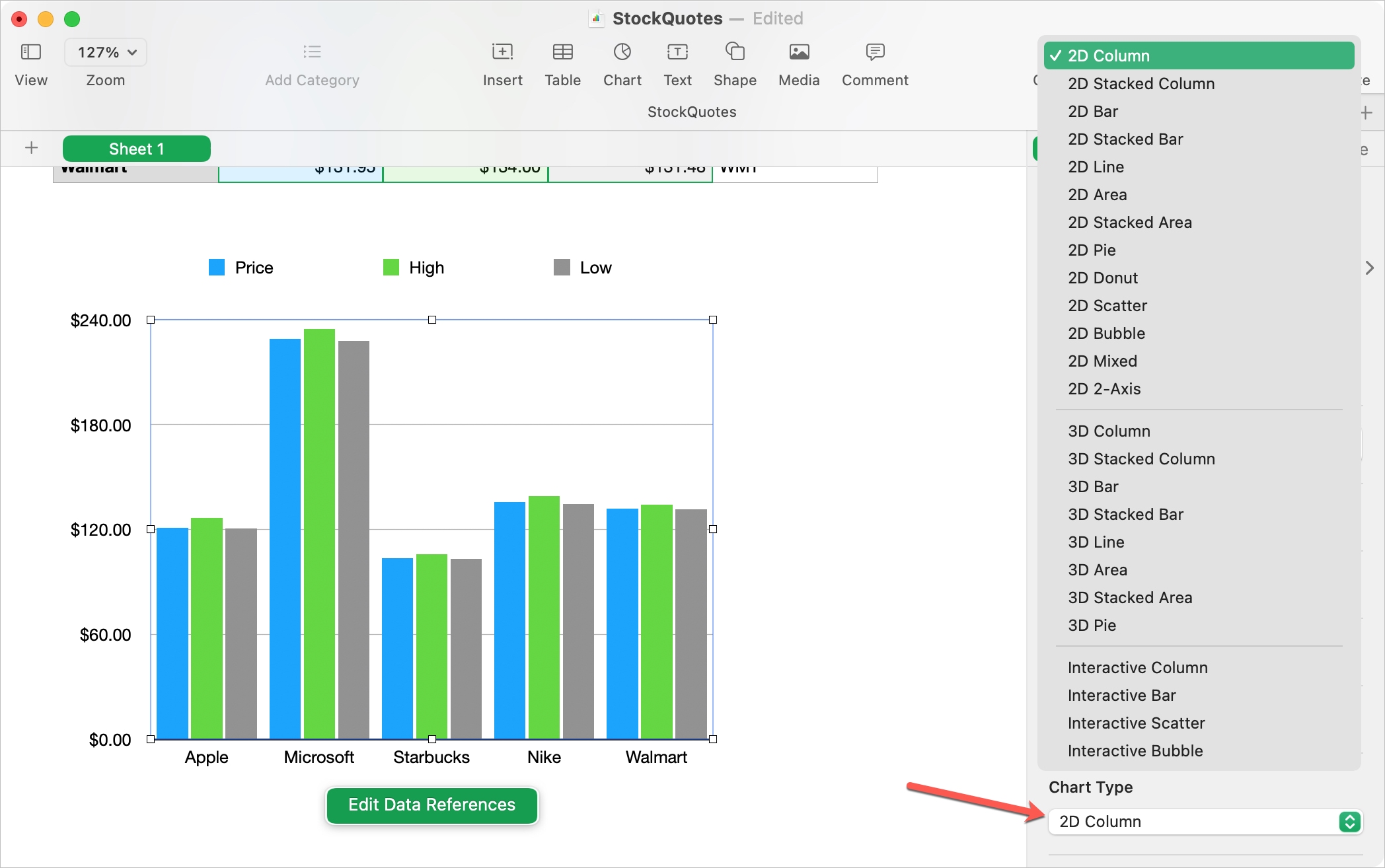
You can also edit the type of chart you’re using. For example, you might feel your data would look better as a column rather than a bar chart.
1) Select the chart and click the Format button.
2) Choose the Chart tab at the top of the sidebar.
3) At the bottom of the sidebar, use the Chart Type drop-down list to pick a different chart style.
Insert a chart in Numbers on iPhone and iPad
Even though working with charts is a bit easier on Mac, you can still insert, format, and edit charts in Numbers on iPhone and iPad. Like on Mac, it’s easier to select your data on iOS before you insert the chart.
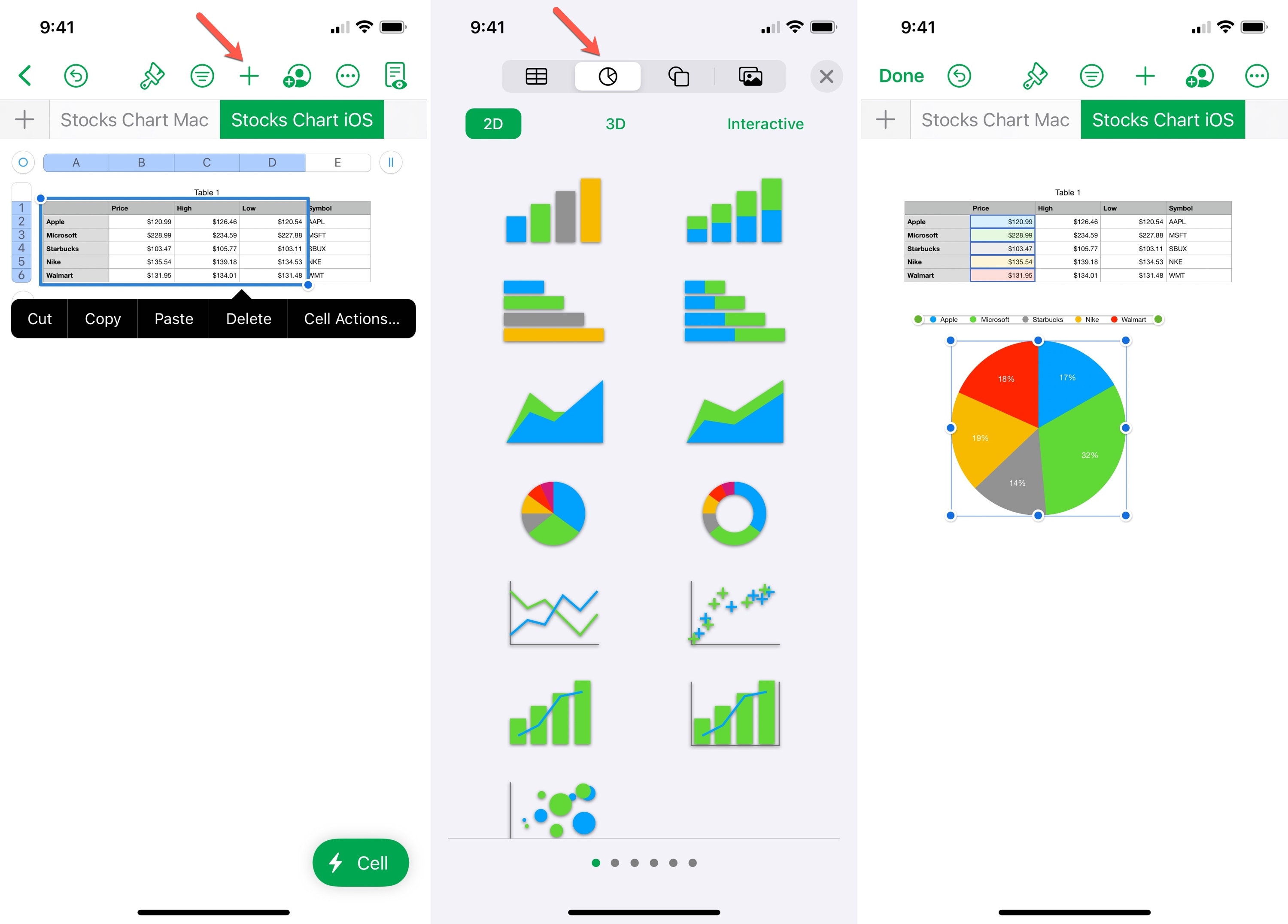
1) Select the data in your chart by dragging through the cells, columns, or rows.
2) Select the purple square icon (earlier plus sign) at the top and pick the Tables & Chart icon. Then, select 2D, 3D, or Interactive. You can swipe left and right to pick a color scheme.
3) Choose the chart you want to use, and it will pop into your sheet below your data.
Format a chart on iPhone and iPad
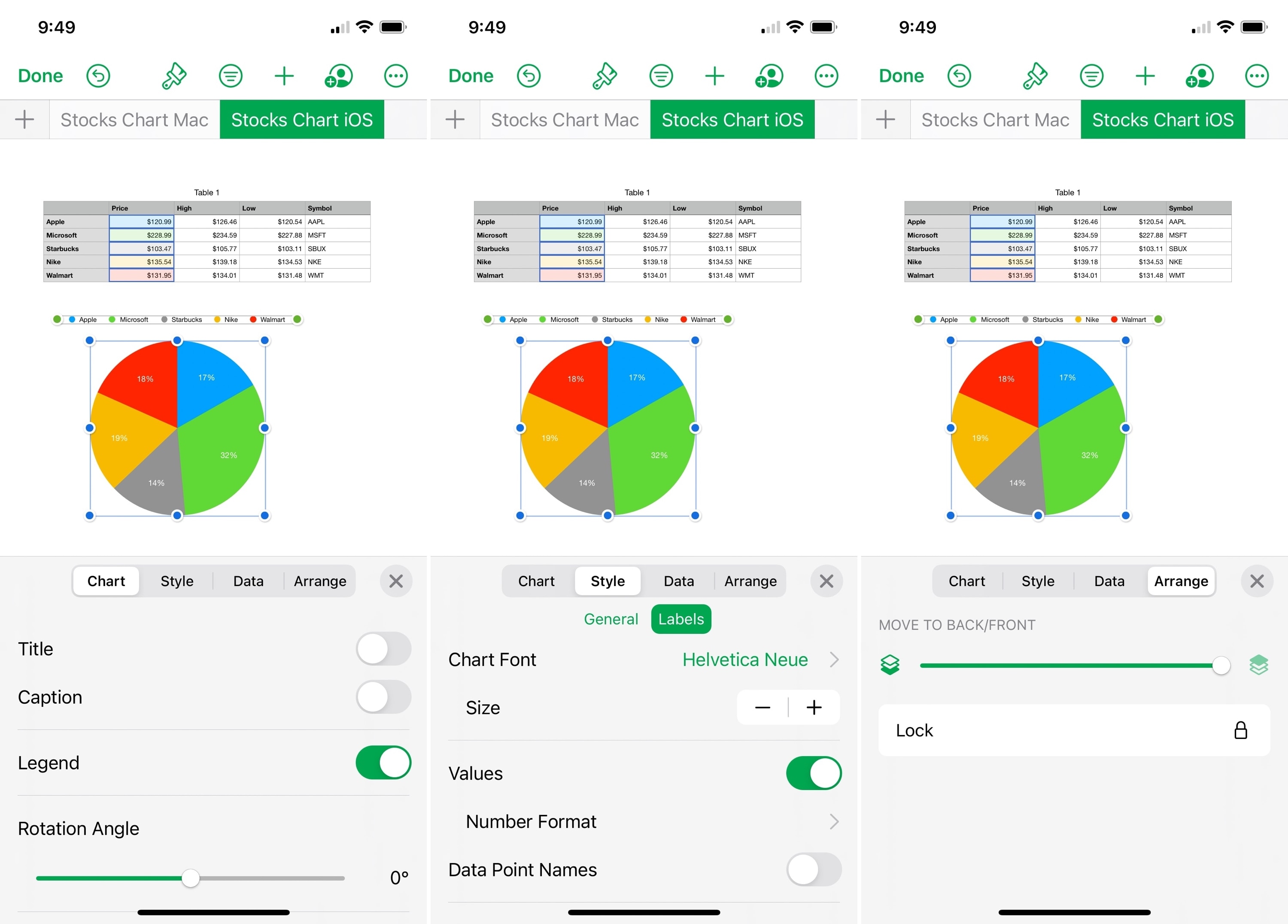
You’ll find most of the same formatting options for a Numbers chart on iPhone and iPad as on Mac.
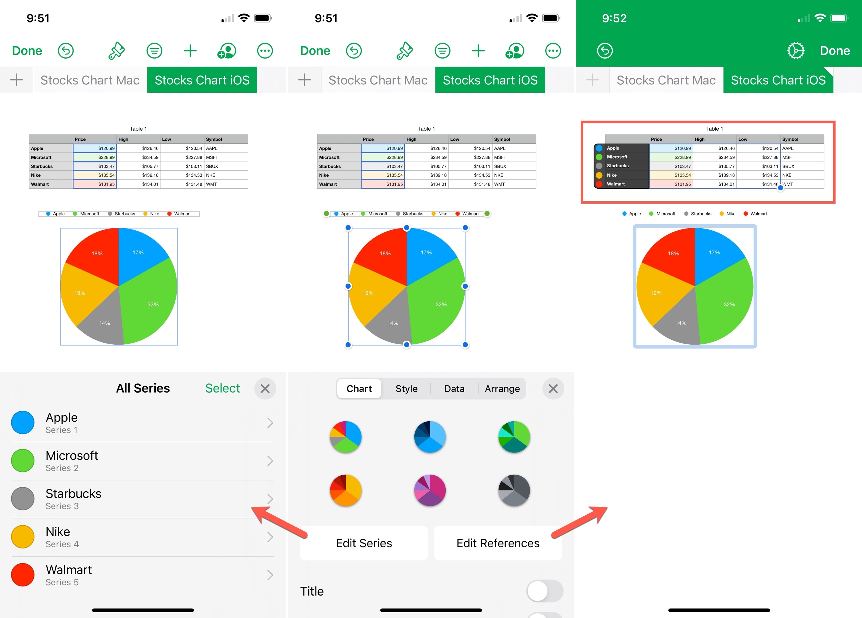
Select the chart and tap the Format icon (paintbrush) at the top. In the pop-up, use the Chart, Style, Data, and Arrange tabs to format the chart.
Edit a chart on iPhone and iPad
To edit the data you’re using in your Numbers chart, select the chart and tap the Format icon (paintbrush icon) at the top.
- Choose Edit Series to make changes to each individual series of data.
- Select Edit References to remove or add data to the chart.
If you think your sheet could benefit from a graph or chart in Numbers, give it a try! You can use a basic chart or one that’s spruced up with cool colors and fancy font. It’s all up to you!
Do you have tips you’d like to share for using charts in Numbers on Mac, iPhone, or iPad? If so, share them below!
Other Numbers app tips: