Infographics

Battle of The Mobile Operating Systems: Are You a Typical iOS or Android User? [Infographic]

Android v.s. iOS arguments never cease in the tech world. The battle between the two leading mobile platforms rages on as Apple makes more money and Android gets pre-installed on more handsets.

What about the people that use Android and iOS? What are they like? An interesting infographic gives you the opportunity to see if you're the typical iOS/Android user...
9 Reasons Not to Buy an iPhone 5

The iPhone 5 is right around the corner. Whether it's coming in September or October, one thing is sure: you want it!

If you can't afford the iPhone 5 and are just looking for a few reasons not to buy it, the peeps at MacTrast got you covered. They came up with 9 reasons not to buy an iPhone 5...

A Summary of All the Crazy iPhone 5 Rumors [Infographic]

It seems like the rumors and speculation for Apple's upcoming smartphone have been non-stop over the last couple of months. To make things even more confusing, a lot of the information is completely contradictory.

Is it going to be a modest upgrade or will Apple give it a major overhaul? Will it launch in September or October? How are we supposed to keep up with all of it? Luckily, the folks over at The Next Web were kind enough to help put everything in perspective with this infographic...

The U.S. Divided by Mobile OS of Choice [Infographic]

I've always said that the Android vs. iOS debate could spark another civil war here in the states. It seems like arguments for and against the industry's 2 hottest platforms can get heated in a hurry.

With that in mind, here's an interesting infographic displaying the results of mobile ad firm Jumptap's ad-tracking data. It shows the U.S. with states color-coded according to which mobile OS dominates the region. Hit the jump to find out what OS your state prefers.

35 Years of Apple’s Consumer Electronics [Infographic]

With Apple expected to unveil a new iPhone (or iPhones) this Fall, the rumor mill is on a rampage. It seems like everyday we hear contradicting information from people with "inside sources," offering tidbits about Apple's plans for the next few months.

If you'll notice, there isn't another company that garners this kind of attention. Why is that? It's because over the last 30 years, Apple has been capturing the imagination of consumers with its wide range of consumer electronics...

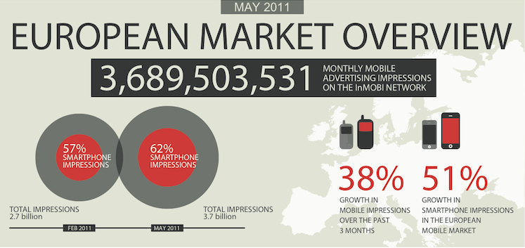
Apple’s iPad and iPhone Quite the Advertising Force in Europe

A curious glance around any train station, bus stop, or airport will show you just how popular Apple's iPad and iPhone mobile devices are, and the sales figures back up the assumption that Apple just can't make enough of its magical devices.

What might not be so obvious, is that the iPad is one of the most advertised devices in Europe, with the smartphone being the 6th in a list of devices when it comes to ad impressions...

The Evolution of Smartphones [Infographic]

Have you ever wanted a bird's eye view of the smartphone industry? Wouldn't it be cool to look back at the evolution of handsets from the 90s until now?

TechKing has put together an awesome infographic that demonstrates how smartphone design has changed throughout the years. Starting with the IBM Simon and ending with the upcoming iPhone 5/4S -- it's amazing to see how far we've come...

Pimping Out Your iPhone [Infographic]

Have you ever wondered how much money people spend on their iPhones? The folks at Geekaphone have prepared an infographic called "Pimp Your iPhone," and now you can see figures on how much cash people drop on their precious handsets.

A staggering $497 million was spent on iPhone accessories in the last 9 months alone. The average price of a paid app is $1.25.

Check out the full infographic after the break...

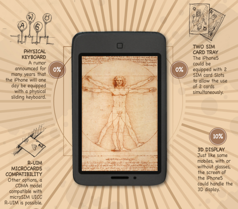
iPhone 5 Rumor Mill [Infographic]

The iPhone receives its fair share of rumors on a daily basis. It can be difficult to make sense of all the conflicting reports and claims that fly around the internet, so sometimes we need a way to get a 10,000 foot view of all the stories out there.

Thanks to Infographic Labs, you can now see most of the rumored features for Apple's iPhone 5 in one place. This graphic gives a percentage of likelihood for each feature, and it adds a sense of renaissance style.

An Incredible Story of App Store Success for Camera+ [Infograhic]

The popular iPhone photography app, Camera+, recently had its one year App Store anniversary. The folks at tap tap tap are no strangers to success in the App Store, and the development company is known for its smart marketing tactics and quality applications.

The developers of Camera+ have released an infographic detailing the success of their app, including an accumulative $2.7 million in revenue. The infographic shows what types of photos people are sharing the most with Camera+ as well. The winners include dinner, beer and cats...

Twitter on iPhone: By the Numbers [Infographic]

It's no secret that Twitter has become incredibly successful as a social network and publication tool. A large part of the site's success is thanks to the mobile implementation we've seen in an array of third party clients over the years.

Particularly, on the iPhone, Twitter apps are a dime a dozen. You've got the official client, TweetDeck, Echofon, Tweetbot, etc. all clamoring for attention in the App Store.

The folks at Onavo Insights have put together a nice infographic detailing Twitter's statistics on the iPhone. Check it out after the break...