I’ve always said that the Android vs. iOS debate could spark another civil war here in the states. It seems like arguments for and against the industry’s 2 hottest platforms can get heated in a hurry.
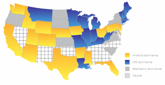
With that in mind, here’s an interesting infographic displaying the results of mobile ad firm Jumptap’s ad-tracking data. It shows the U.S. with states color-coded according to which mobile OS dominates the region. Hit the jump to find out what OS your state prefers.
If a civil war did break out, these would be the teams. It’s not surprising to see that Android dominates the states with larger populations like California, Texas, and Florida. Bigger populations means a bigger lower class, and low-end Android phones start off pretty cheap.
As 9to5Mac points out, this chart is sourced from a limited selection of people (83 million) on Jumptap’s ad network rather then actual sales numbers. So count that as your disclaimer. It’ll be interesting to look at this in a couple of years. Will BlackBerry even be on the map?
What do you think? What’s your state’s mobile OS of choice?

