If you’re new to Keynote or simply the chart options, here’s how to create a basic chart or graph in the Keynote app on your Mac, iPad, and iPhone.
Charts and graphs are great visual representations of data. So adding one to your Keynote presentation can be beneficial for your business or organization.
Related: How to insert, format, and edit charts & graphs in the Numbers app
Create a chart in Keynote on Mac
1) Open your presentation in Keynote and head to the slide where you want to insert the chart.
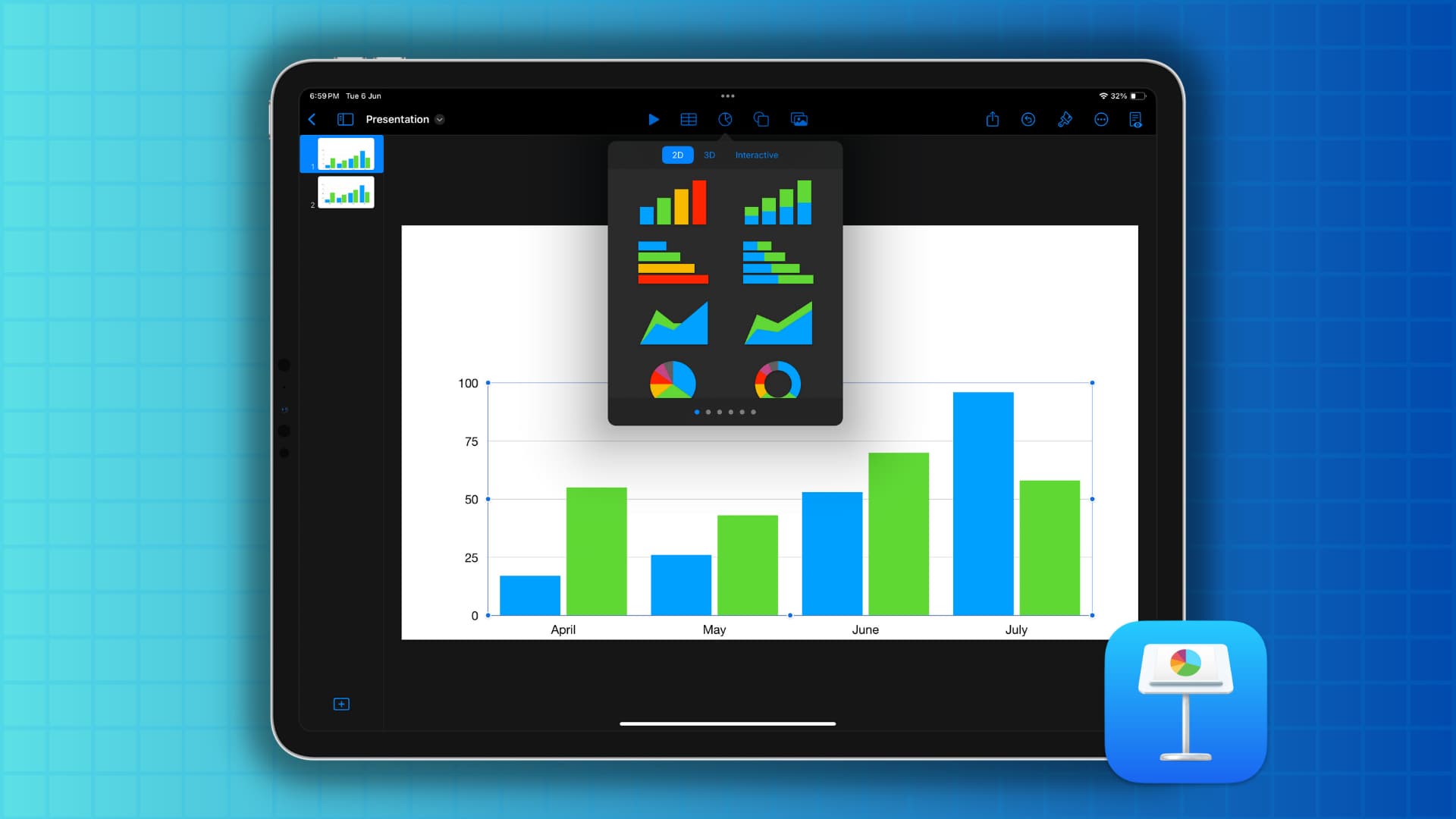
2) Click the Chart button in the toolbar or click Insert > Chart from the menu bar. You’ll see a large selection of chart styles within the three types: 2D, 3D, and Interactive.
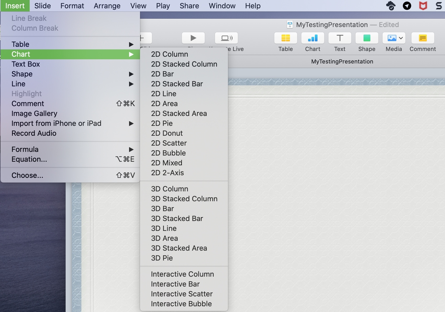
2D and 3D charts obviously differ in their visual style, but an Interactive chart is one where you can use a slider and buttons to see additional data.
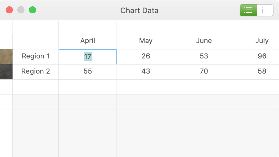
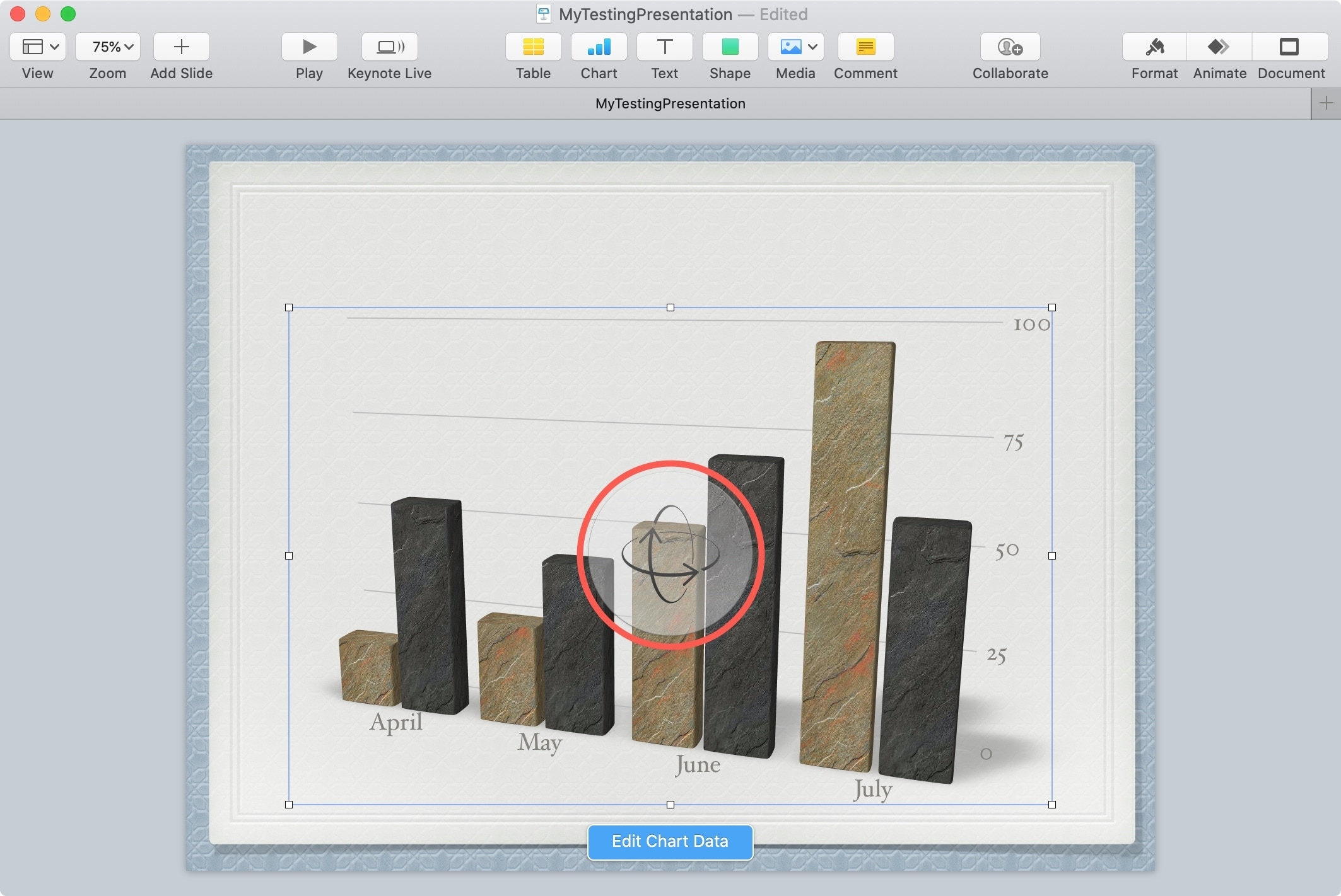
3) Once you select your chart type, style, and color, it will pop onto your slide. Then, with the chart selected, click the Edit Chart Data button.
4) You’ll see sample data in a table. This makes it easy to add your own data. And if you want to swap the way the data displays, click the Plot rows as series or Plot columns as series button from the top right.
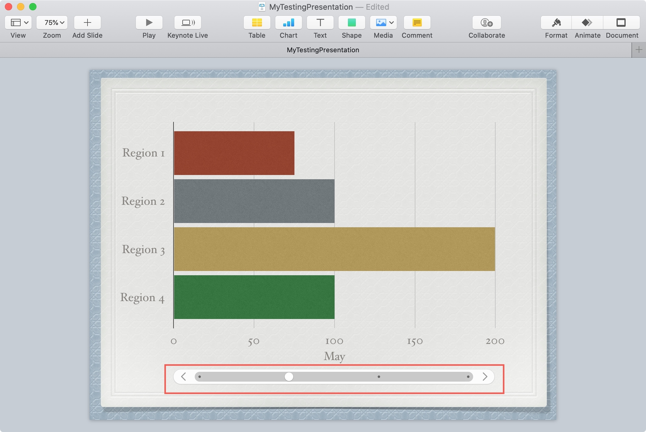
5) You can move your chart by selecting and dragging it or resize your chart by dragging one of the borders or corners.
For a 3D chart, you’ll see a Rotation Control in the center. So you can move the chart to get just the right angle.
And there you have it, a basic chart for your Keynote slideshow.
Format the chart
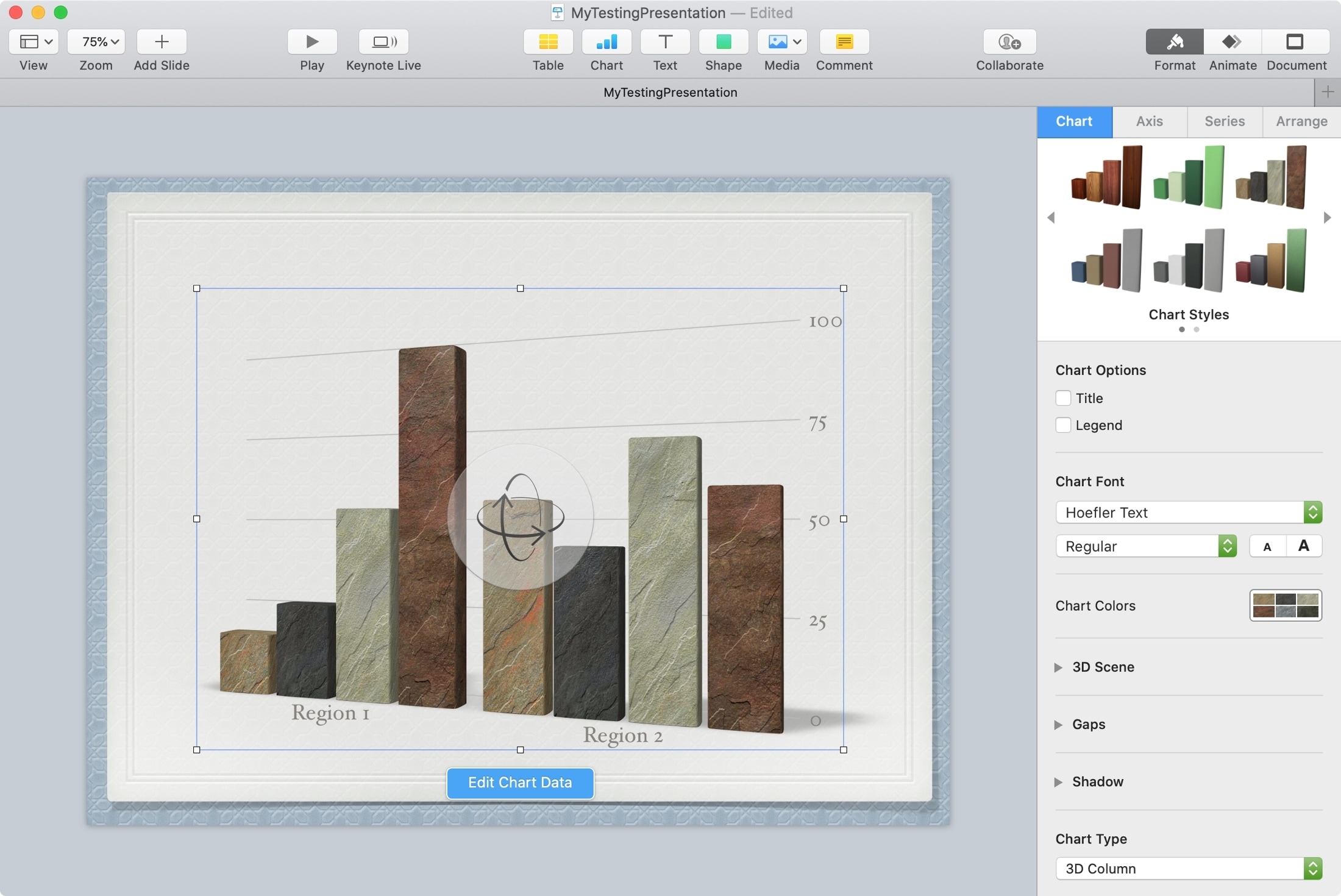
If you want to make more adjustments to your chart, select it and click the Format button (paintbrush icon) on the top right of the Keynote window.
You’ll see tabs for Chart, Axis, Series, and Arrange. The options within each tab will differ depending on the type of chart you’re using. But for the basics, here are the types of changes you can make.
- Chart: Pick a different style, add a title or legend, and adjust the font, color, background, & border.
- Axis: Add an axis name or line, change the scale or labels, adjust the angle, references lines, gridlines, and include tick marks.
- Series: Select and customize value labels.
- Arrange: Change the alignment, size, and position, and lock, unlock, group, and ungroup.
Add a chart to Keynote on iPad or iPhone
1) Open a blank or existing presentation in the Keynote app.
2) Go to the slide where you want to add the chart, and do the following:
- On iPhone: Tap the square like button at the top, as shown in the screenshot (in older versions of Keynote, tap the plus button instead). Now tap the chart icon and choose 2D, 3D, or Interactive sub-heading. Next, pick the chart you want to use, and it will pop right in on the slide.
- On iPad: Tap the charts button from the top and pick an option.

3) Tap the added chart and use the paintbrush icon at the top to see several options to format your chart. The options here vary depending on the chart you picked.
Or, tap the arrow icon and then Select Objects, Edit Data, Edit Series, or make other adjustments.

4) Finally, tap the checkmark icon to save your presentation.
Once you take a look at all of the formatting options, you may be surprised at just how much you can do with the chart you create in Keynote. But if you just want to make a basic chart or graph, you can do it quite easily.
Are you going to create a chart for your next Keynote presentation?
Other Keynote tips: