Google's YouTube app for iOS is undergoing some changes amid a broader redesign and rebranding effort reflected in the service's revamped logo and icon, announced earlier today.
Video: YouTube’s overhauled look and new features coming to iOS app
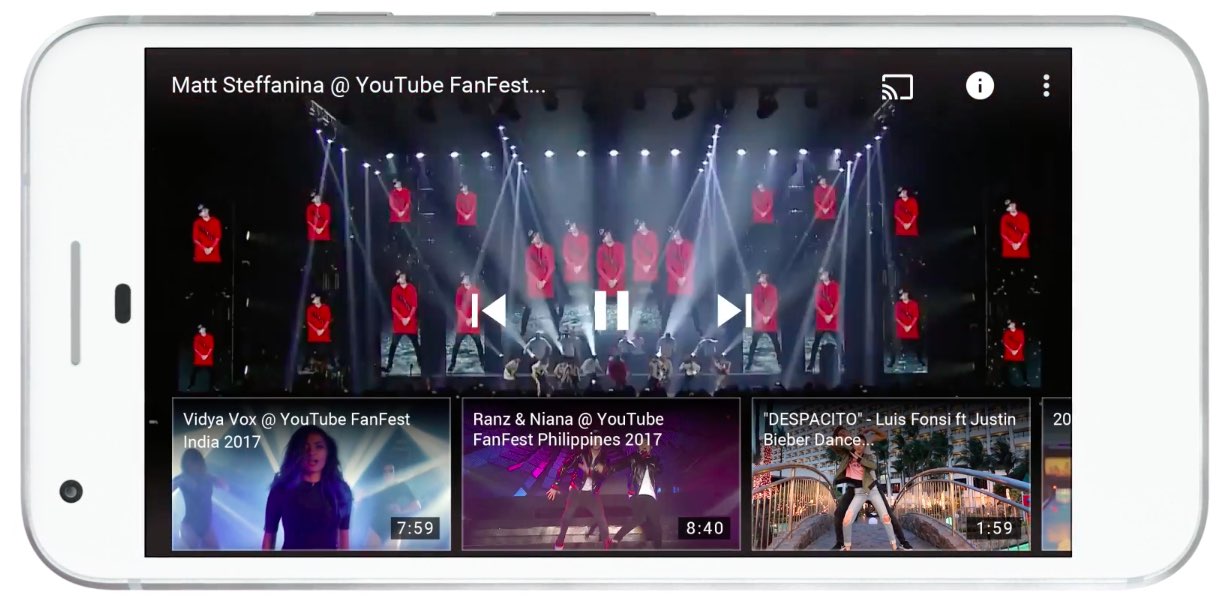
Google's YouTube app for iOS is undergoing some changes amid a broader redesign and rebranding effort reflected in the service's revamped logo and icon, announced earlier today.
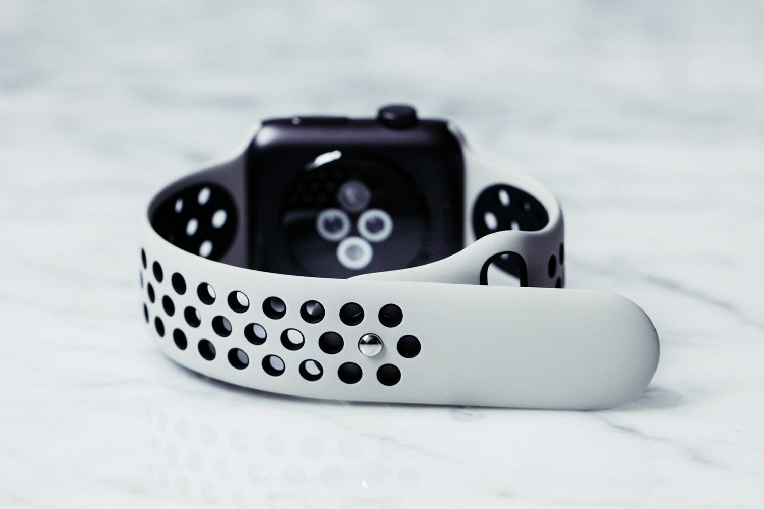
Respected Apple analyst Ming-Chi Kuo of KGI Securities wrote in a new report to clients today that Apple Watch Series 3 won't have any obvious form factor changes from existing models, saying LTE cellular connectivity will be its main selling point.
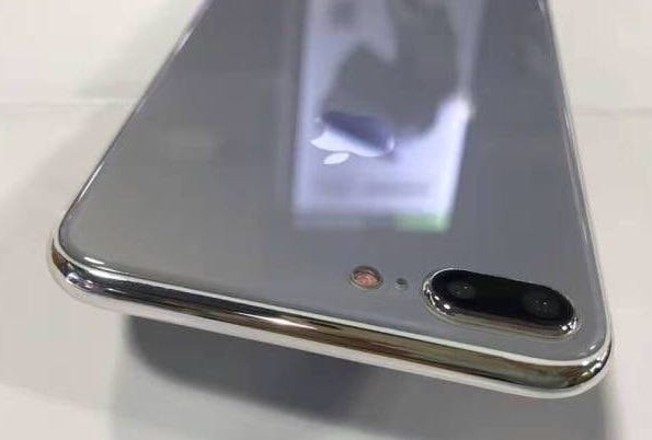
Most of the chatter about Apple's upcoming iPhones is revolving around the highly anticipated OLED-based model, but fresh new images from Apple tipster Sonny Dickson, reposted by French outlet iGeneration, have depicted the rumored glass-sandwich design for the LCD-based iPhone 7s and iPhone 7s Plus models.
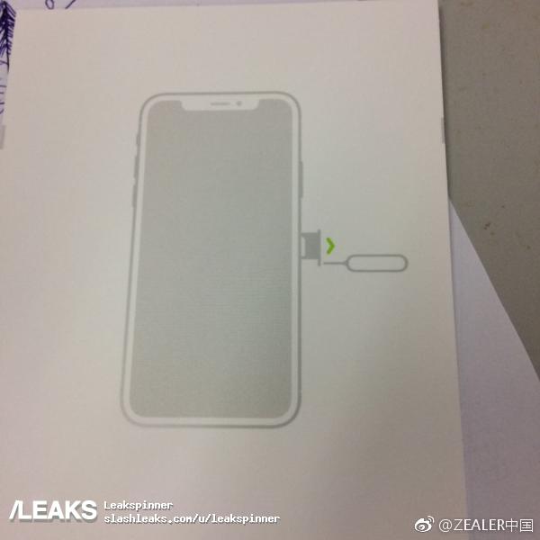
Leak aggregator SlashLeaks today published a claimed photograph of the purported iPhone 8 user manual that seemingly “confirms” the device's rumored bezel-less design with a physical slit at the top of its 5.8-inch OLED display for the earpiece, the camera and sensors.

Jony Ive, 50, Apple's Chief Design Officer in charge of all design efforts across the company, sat down with The Wall Street Journal's Christina Passariello to discuss the company's massive new campus, called Apple Park, and other topics of interest.
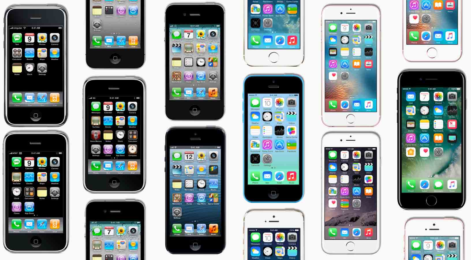
Hugh Dubberly, a former Apple creative director and former member of Samsung’s global design advisory board, was cited in The Wall Street Journal's write-up Monday as saying that the pipeline that Steve Jobs started is now over. “It’s not so much that Samsung has gotten better, but Apple has fundamentally changed,” he added.
While smartphone innovation in general has stalled due to market saturation and other factors as game-changing technologies continue to give way to incremental changes, the article suggests that Samsung has out-designed Apple with its Galaxy S8.
The smartphone war is shifting to how a phone looks and feels, reads the article.
Samsung design chief M.H. Lee was cited as saying:
Companies used to design phones to show off their technology. Now the focus is on designing a product that can be a buddy to the person, inseparable to them. Smartphone design is not just artwork that expresses what you want but a process of making things people around the world can actually use.
Charles L. Mauro, president of MauroNewMedia, a product-design research firm that has done consulting work for Apple and Samsung, said smartphone aesthetics now account for about half a consumer’s purchase decision versus just seven percent of purchases in an older survey.
An excerpt from the article:
Samsung's Galaxy S8 is nudging the bar higher as Apple seeks to impress with its 10th anniversary iPhone this fall. For Apple to outdo Samsung on design, analysts said, it would need a new distinguishing feature, like a fingerprint sensor beneath the display rather than a physical Home button.
Consumer Reports ranked the Galaxy S handset the top phone for the second straight year, praising features like Galaxy S8's industrial design, battery life and camera quality.
Galaxy S8 sales hit one million units in South Korea in half the time it took for its predecessor to hit that milestone. On the other hand, it saw significantly lower global sales during its first two months of availability than the Galaxy S7 model during the same period last year.
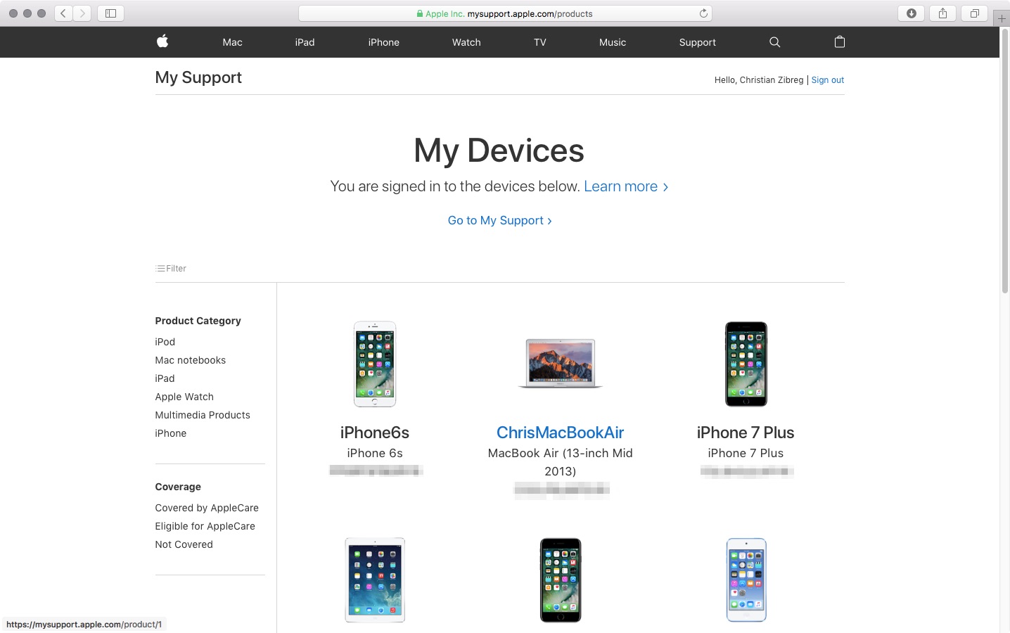
Apple has relaunched the My Support website with an all-new design featuring bolder headings and adaptive layout to match the look of the rest of Apple.com. Available through the new address at mysupport.apple.com, the overhauled site has all the same features like the old one, which debuted back in 2011.
Upon logging in with your Apple ID, you can register your Apple product by typing in a serial number, which lets you access various support options and do things like track repairs, check on a device's warranty status and much more.
You can give products nicknames, reorder them, sort them by device category or coverage status and more. Other options include the ability to browse your repairs within the past 90 days, look up a repair by entering your Repair ID or a product's serial number and so forth.
Some of the features of the old site are nowhere to be found on its redesigned counterpart.
That's because some of them have been relocated elsewhere or integrated into the redesigned Apple ID or Apple Support webpages, like the ability to edit your contact information.
While the old site let you add an AppleCare protection plan to hardware, that features is absent on the new site because, as of recently, all of Apple's AppleCare plans for Macs, iPads and iPhones must be bought alongside a new device or within 60 days of purchase and they're automatically registered to your Apple ID.
The site provides a Contact Us link that leads to Apple's webpage where you can find various support options that are available to you, based on your country and products.
Like before, you can see a history of your support interactions and AppleCare coverage eligibility, access product manuals, guides, technical specifications and support pages for your products, view previous replacements of products and more.
Many people were unaware that this site existed in the first place because finding it without remembering the URL was impossible. I remember having to Google “where can I find all my registered Apple products” just to get to that page.
Even though the Apple ID site shows all your devices, older hardware with no iCloud support isn't displayed there. At the revamped My Support site, you can easily find all your Apple products, including all your iCloud-authorized devices and any manually registered products.
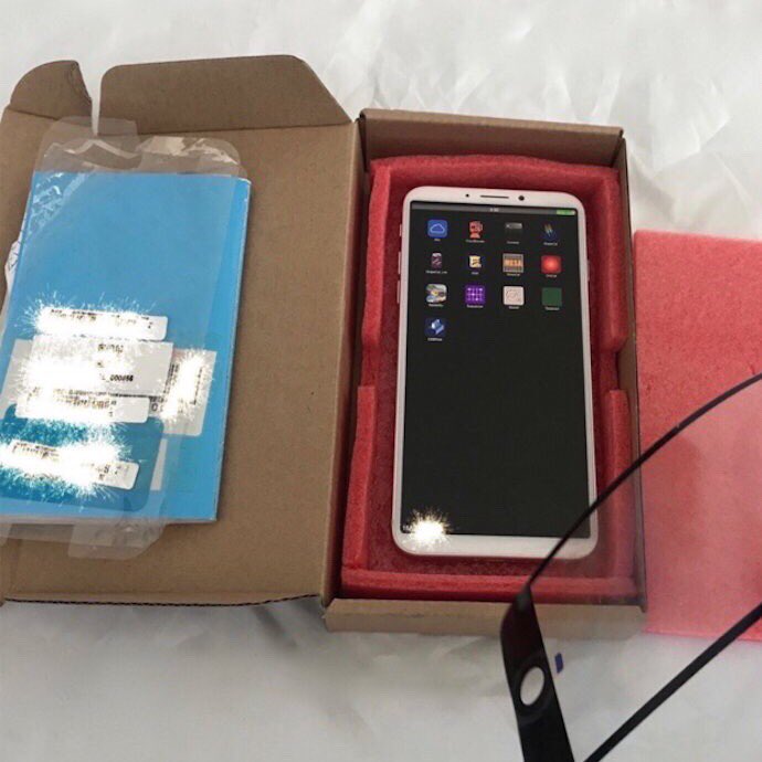
A trio of images published by Benjamin Geskin last night have gotten some folks excited (or worried, depending on your point of view). The photos appear to show an early iPhone 8 prototype, which he says was obtained from an insider.
The device pictured on the images does not have its front-facing FaceTime camera and the speaker integrated into the display, like we're expecting in the final model due this fall.
Instead, there's a “chin” at the top of the display, albeit thinner than on current iPhones.
The images show that the device came in the box with an iPhone 7 screen protector applied to its display. What's more interesting than that is a blue “passport” we can clearly see in the box.
For the uninitiated, iPhone prototypes are accompanied by this passport document at all times, for quality assurance and control testing.
According to Australian leakster Sonny Dickson:
Each component or product that is tested they document in the page. The person writes their initials next to it and any notes about it passing or failing or any other comments. It makes its way through each test and person. It then is finally sent with its 'passport' from China to Apple.
That being said, we're still unsure if the device shown on Geskin's image is in fact one of the ten iPhone 8 prototypes Apple has reportedly tested this year or simply a dummy unit created based on rumors, but we're posting it here for the sake of discussion.
So, what do you say?
Is this a real iPhone 8 prototype? And if so, does it represent the device we're going to see this fall or one of the designs that Apple has ultimately abandoned?
Let us know by posting a comment below.
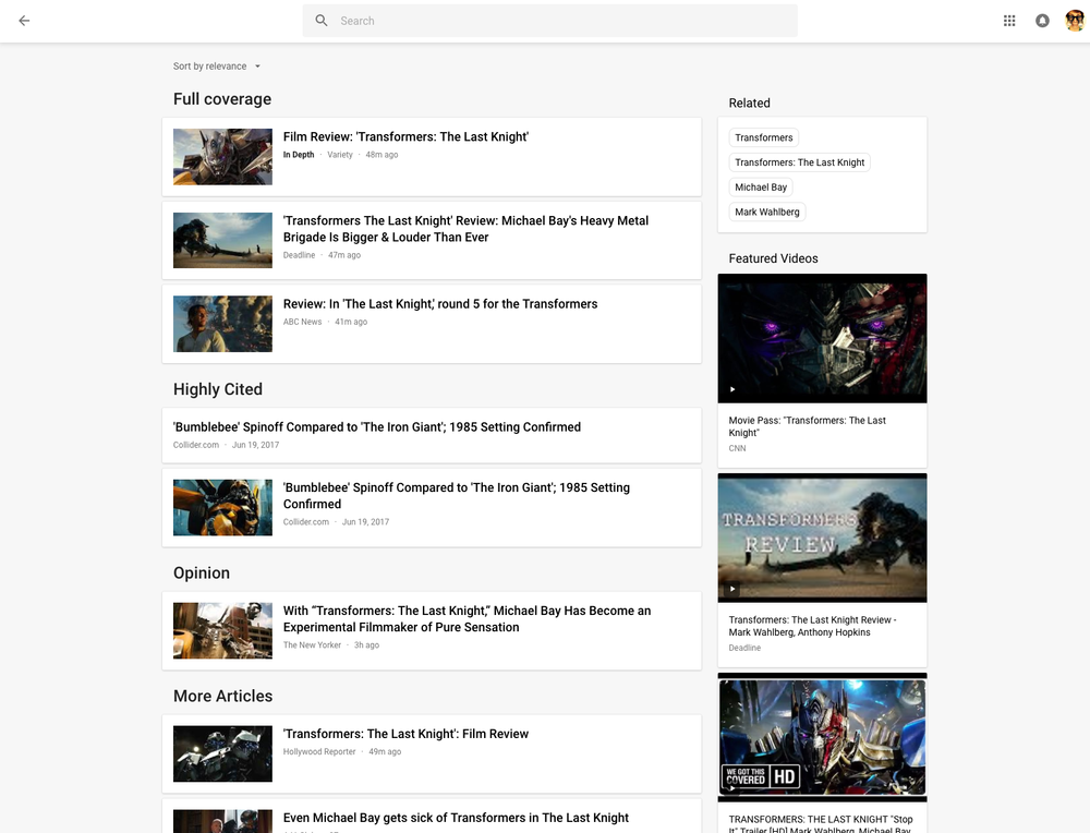
Rolling out globally in the coming days, the desktop version of Google News has been thoroughly redesigned for easier navigation and readability while adding new features like a dedicated Fact Check section, additional controls for users to specify their favorite news sources and interests, an Apple Music-like For You section and more.
Check out the new-look Google News by visiting news.google.com on your desktop.
As evidenced by the before vs. after screenshot comparison top of post, the uncluttered look is based on Google's Material Design and makes heavy used of a card format to make it easier to browse, scan and identify related articles about a story.
The overhauled layout focuses on publisher names and article labels, and maintains your view and place on the page as you click in and out of stories and explore topics. The lefthand navigation column is customizable and lets you jump quickly to news that interests you.
In addition to the built-in sections like Sports or Entertainment, the lefthand navigation column provides one-click access to your saved search queries like, say, “FIFA World Cup” or “Bollywood.” You can sort your news by relevance or date, see top videos, and browse top news topics in the Related block.
Story cards are designed to you a quick glance into a story.
They can be expanded to show additional articles with different points of view and are labeled with helpful tags, like Local Source, Most Referenced, Opinion, Fact Check and more. Also important, to give you additional context Google News now shows a second labeled article in addition to the top headline for each story.
Clicking the Full Coverage link from the story card brings up a bunch of news stories about a given topic. Another navigation bar at the top of the page provides shortcuts to the following sections: Headlines, Local and For You.
The Local section is your home to local news stories from any part of the world. The For You section is your personal news feed based on your interests. After signing in with your Google Account, you can customize what appears in the Local and For You tabs.
With all settings in one place, Google News now lets you quickly edit existing sections, name custom ones, select what you'd like to see in the For You section, cherry-pick your favorite news sources that you want to see more or less of, and much more.
Videos have seen some much-needed improvements, too.
“Videos have become central to news storytelling, so we improved the algorithmic selection for top videos, highlighted the top video in a story card, and built a better player,” says Google.
“While playing a video, more related videos will be available in the player.”
The Fact Check label introduced last year is now prominently used across Google News.
As a bonus, you now have a new Fact Check section on the right column of the Headlines section, filled with links to the top recently published fact-checked articles.
This section is currently available in the US only.
As I mentioned before, the new Google News is a staggered release rolling out globally in the coming days so you may not get the new look immediately.
How do you like Google's News redesign?
Tell us in comments!

Apple is putting finishing touches on a new store on Chicago's North Michigan Avenue and one particular design detail immediately jumped out at us: an Apple logo on the top center of the building, making the flagship store look as if a massive MacBook Air just landed.
“Our store on North Michigan Avenue has welcomed more than 23 million customers since it opened in 2003,” said Apple spokesman Nick Leahy in 2015. “We're now creating something even more remarkable for Chicago.”
As reported by Chicago publication DNAinfo, less than an hour later crews rolled up the logo and took it away. The logo did not appear on store renderings dated 2015.
It's unclear whether it will be reinstalled.
https://www.youtube.com/watch?v=BmzPr106E7U
The upcoming 20,000-square-foot flagship outlet was designed by London-based Foster+Partners. As evidenced by the video, it consists of a huge glass box stretching from Pioneer Court to the riverfront.
Located on Pioneer Court, 401 North Michigan Avenue, the new store will, when complete, replace Apple's existing outlet on 679 North Michigan Avenue.
The Chicago store's attractive roof design reminds me of Apple's awesome-looking 20,000 square-foot retail outlet in Istanbul, Turkey, which too features a striking all-glass exterior with an Apple logo on its rooftop, as seen above.
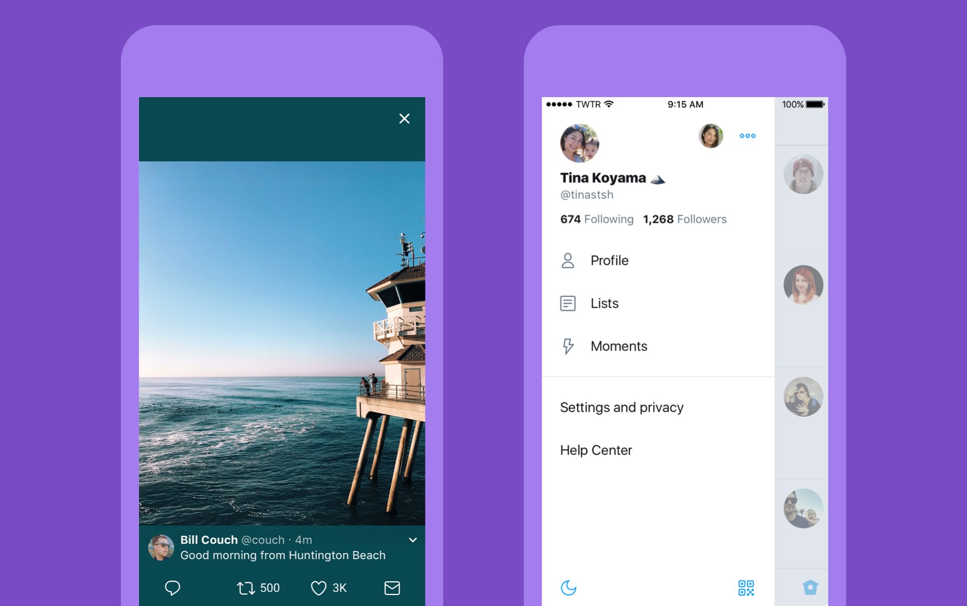
Twitter today announced a major overhaul, making the app feel lighter, faster and easier to use with faster navigation via a new side menu, bolder headlines, revamped icons and more.
The new side navigation menu lets you quickly access your profile, accounts, settings and privacy. As a bonus, you can now add filters and stickers on your profile image, if you'd like.
Tweets now update dynamically with Reply, Retweet and Like counts so that you can easily see conversations as they’re happening, in real-time. The app now features support for opening links to articles and websites in Safari’s in-app viewer.
This lets you log in to websites using your saved Safari passwords and enjoy articles in the browser's Reader mode, all within the Twitter app.
New switches in Twitter's settings interface let you turn on increased color contrast, decided whether or not you'd like links to open in Safari's Reader View and more.
Accessibility settings are now in a more prominent location.
So fresh. So clean. So live.
Check out our new look.https://t.co/ClWbwi8CEH pic.twitter.com/nR27POQkEi
— Twitter (@Twitter) June 15, 2017
Here's an overview of the new features and design:
Profile, additional accounts, settings and privacy—all in one place. A new side navigation menu and fewer tabs at the bottom of our app=less clutter and easier browsing. You told us you loved this change on Android last year and we’re excited to now bring it to iOS. Links to articles and websites now open in Safari’s viewer in the Twitter app so you can easily access accounts on websites you’re already signed into (iOS only). We’ve refined our typography to make it more consistent and added bolder headlines to make it easier to focus on what’s happening. Also, rounded profile photos make it clearer to see what’s being said and who’s saying it. More intuitive icons make it easier to engage with Tweets—especially if you’re coming to Twitter for the first time. For example, people thought the Reply icon, an arrow, meant delete or go back to a previous page. We switched to a speech bubble, a symbol most know and love. We also made the icons lighter for more seamless interaction Tweets now update instantly with Reply, Retweet and Like counts so you can see conversations as they’re happening, live (not available on twitter.com and Twitter Lite).The aforementioned changes are rolling out across twitter.com, Twitter for iOS, Twitter for Android, TweetDeck, and Twitter Lite over the coming days and weeks.
Twitter for iOS is a free download from App Store.

Unlike the name might imply, Apple’s Design Awards are not exclusively dedicated to chasing the pinnacle of visual design, but more comprehensively appraise other app elements such as user interface innovation, sound design and also gameplay for apps offering unique gaming experiences. The latter, games, have easily stolen the show this year with 5 out of the 12 winners coming from said category.
In a slightly embellished press release, Apple announced the names and links of all twelve winning applications, each coming with a punchy story to explain and celebrate the selection in addition to screenshots and pictures of each developer team.