We’ve seen our fair share of the supposedly leaked technical drawings, front panel parts, third-party cases and manufacturing molds concerning Apple’s next iPhone, but what about bigger-screened apps?
A form factor change will probably yield a higher screen resolution so developers will need to optimize apps for 4.7 and 5.5-inch canvases. The larger 5.5-inch iPhone reportedly got delayed over production issues so we’ll sharpen our focus on the 4.7 incher.
Now, current iPhones rock 640-by-1,136 screens, resulting in a pixel density of 326 pixels per inch (ppi). Should the next iPhone come outfitted with a larger 4.7-inch screen at the same 326ppi, its resolution is going to increase to about 756-by-1,344 pixels.
Quickly, do the math in your head: that’s 40 percent more pixels for the apps and content you care about. Sweet, no?
I have a few smart mockups and some thoughts to share with you on what apps could look like on a larger-screened iPhone 6 and what Apple can do to weather this transition…
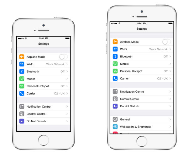
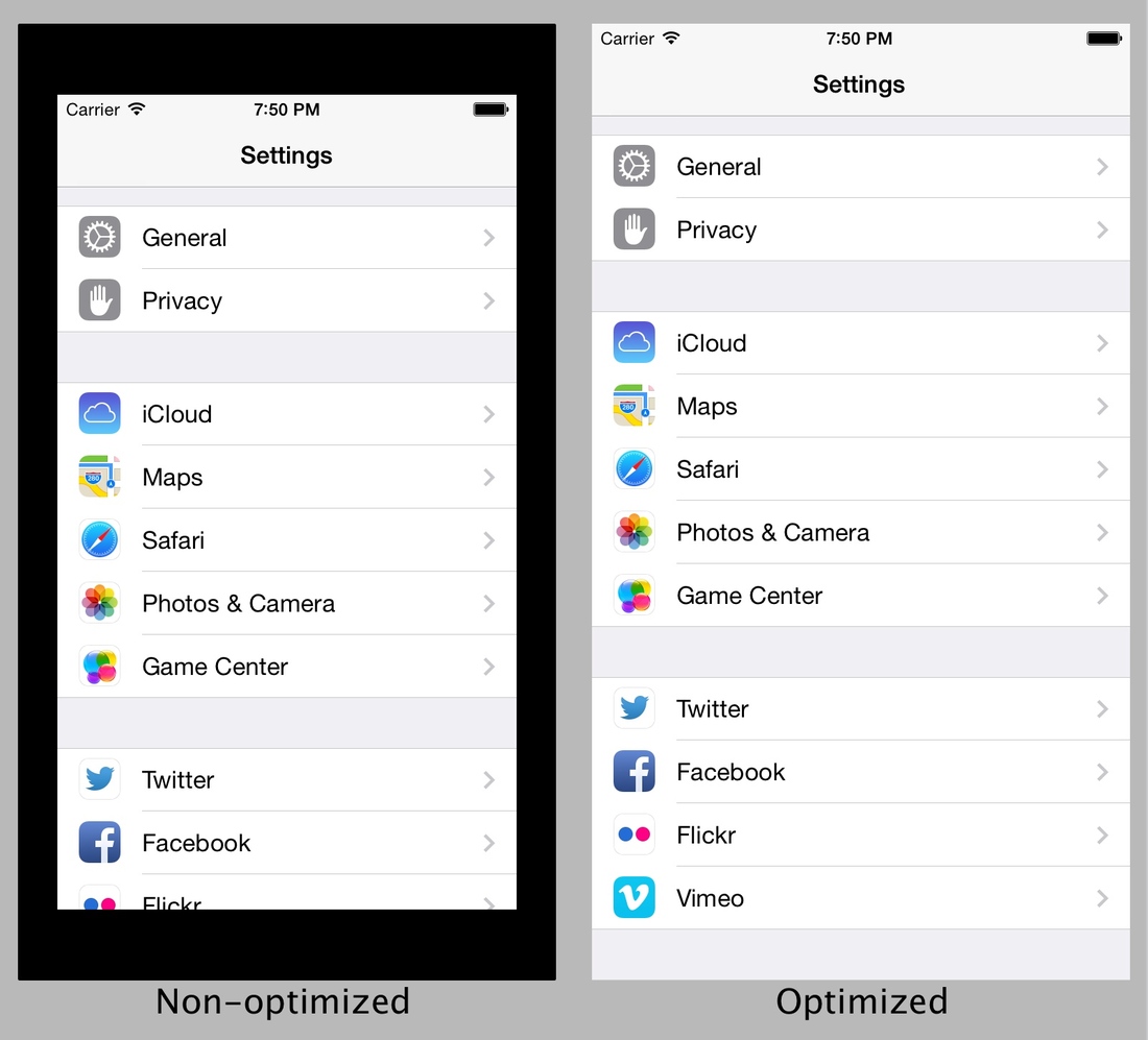
The above image was shared on Twitter by Brilliant Basics designer Sam Beckett.
It’s just a mockup and not a leak, but it does give us a good idea of what a typical iOS app – in this case the stock Settings app – could look like on a 4.7-inch screen (it impressed Apple’s user interface designer Jan-Michael Can who favorited it on Twitter).
And here’s another one showing the Home screen on the iPhone 5s (left) versus the 4.7-inch iPhone 6 (right).
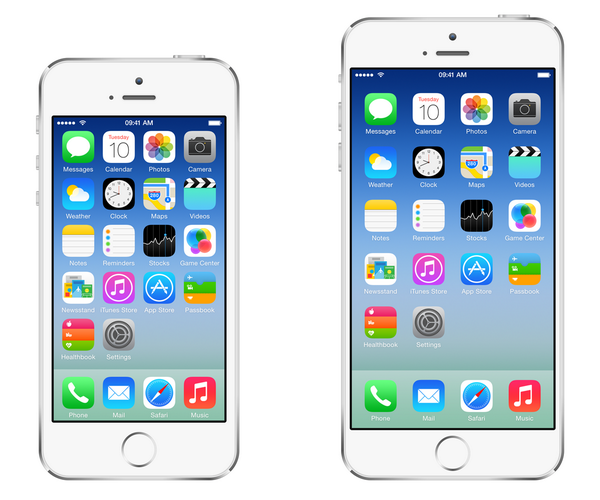
Notice how the icons are the same size as on the iPhone 5s, but with increased spacing like with the iPad. “I could design another row/column but it would be a very crowded home screen, detracting from the simplicity Apple likes,” remarked Beckett.
I’m with him: adding another row and column would just litter the Home screen with more icons. On the other hand, I can also see how sensical it’d be to have additional icons on a bigger canvas because of better overview. If Apple’s going to ship an iPhone with a big screen, it better put those pixels to good use, some would say.
We can only guess at this point whether the iPhone 6 will add more pixels by retaining the current pixel density of 326ppi or venture past Retina, into the 500ppi territory.
Should Apple go with four times more pixels like they did with the iPhone 4, the next iPhone 6 will have a screen resolution of a whopping 2,272-by-1,280. I don’t believe this is going to happen as having that many pixels would put a tremendous strain on the battery, CPU and GPU.
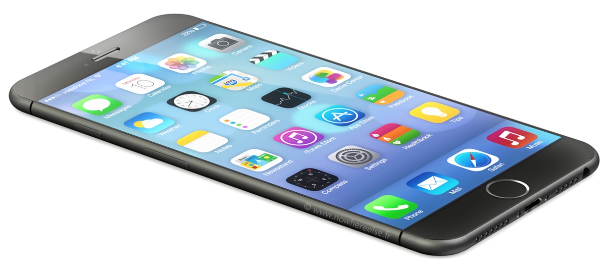
iPhone 6 rendering by 3D artist Martin Hajek.
Besides, I doubt an average human eye is able to discern the increased clarity and sharpness on a mobile display of this resolution. Moreover, I don’t think 2,272-by-1,280 screens can be mass produced reliably in 2014 in volume, especially given Apple’s insane volume requirements.
On the other hand, we have LG’s forthcoming G3 smartphone said to sport a 5.5-inch screen with a tantalizing pixel density of 432ppi – enough for a whopping qHD resolution of 2,560-by-1,440 pixels.
On his part, Beckett argues that Apple would benefit from keeping the iPhone 6’s display at the current Retina pixel density of 326ppi. Firstly, there would be a potential increase in battery life as there would be no additional pixels to light up. And secondly, developers would find the transition easier because they wouldn’t have to update image assets and UI layouts.
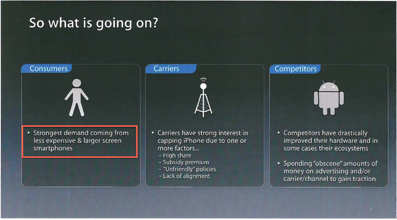
This internal Apple slide proves the company is cognizant that time is nigh for an iPhablet.
Speaking of developers, Apple provides a robust set of tools that make these transitions as painless as possible. The company advises developers to use auto-layout tools that deal with the placement and size of user interface elements in relative instead of absolute terms.
As in, this button is centered horizontally, this switch needs to be aligned to the right, this logo image goes to the top and 20 percent from the left side and so forth. This way, the operating system can automatically adapt the UI to whatever screen resolution is available, based on rules and priorities set by the developer.
But what do we do with nearly a million apps in the App Store designed for the existing iPhones? The brute force solution: until developers update them for the iPhone 6, the handset could letter-box non-optimized apps, as evidenced when Apple transitioned from 3.5 to four inch iPhones in 2012.
Source: Imgur.com, via The Verge forums.
Apple could also increase the display size while keeping the current 1,1360-by-640 pixel count intact, but that would simply make the pixels bigger and decrease the pixel density below Retina-approved 320ppi, down to 264ppi.
On the other hand, a 4.7-inch device can be held further away so a lower pixel density may not necessarily degrade the screen sharpness.
I wish Apple increased the iPhone’s screen size to 4.7 inches back in 2012…
Better late than never, I guess.
And your thoughts on the bigger-screened iPhone(s)?
Should Apple add more rows and columns on the Home screen and how should the company go about ensuring that existing apps look good on the upcoming devices during the transitional period?