When it comes to UI design, Google up until recently used to make what you’d call Spartan programs, more often than not resembling old-school software your parents might use. What a difference a leadership change makes: after co-founder Larry Page took over from Eric Schmidt as Google’s CEO in April 2011, we started noticing radical changes to how the Internet giant approaches app design.
I think it is safe to say that some of Google’s contemporary iOS apps are starting to look arguably better than Apple’s. But what’s so special about Google’s newly found design language? To answer that question, Google recently uploaded an interesting video to its Life at Google channel on YouTube. The entire clip is dedicated to highlighting how the new app design philosophy lends itself to the nimble, streamlined and interactive search experience on the Apple tablet…
From YouTube description (via 9to5Mac):
After just three months at Google, Interaction Designer Noah Levin helped change the way our users interact with Google Search on the iPhone and iPad. Learn how he takes a complex system and makes it a simple user experience for our most well-known product: Search.
By the way, check out all of the stuff going on in the background as engineers are notably depicted using Apple gear, from all-in-one iMac desktops to MacBook notebooks.
You’d have thought Google by now would have phased out at least the MacBooks in favor of its own Retina-fied Chromebooks.
I wasn’t exaggerating when I said certain Google apps blow Apple out of the water.
The Search iOS software is a good example: it’s clean, streamlined and uses animations only sparingly rather than lavishly. You can get where you want quickly, mostly with just a tap, and the app doesn’t require you to go through the intro explaining the gestures and buttons (when you see those introductory features, UI designers blew it).
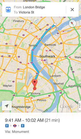
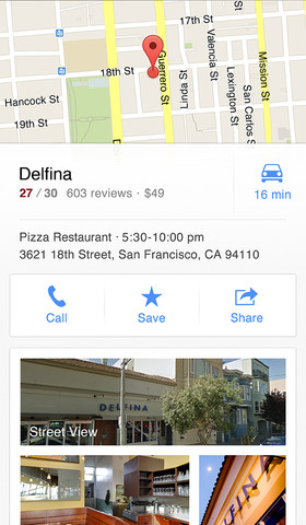
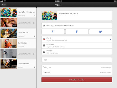
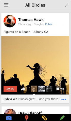
Other examples I’d like to highlight include Gmail, YouTube, Maps and Google+ programs which push the envelope in terms of effective UI design, each in its own right. I especially love how navigating between different panels in these apps zooms the previous one gently in and out of the view.
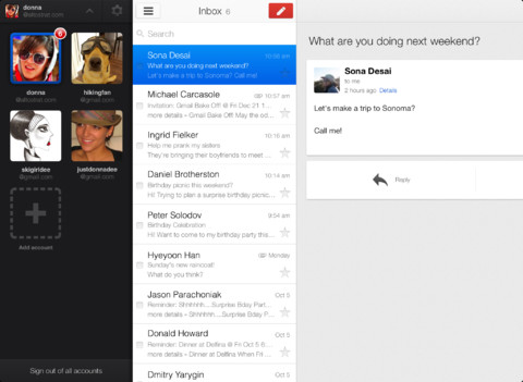
The effect is subtle and looks great, but not intrusive. I’ve also seen this trick used in a few recent apps from other developers so Google must be doing something right here. If you’re wondering about my fav iOS app from Google, it has definitely got to be Google+.
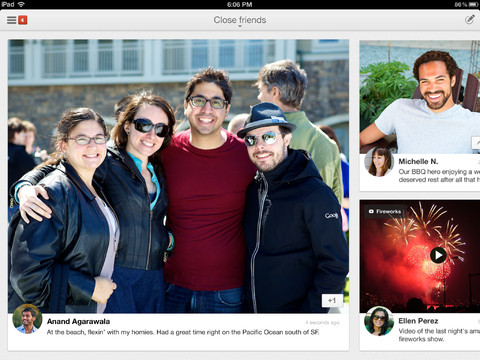
Not only does it get out of your way to just sit there looking awesome: in my opinion, the Google+ app sets the bar high in terms of effective, engaging and functional design for social apps on mobile.

Google also maintains a bunch of other lesser known iOS apps that come across as painfully outdated, but I guess it’s just a matter of priorities. Google is simply putting more wood behind fewer arrows, so to speak.
What about you?
What does your top five list of best-designed iOS apps from Google look like?