Concept

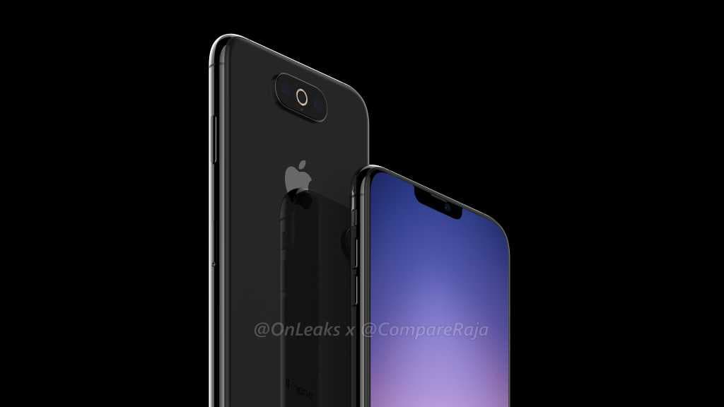
New renderings show another possible triple-lens iPhone design

New renders surfaced on the web today, purporting to show the design of Apple's next handset. In a joint venture, Indian website CompareRaja and notorious smartphone leaker Steve Hemmerstoffer (OnLeaks) released the images, which they believe to represent a legitimate iPhone prototype.

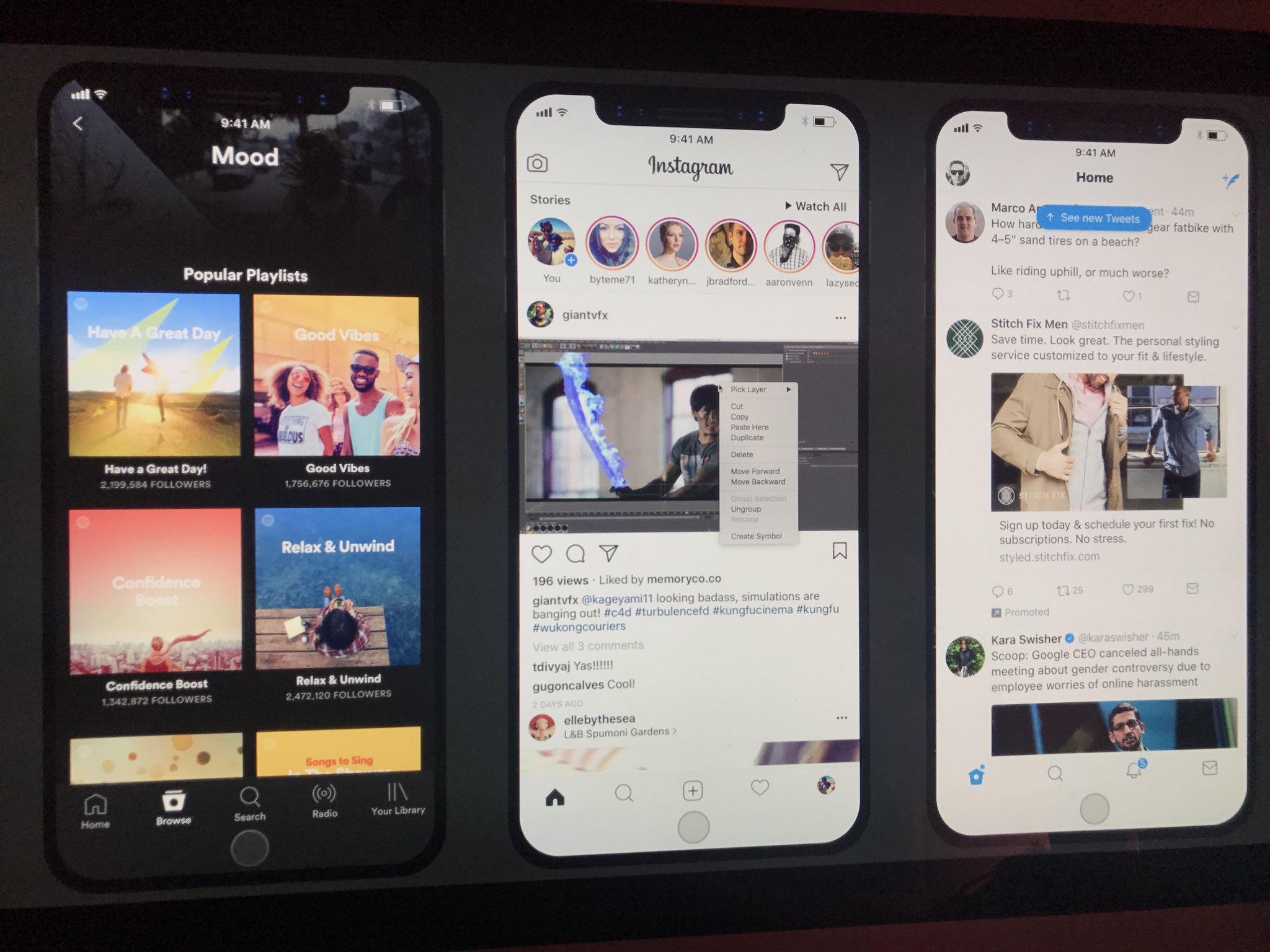
Here’s how your favorite apps might embrace iPhone 8’s notch

Taking Steven Troughton-Smith's findings regarding iPhone 8's resizable, auto-hideable virtual Home button and a split status bar on either side of a notch at the top of an OLED display, user interface designer Maksim Petriv took it upon himself to imagine how popular apps like Apple's Music, Instagram and Twitter might embrace the notch and look like running on iPhone 8.

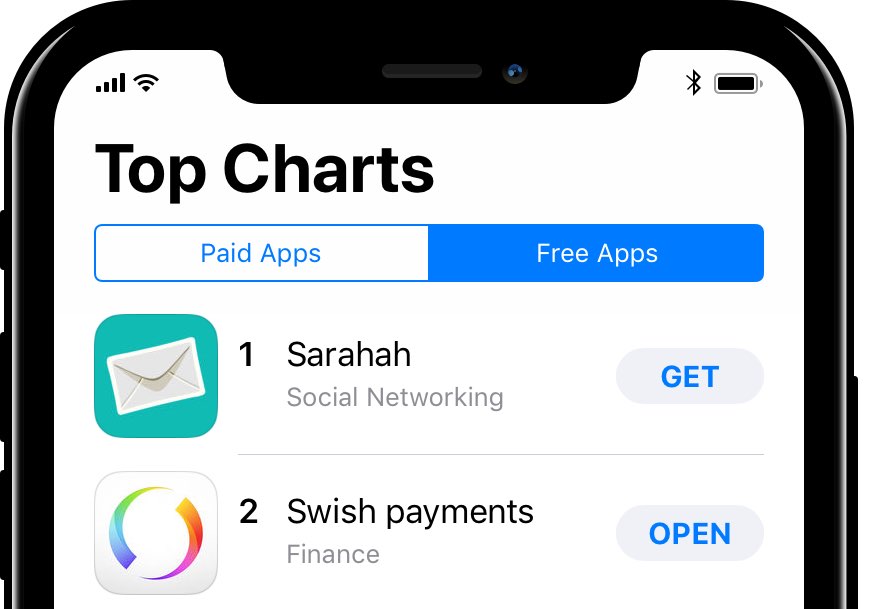
How Apple could embrace iPhone 8’s rumored notch in the status bar

With Apple's high-end iPhone 8 rumored to feature a notch in the middle of the iOS status bar at the top of its seamless screen, Max Rudberg has come up with some thought-provoking mockups that highlight how the Cupertino firm could own that pesky break in the OLED display.

His mockups are also full of smart ideas regarding potential changes to the iOS user interface on iPhone 8 that would afford a much more convenient bottom-oriented navigation.

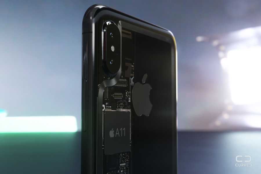
If Apple built a transparent iPhone 8…

Apple is probably never going to build anything remotely like it, but the very idea of a transparent iPhone does make for exciting conceptual artwork, as evidenced by a batch of high-quality renderings commissioned by German magazine Curved.de, published today.

iOS 11 concept imagines new productivity features for iPad

Apple is going to preview iOS 11 along with other OS updates at its annual developers conference next month and we fully expect the mobile operating system to include advances that should make the Apple tablet a better laptop replacement than it currently is.

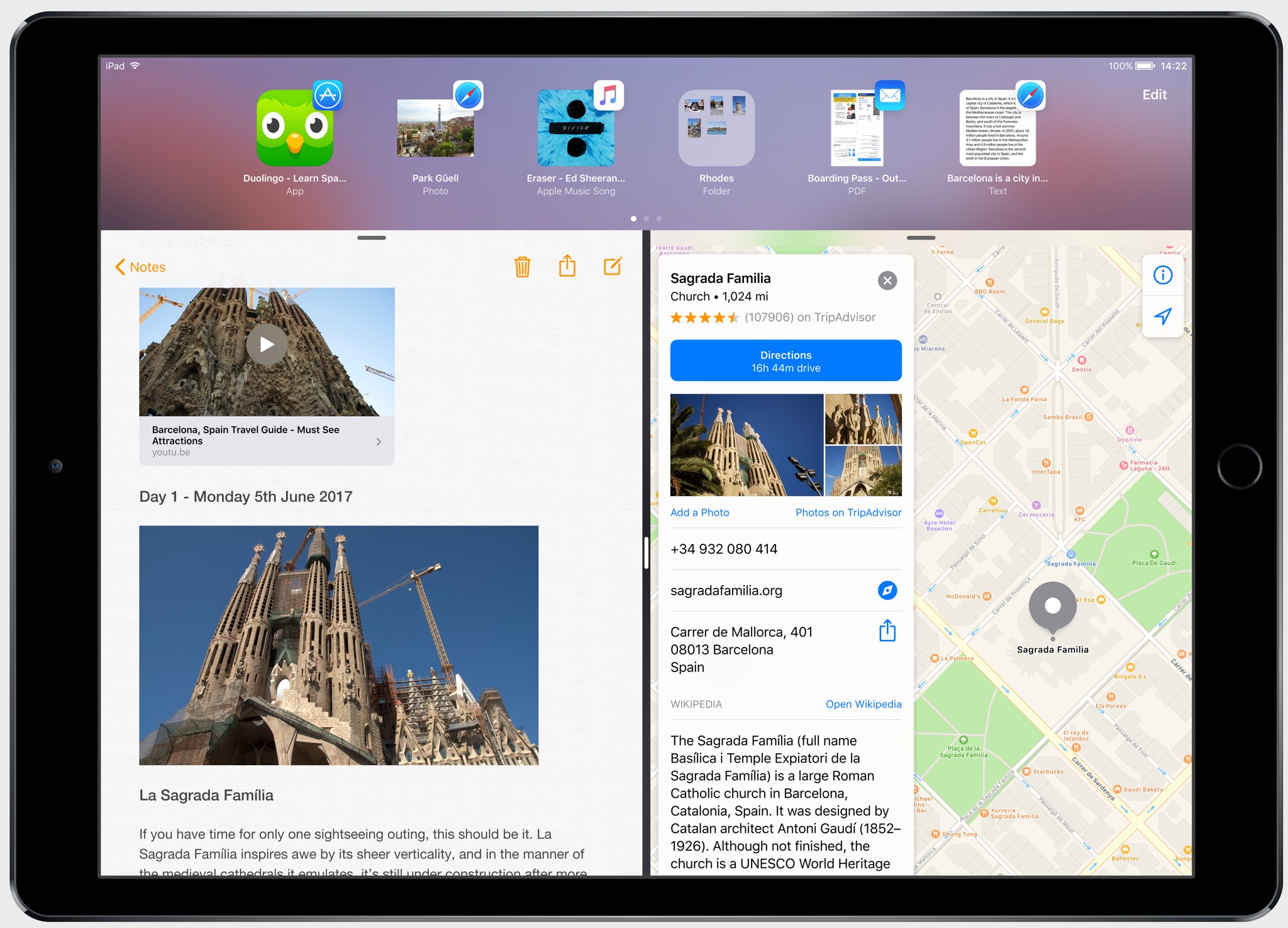
In the meantime, Federico Viticci and Sam Beckett of MacStories have put together an incredibly detailed concept of iPad-specific features that could be part of iOS 11, including the Finder, a new Shelf feature, drag-and-drop available system-wide and other perks.

With the Shelf feature, you would be able to clip pretty much anything with a simple drag-and-drop gesture. Sitting above apps both in full-screen or Split View mode, it would reveal itself automatically when you're dragging an item towards the top of the screen.

The Shelf would display your previously saved items as thumbnail previews and you'd be able to drop an item on top of another item to create a folder in the Shelf.

“The idea behind the Shelf is to make it as effortless as possible to hold something for later without the cognitive load of deciding which app or extension should receive it right away.”

The Shelf would be paginated and local to each iPad.

You'd be permitted to drop almost anything in it: from text selections and images to phone numbers and even songs. Tapping an item in the Shelf would pull up a custom Quick Look preview with additional information and actions relevant to the selected item.

And here's the concept video.

https://www.youtube.com/watch?v=UyFUDQ5LLZw

Next up: file management.

As you know, Apple currently offers the iCloud Drive app for browsing your iCloud files.

MacStories has envisioned a Finder for iOS because the argument that iPad doesn't need to expose its filesystem to the user “lost its validity when Apple introduced document providers in iOS 8 and the iCloud Drive app in iOS 9.”

Unlike Finder for macOS, its iOS counterpart would not expose system information beyond the actual files. You'd be able to browse your files in column and grid views, shared items via iCloud with full permission controls, apply tags, use the Versions feature and even take advantage of Siri integration to search across your files.

“All the pieces of the current system—iCloud Drive, the document picker and document providers—should be unified into a single Finder app and system-wide layer available everywhere,” said MacStories.

Instead of having files stored within app-specific folders on iCloud Drive, users would be able to create files in a top-level iCloud Drive view.

As a bonus, rather than list a bunch of installed document provider extensions in a popup, you'd get a full-blown Finder dialog to open files from any folder or app.

MacStories notes:

With a new set of APIs and user permissions, iOS 11 could allow apps to more easily open each other's documents in complex (but intuitive) workflows that aren't possible today.

And, obviously, automation could play a role in this down the road, opening the door to ideas such as folder-monitoring utilities and file automation either via Workflow or Hazel-like apps.

Finder for iOS would integrate with other features that MacStories has envisioned, such as the Shelf and system-wide drag-and-drop, but without the complexity of macOS.

But wouldn't drag-and-drop clash with iOS's standard gestures?

In a word, no. As MacStories explains:

Because drag-and-drop would be fully multitouch-enabled, it wouldn't block the iOS interface: another finger could be used to navigate in a different "drop area" of an app, or a user could keep dragging until the Split View app picker is shown and drop an item onto an app's icon, opening a contextual action menu.

App Store could be redesigned around Apple Music-inspired redesign, as show below.

Apple could even bring aspects of the watchOS interface to iOS and move beyond the static, inexpressive nature of its interface. “Touch-down states for icons and buttons would add useful context to iOS toolbar icons and menus as well,” reads the article.

A better Split View implementation is one of my favorite concepts proposed by MacStories for iOS 11. In addition to supporting drag-and-drop between the apps in Split View mode, you'd gain the ability to quickly select an app for Split View by choosing it from a Home screen like view complete with Spotlight integration for surfacing Split View-enabled apps.

Be sure to visit the MacStories concept for additional high-resolution mockups and detailed descriptions of other proposed enhancements, such as improvements to Notes and Control Center, better extension support in Safari and more.

Feel free to let us know your thoughts on this concept by posting a comment below.
Design student imagines simplified navigation and gamified experience for Apple Music

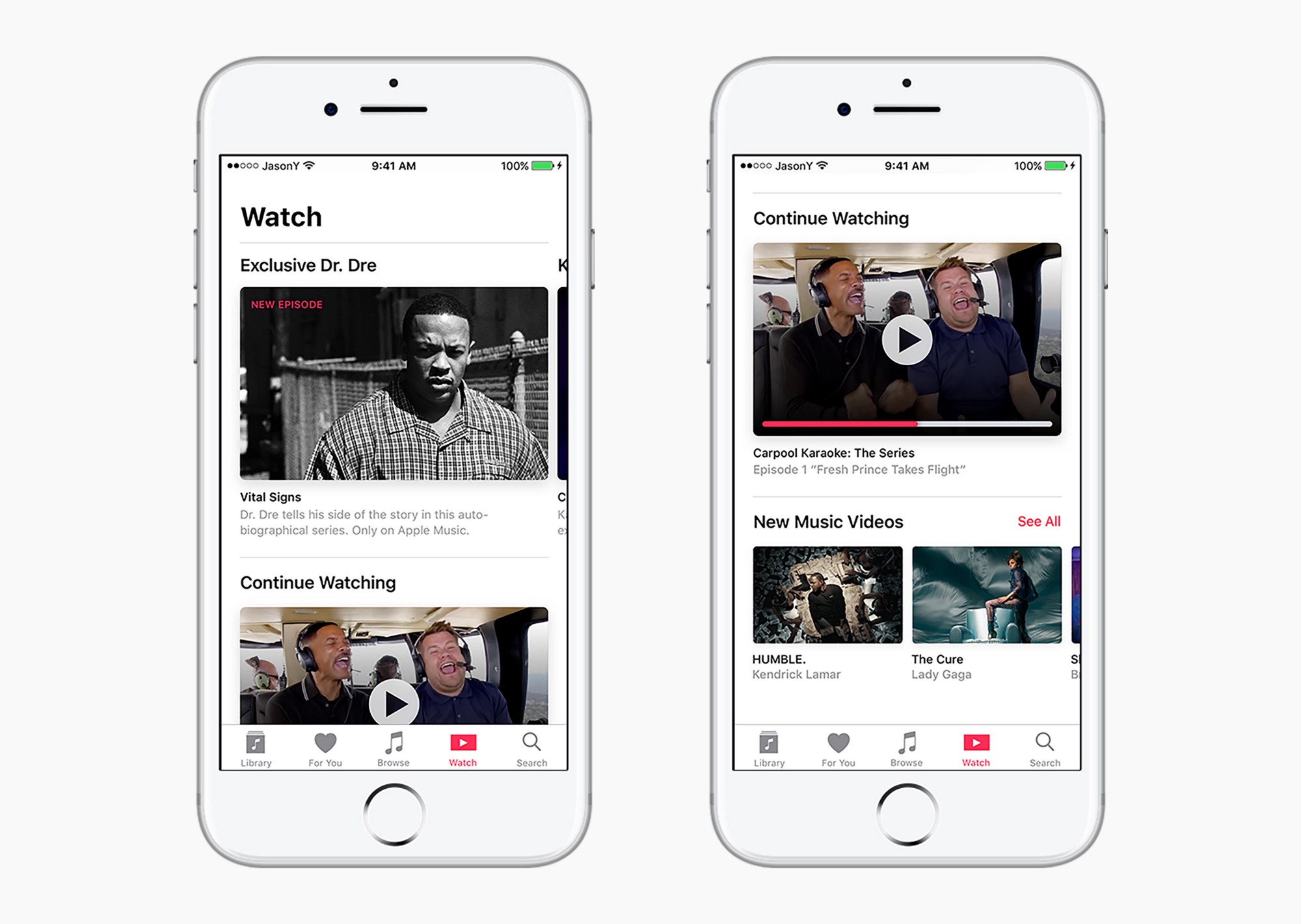
After he got turned down for a dream internship at Apple, Northwestern University design student Jason Yuan took matters into his own hands, deciding to teach Apple a thing or two about good user interface design. The result of his endeavor: beautiful mockups of a completely overhauled user interface for Apple Music.

Yuan explains in a post on Medium that the current Apple Music design is not well-suited for people without massive music libraries who prefer to listen to curated playlists.

On creating the mockups:

At first, I was frustrated — Northwestern University doesn’t offer any sort of undergraduate graphic design program, so whatever growth they were looking for would have to be self taught. But as soon as I came to this realization, I became inspired to embark on what became a a three-month long journey to the holy grail — the iOS app that Apple Music deserves.

For me, this was an opportunity to really dig my teeth into UX research and design, an excuse to spend way too much time on Sketch and Principle, a reason to bore everyone around me with my notebook of crudely drawn wireframes.

He says his Apple Music redesign effort was informed by qualitative user research, Apple’s official Design Principles and his own designer intuition.

He imagined what a video-centric experience on Apple Music could look like.

As you know, the Cupertino firm is gearing up to launch its first original shows on the service. According to Yuan, videos would be served via a new Watch tab, with a Daily Stream feature pushing exclusive video content to Apple Music members based on their preferences.

Apple is also underestimating the power of gamification, the student said.

“I have come to understand that, through a gamified experience, the user is able to establish an immediate connection to the music they discover,” he added.

His proposed My Sampler feature would replace the current New Music Mix playlists.

Here's an excerpt from Yuan's post:

It was born out of the understanding that users who are picky about what goes into their library would also be more reluctant to sit through an entire playlist full of new music. A better experience would be presenting snippets—or samples—of curations that gives the user just enough information to decide whether or not to add it into their library and weekly playlist.

Upon entering a Sampler section, the user would be presented with a series of artist headshots that corresponded to a curated song. After tapping and holding, the system would play a 15-second preview of each song from the album. The user could swipe up to reject the song or swipe down to add it to their library.

Once the user has finished sampling, their selections could be used by the system to create a New Music Mix that the user can listen to. “I chose to use gestural interaction so that users can use the Sampler even if they’re not looking at the screen,” he writes.

In Yuan's view, Apple should focus on integrating existing social media with Apple Music instead of trying to push yet another one on its already overburdened consumers.

“Truth is, I didn’t see any data from my research that would justify keeping the Connect feed in the app as is,” he said. “Users were more interested in connecting with friends and family through music (a la Spotify) instead of with artists through a watered-down Twitter.”

After making it through the first seed, Yuan was selected for an interview with Apple.

Unfortunately, they turned him down.

Though his work was OK, Apple told him it preferred candidates with more growth and training. Yuan eventually completed his internship at Sony Music, where he learned that a brand’s visual presence in a streaming service “must be recognizable yet invisible at the same time.”

Be sure to check out Yuan's post on Medium for additional mockups and his thoughts on how Apple Music could be rethought from a user experience standpoint, including an enhanced For You section and more.

How do you like Yuan's user interface ideas for Apple Music?

Let us know by leaving a comment below.