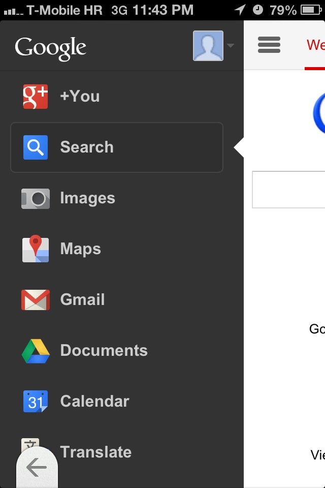
Google is rolling out a revamped mobile experience on smartphones as we speak. It’s pretty slick as Google has finally adopted the design language used across its other web properties. The company really hit the ball out of the park in terms of design: the refreshed site features a black navigation bar which slides in and out of view smoothly, akin to the Facebook app.
Matter of fact, it almost feels like a native app. Knowing it’s been ages since Google updated its Search app on the iPhone, the prettified mobile site will certainly better serve your needs. My favorite capability has to be the ability to navigate Google’s most popular services with ease, all without losing track of content at hand…
Twitter user Derek first spotted the change earlier today, with both 9to5Google and Search Engine Land reporting on the refreshed mobile site.
Previously, the mobile site did not fit into the minimalistic desktop theme in that it crammed shortcuts to oft-used services along the top, resulting in touch targets that were too small and hard to hit.
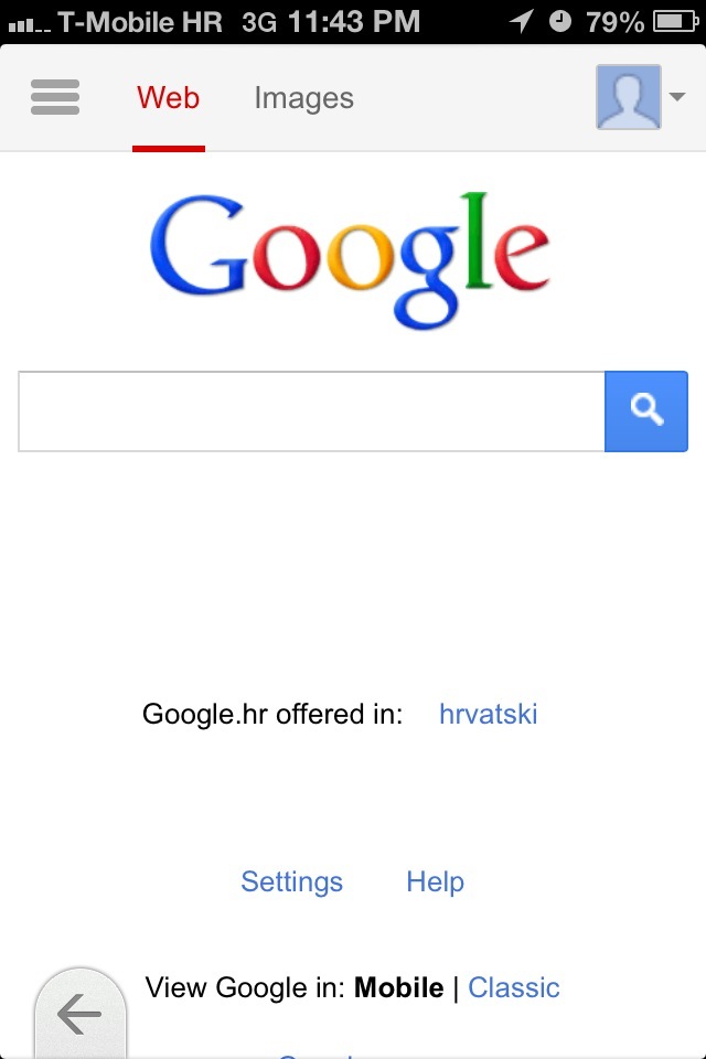
Here’s the redesigned site on my iPhone.
Touching an icon in the upper left depicting horizontal lines elegantly slides the black navigation bar into view. Touch it again to remove the navigation bar from view.
Don’t see what you’re looking for? Just scroll down and hit the All Products link at the bottom for a handy list of all services from your favorite search company.
The navigation bar is pretty dope: it scrolls independently from the rest of the page, letting me browse Google services without scrolling web content on the right out of view.
That’s the power of HTML5 and clever programming for you.
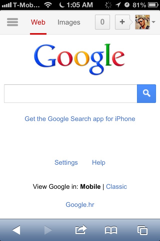
Notice the handy links for web and image search on the top. And if you’re signed in, your Google+ profile image will appear in upper right. Touch it to reveal a smoothly animated panel with two buttons, one to sign out of your Google Account and the other to view your Google+ profile.
The top bar will also display a notification count for signed-in users and the plus sign. Tapping it opens a new page where you can quickly post something on Google+, if that’s your thing.
Pretty handy, no?
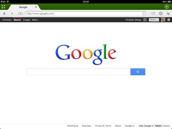
The tablet interface on the iPad has remained intact.
You can test the new mobile interface by navigating to www.google.com in Safari on your iPhone or iPod touch. If it doesn’t load for you, give it some time as these things need time to propagate.
Or, you can use use Dolphin Browser, a free (and pretty awesome, if you ask me) iPhone and iPad browser. If you’re on Android, you should be good.
It looks like Google is also tweaking the YouTube design a bit.
In other Google news today, the company announced 42 new online historical exhibitions which tell the stories behind major events of the last century, including Apartheid, D-Day, the Holocaust and more.
http://www.youtube.com/watch?v=dSKATUciBEE
Storytelling is superb, thanks to authentic materials provided by museums and cultural foundations, with Google noting that some of that stuff is on the web for the first time.
In case you were wondering, The Google Cultural Institute strives to preserve and promote culture online.
Is that enough of Google for you today?
