Rolling out globally in the coming days, the desktop version of Google News has been thoroughly redesigned for easier navigation and readability while adding new features like a dedicated Fact Check section, additional controls for users to specify their favorite news sources and interests, an Apple Music-like For You section and more.
Check out the new-look Google News by visiting news.google.com on your desktop.
As evidenced by the before vs. after screenshot comparison top of post, the uncluttered look is based on Google's Material Design and makes heavy used of a card format to make it easier to browse, scan and identify related articles about a story.
The overhauled layout focuses on publisher names and article labels, and maintains your view and place on the page as you click in and out of stories and explore topics. The lefthand navigation column is customizable and lets you jump quickly to news that interests you.
In addition to the built-in sections like Sports or Entertainment, the lefthand navigation column provides one-click access to your saved search queries like, say, “FIFA World Cup” or “Bollywood.” You can sort your news by relevance or date, see top videos, and browse top news topics in the Related block.
Story cards are designed to you a quick glance into a story.
They can be expanded to show additional articles with different points of view and are labeled with helpful tags, like Local Source, Most Referenced, Opinion, Fact Check and more. Also important, to give you additional context Google News now shows a second labeled article in addition to the top headline for each story.
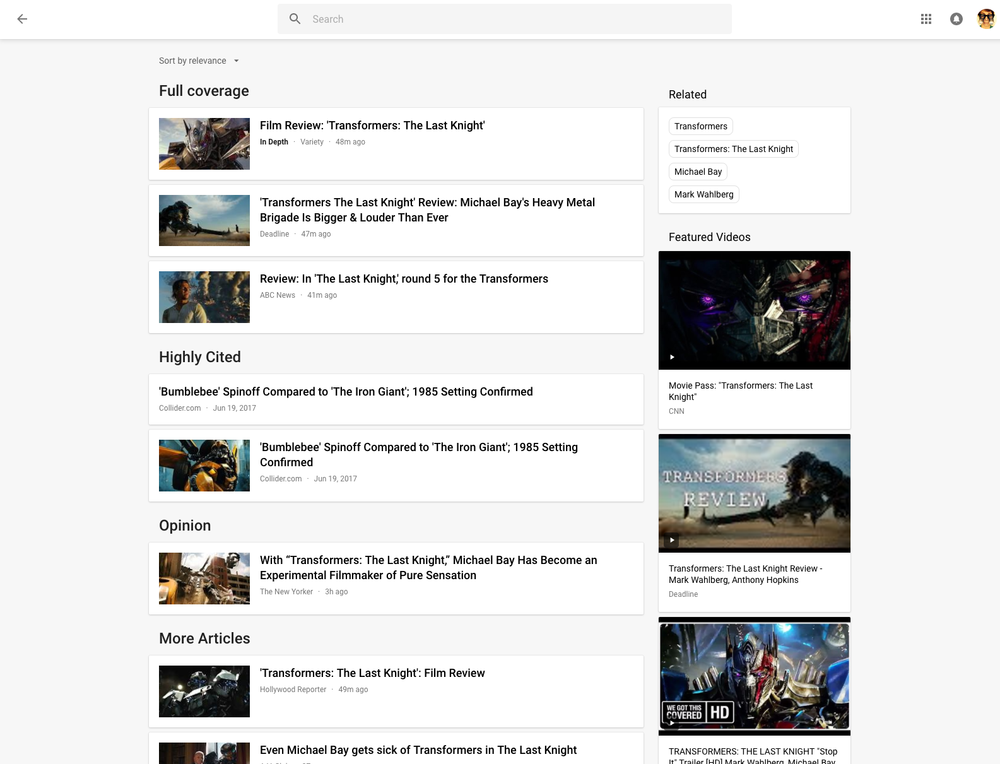
Clicking the Full Coverage link from the story card brings up a bunch of news stories about a given topic. Another navigation bar at the top of the page provides shortcuts to the following sections: Headlines, Local and For You.
The Local section is your home to local news stories from any part of the world. The For You section is your personal news feed based on your interests. After signing in with your Google Account, you can customize what appears in the Local and For You tabs.
With all settings in one place, Google News now lets you quickly edit existing sections, name custom ones, select what you'd like to see in the For You section, cherry-pick your favorite news sources that you want to see more or less of, and much more.
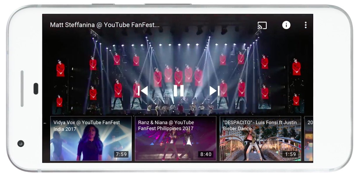
Videos have seen some much-needed improvements, too.
“Videos have become central to news storytelling, so we improved the algorithmic selection for top videos, highlighted the top video in a story card, and built a better player,” says Google.
“While playing a video, more related videos will be available in the player.”
The Fact Check label introduced last year is now prominently used across Google News.
As a bonus, you now have a new Fact Check section on the right column of the Headlines section, filled with links to the top recently published fact-checked articles.
This section is currently available in the US only.
As I mentioned before, the new Google News is a staggered release rolling out globally in the coming days so you may not get the new look immediately.
How do you like Google's News redesign?
Tell us in comments!