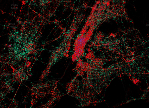
This is kind of interesting. The folks over at Gnip and MapBox have teamed up with ex-Google data guru Eric Fischer to create a series of interactive heat maps that show the usage of iOS, Android and BlackBerry devices around the world.
The data consists of some three billion global, geotagged tweets that have been collected since September of 2011. And the team has converted all of this data into navigable maps in an attempt to illustrate patterns in language and device use...