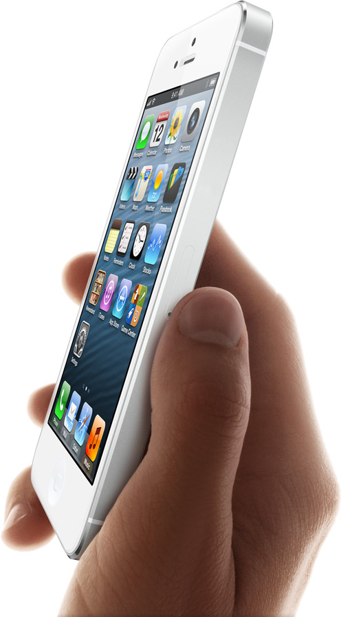
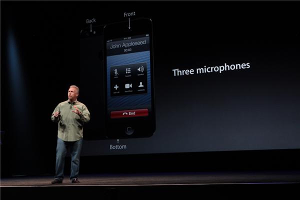
Isn't it funny how no one is bitching about the two-tone iPhone 5 design now? Prior to the announcement, you were pretty divided over the controversial design, with 53 percent upvoting the two-tone thing and the remaining 47 percent saying it looks hideous.
It's here now, it is two-tone and boy does it look great, thanks to Apple's production polish and some top-notch Photoshop work. If there's one thing we can all learn from this, it's not to take blurry shots of engineering samples and leaked shells for granted: the final production units always feel and look substantially smoother and sexier compared to the samples leaking out of Asia.
The two-tone design entails some interesting design solutions: the handset is no longer purely black or white. Instead, Jonny Ive and his team took advantage of two similar colors to subtly accent the phone's trim, not just the glass stripes on the back.
If you'll be getting yourself an iPhone 5, we'd love to hear which one it's gonna be: the white & silver combo or the black & slate one...