The San Francisco font used throughout the Apple Watch’s operating system is expected to replace Helvetica Neue as the new default font in iOS 9 code-named “Monarch” and OS X 10.11 code-named “Gala,” according to sources with knowledge of the preparations who spoke to 9to5Mac.
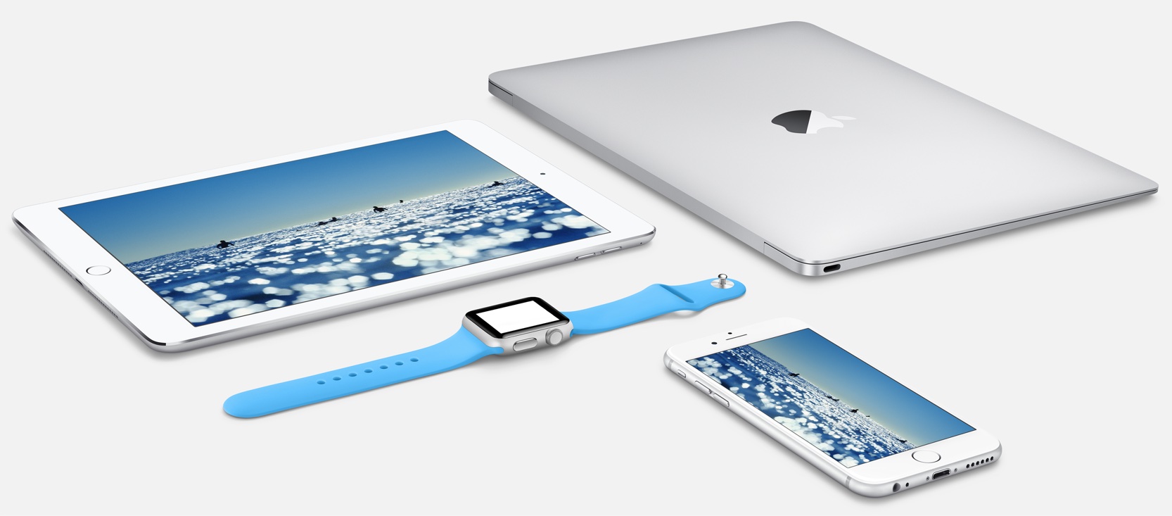
In addition to achieving a consistent look across Mac, iPhone, iPod touch, iPad and Apple Watch devices, it should help alleviate much of the criticism leveled against Apple over its use of thin weights of Helvetica Neue in iOS 7, iOS 8 and OS X Yosemite.
Changing the system font across Mac and iOS devices is likely to require a minor redesign of third-party apps on the App Store and Mac App Store “ahead of the new font’s general release this fall,” the article reads.
Some third-party developers have already started to redesign their apps for San Francisco, the story claims, adding:
According to the sources familiar with the decision to move to the San Francisco type face on iOS and OS X, Apple higher-ups also believe that the new look will serve to refresh its familiar operating systems, helping iOS and OS X to avoid becoming stale.
However, some Apple engineers have told us that they are not fans of the new font, which may look particularly rough on non-Retina screens.
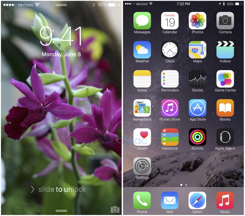
9to5Mac has provided the following mockup which depicts how the font could look like on the iPhone’s Lock and Home screen.
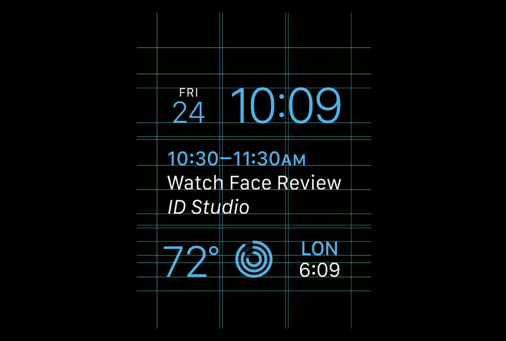
The San Francisco font has made its debut on the Apple Watch last fall. Recently, it got deployed as Apple’s font of choice for the characters on the new 12-inch MacBook’s keyboard.
The Apple Watch Human Interface Guidelines available on Apple’s website state that the company has designed the font “specifically for legibility” on the tiny 38mm and 42mm Apple Watch displays.
There are two variants of San Francisco: San Francisco Text and San Francisco Display. When developers specify the system font for text in labels and other system interface elements in their apps, Apple Watch automatically applies the most appropriate version of the font based on the point size.
It also switches fonts automatically as needed.
“Both variants of the San Francisco typeface were designed to be highly legible on Apple Watch,” reads the document. “Dynamic Type also improves legibility by letting people make global changes to their preferred text size.”
In terms of legibility and readability, both Helvetica Neue and San Francisco are clean and uncomplicated typefaces that look great on high-definition displays.
However, Apple has been chastised for its use of the Helvetica Neue typeface in iOS and OS X because the font tends to look jaggy on non-Retina screens.
The switch to Helvetica Neue in OS X Yosemite 10.10 took many watchers by surprise for the Mac operating system has used Lucida Grande as the system font since its inception more than three decades ago.
At any rate, the San Francisco font should lend itself perfectly to the thin and clean design style that Apple’s been favoring lately. Apple will share details of iOS 9 and OS X 10.11 at WWDC next month.
Source: 9to5Mac