
Keen on deploying Android Lollipop’s Material Design across its mobile apps on all platforms, Google on Wednesday announced a new version of Google Maps for the iPhone and iPad featuring engaging animations, shadows and depth.
The fresh new design is all about creating surfaces and shadows that echo the real world, the search firm said.
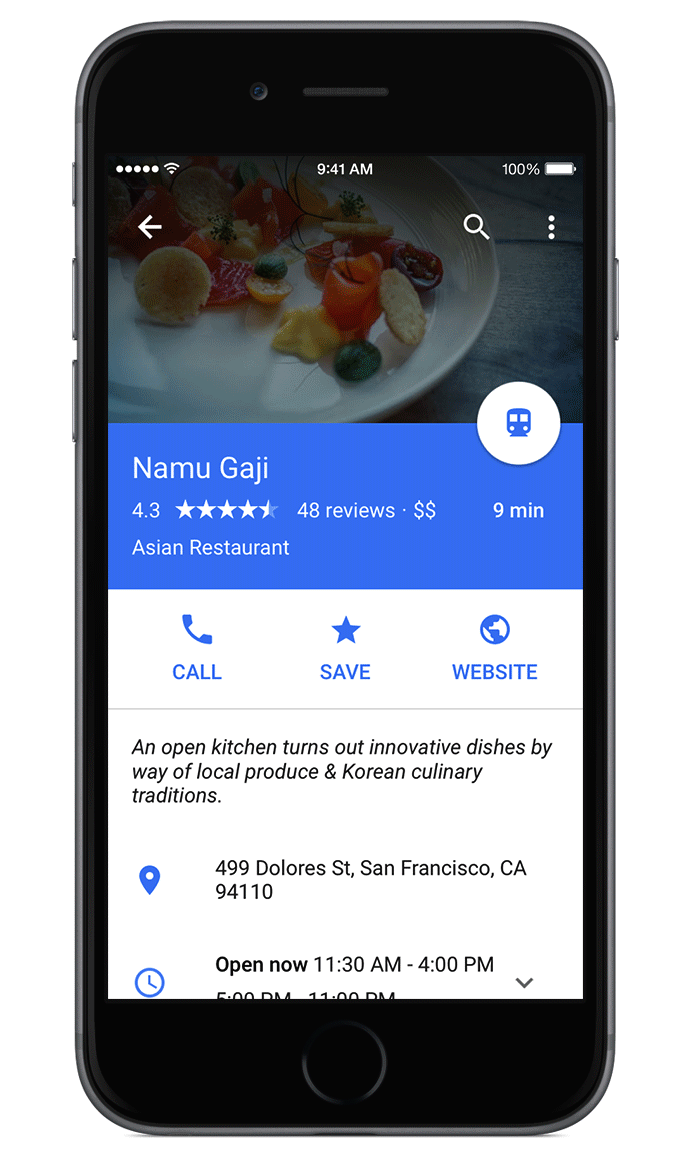
With Google Maps’ new material feel, layers and buttons “come to life so you know just where to touch to get directions, recommendations and imagery”. The update will be rolling out over the next few days.
Google Maps is available free in the App Store.
The fun new look seems plenty engaging.
Like in iOS 7 and 8, Material Design is all about elegant, smooth animations and UI transitions and real-world shadows that convey a sense of depth.
In the new Google Maps, tap a place’s info sheet at the bottom to see a new layer gliding up to the top, showing you photos, reviews and more. At the same time, the Explore section at the bottom shows you recommendations of new places to dine or visit.
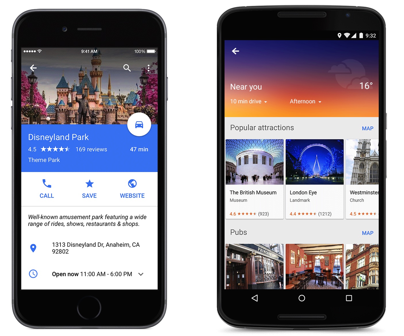
It’s not just about the whiz bang, the team’s added new features, too.
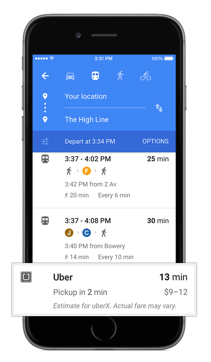
For example, U.S. users can now make a restaurant reservation right from the app for restaurants found on OpenTable. And if you have the Uber app installed and the service is available in your location (the app is available free in the App Store), Google Maps will now show you estimates for Uber’s pickup time and price for their route in walking and transit directions.
There is no doubt that the company is going to deploy Material Design, its new design language for desktop, mobile and the web, across its key iOS apps. The newly released Inbox app from Gmail, for example, is all about Material Design.
Consistency matters and I’m glad that bright minds at Google have at last decided to deploy the same layout, UI effects and navigation across apps and platforms. It makes for a much friendlier and more inviting user experience, don’t you think?
I’m liking Material Design in Google Maps a lot.
How about you?
By the way, a native Google Calendar iPhone app with Material Design is in the works.
[App Store via Google Maps Blog]