 I used to hold down a “square” job, where I looked at charts and diagrams all day. It wasn’t nearly as exiting as writing app reviews, but it paid the bills. After spending all day with my head in an Excel program, the last thing I would want to do in my free time was to create another pie chart. However, sometimes they are the best way to get your point across.
Viz takes all of the work out of chart creation by making them for you. No more adding formulas to cells or dragging arrows around on a spreadsheet. All you need is some labels and numbers…
Design
One of the reasons that Viz caught my eye was because of its design. The app is simple, clean, and flat. It features bright colors set on a white background. It presents information in a minimalistic way, which clears away any clutter or distractions.
Creating a chart is as simple as entering a label and a number. When you select one of the five available graph options and tap the “Create Chart” tab, you will immediately see the generation of your chart in a brightly colored graph that you can further edit by changing the color, or even selecting a different type of chart.
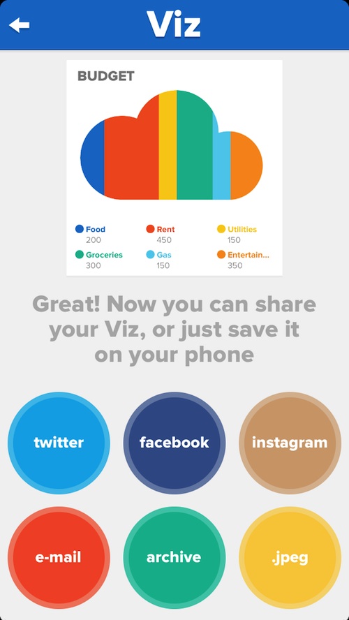
When you are finished creating your chart, the sharing options appear as big, colorful buttons so you can easily send it to someone else with a single tap.
App Use
To create a chart, open the app and tap the “New Chart” tab. Then, name your chart by tapping on the section “Untitled.” If you are creating a chore chart, or a weekly budget, put the name of it here.
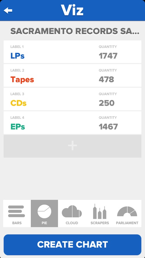
Then, tap one of the Label sections to enter a label. For example, if you are creating a budget chart, add the label, “food” or “rent” or something like that. You can add up to six labels, so keep that in mind when you are creating a chart.
After you’ve entered the label, input the quantity. If you want see how many cupcakes your company sold versus how many slices of pie, add the number of cupcakes sold in one section and the number of pies in the other.
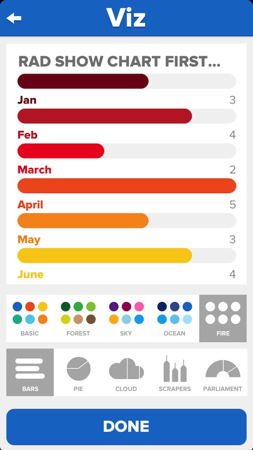
The next step is to decide what you want your chart to look like. You can have horizontal bars, a pie chart, a divided cloud, vertical scrapers or a parliament. Select the one you want to use and then tap the Create Chart button.
You will immediately see the chart, designed with the basic color theme. The basic colors include indigo, yellow, red, green, orange, and light blue. You can change the color theme to: Forest, which features greens, yellows, and browns; Sky, with hues of blues, purples, and pinks; Ocean, which has varying shades of blue; and Fire, which includes reds, oranges, and yellow.
In this section, you can also select another chart option. If you want to see what your numbers look like as horizontal bars instead of a pie chart, tap the icon to switch views. When you have the chart looking exactly the way you want it to, tap the “Done” button and a JPEG will be created.
You can then share your chart on Twitter, Facebook, or Instagram. You can also send it directly to someone through email or save the JPEG to your device’s camera roll. If you just want to keep the chart to yourself for later editing, tap the Archive button and you can access it at any time from within the app. If you don’t want a chart in your Archive folder anymore, swipe it to the left and tap the delete button that appears.
The Good
Even if you have never experienced the “joys” of making a pie chart or creating a graph, you can quickly and easily make one with Viz. The user interface is clean and clear and very easy to understand. Within minutes, you will have a colorful chart that can be easily shared with others through a variety of social networking sites, or directly through email.
The Bad
When modifying my archived charts, the app crashed multiple times. Then, my charts were mixed up and wrong. One of them even lost most of the information in it. Basically, all of my archived charts became garbage and had to be deleted.
I also wish there were a couple of more features included. For example, I’d like the ability to have more than six labels. I’d also like to be able to choose what color each label is.
Value
Viz costs $1.99. For a productivity app, it is reasonably priced. However, don’t expect this app to replace Excel. It is simple, but also very limited in its options. It teeters on the verge of a novelty app. It is worth $1.99, but it is not a substitute for your real spreadsheet programs.
Conclusion
This is a good app for people who want to experiment with simple charts, but don’t want to do the work creating them. It offers a simple way to make minimalist charts with basic information. It is easy to share with others and they don’t even need a program to open the file. It is not going to replace the full-featured chart making applications that you use in the workplace. However, it does offer a level of simplicity that is not available in more complex programs. Download it in the App Store today.
Related Apps
Chart Tool is an app that lets you create graphs and charts with a focus on stock trading. MOrgChart is an organization chart maker for team structure and business hierarchy.
Do you think you would benefit from using a chart maker that is so simple? Or, would you prefer something more complex with more features and capabilities? Tell us what you think in the comments below.