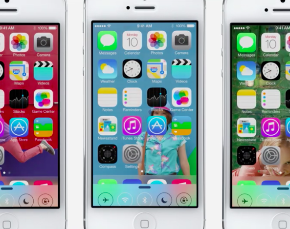
Since the moment Apple unveiled its completely redesigned mobile OS on Monday, the comments regarding its UI, and particularly the new icons, have been flowing nonstop. Some folks like the changes, and others refuse to believe it’s the product of Apple designers.
And as it turns out, the latter group may be right. Sort of. A new report is out this afternoon claiming that there are explainable reasons behind the strange-looking app icons and inconsistant UX in iOS 7. And according to insiders, it’s still a major work in progress…
Matthew Panzarino of The Next Web says he has heard from multiple sources that Jony Ive took a new approach to designing the UI in iOS 7. For starters, he brought in Apple’s print and web marketing design team to set the look and color palette of the stock app icons.
“From what we’ve heard, SVP of Design Jony Ive (also now Apple’s head of Human Interaction) brought the print and web marketing design team in to set the look and color palette of the stock app icons. They then handed those off to the app design teams who did their own work on the ‘interiors’, with those palettes as a guide.”
Panzarino goes on to say that, according to his sources, there wasn’t a whole lot of communication between various teams (like Mail and Safari), and there were competing icon designs within each team—both of which inevitably led to the inconsistencies we see.
Why’d Ive take this approach? Well think about it. If you wanted to create a whole new look for an operating system, do you use the design team that has been making app icons for the old operating system for 5+ years, or do you bring in completely new blood?
The good news is, it’s still a major work in progress. Panzarino’s sources described the current iOS 7 beta as a ‘mid-stride’ snapshot, and said work on design and development is still in full swing. Apparently, even the build shown onstage Monday is newer than beta 1.
“Of the various aspects of iOS 7, the design of its icons and other visual cues are the most in flux at the moment. There are still refinements and conversations going on around them. I don’t know but would expect there to be a lot of fixes for the inconsistency we’re seeing in things like gradients and design language on the home screen.”
For more details, I recommend reading the full article over at The Next Web. But the basic concept of the whole thing is that this is the biggest change Apple has ever made to iOS. So we should expect the changes during the beta process to be similarly monumental.
And I think all of the dots connect here. Even if you account for the fact that designers were working on iOS 7 before Jony Ive took over last October, you have to think he tossed most, if not all, of their work out. That means we’re talking about a total rebuild in 6 months.
So if I’m trying to rebuild an entire OS in just 6 months, do I spend time worrying about the icons and the background textures, and try to work out every little detail? Or do I just get a solid foundation—an outline—down and spend most of my time on the OS itself?
I’d choose the latter, and it looks like Apple did too. And now it can spend the next 3-4 months fine-tuning iOS 7 with the help of millions of beta testers. It seems like a smart move, but we’ll have to wait until iOS 7 is released to the public to see if it pays off.