Susan Kare needs no introduction. She has a special place in Apple lore as the artist who designed the original icons, symbols, vector fonts and many of the other user interface elements used by the Mac computers in the 1980s, many of which have lived on to this day.
As The Loop’s Dave Mark noted, Karen’s work is “foundational and incredibly influential”. The video, running sixty seconds and embedded further ahead, is worth your time for many reasons, including because few people outside Apple have heard Karen speak.
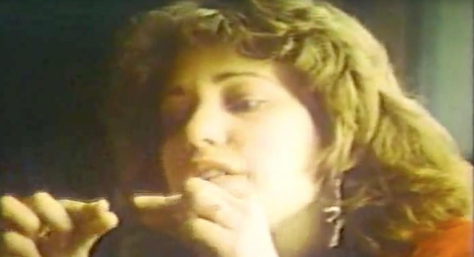
It was published on YouTube by Andy Hertzfeld, a member of the original Macintosh team.
If you’re an artist and you’re skilled with media, this is a new medium that offers great control turning off these thousands little dots in half an inch. You have the capacity, real or magnified, either to turn on or off each one of those dots. So on a screen you just got so many dots. That’s nothing really you can’t present on that screen.
She went on to discuss the importance of bitmap-based devices in terms of printing on-screen graphics. Apple and Adobe, as you know, invented desktop publishing with the laser printer and inventions like the bitmap display, proportionally spaced fonts and vector graphics.
The video is actually a commercial for the original Macintosh that Apple’s favorite advertising agency Chiat-Day produced in the fall of 1983 and is part of a longer series. Steve Jobs liked Karen’s work a lot: she also used to be Creative Director and one of the original employees at NeXT, Steve’s company formed following his firing from Apple in 1985.
Jobs highlighted the importance of the graphical user interface during the January 2007 iPhone introduction. First, he put up a slide of some of the typical smartphones that were all the rage at the time, the usual suspects like the Motorola Q, Palm Treo, Nokia E62 and BlackBerry, arguing that those devices were limited because they had “plastic little keyboards that are there whether you need them or not”.
https://youtu.be/9hUIxyE2Ns8?t=307
Here’s the quote:
What’s wrong with their user interface? The problem with them is really sort of in the bottom 40 there. It’s this stuff right here. They all have these keyboards that are there whether you need them or not to be there. And they all have these control buttons that are fixed in plastic and are the same for every application. Well, every application wants a slightly different user interface, a slightly optimized set of buttons — just for it.
He proceeded to introduce another issue plaguing hardware keyboards:
And what happens if you think of a great idea six months from now? You can’t run around and add a button to these things, they already shipped. So, what do you do? It doesn’t work because the buttons and the controls can’t change. They can’t change for each application and they can’t change down the road if you think of another great idea you wanna add to this product.
The solution?
Well, how do you solve this? It turns out we have solved it. We solved it in computers twenty years ago. We solved it with the bitmap screen that can display anything we want, put any user interface up. And a pointing device, we solved it with the mouse, right? We solved this problem. So how are we gonna take this to a mobile device. What we’re gonna do is get rid of all these buttons and make a giant screen.
This right here tells you about the importance of bitmap screens, typography and iconography in user interfaces. Voice may be the next frontier, but we’re still interacting with our technology mostly by touching, clicking and dragging various symbols and icons on the screen.
In creating the iPhone and later the iPad, however, Apple has had to create a new kind of user interface that would have the precision of a finger, which is way cruder than pixel-perfect accuracy achievable with the stylus.
When asked by former Wall Street Journal technology columnist Walt Mossberg during the All Things D conference back in 2008 about stylus-based tablet PCs that Microsoft and others were backing for almost a decade prior to the iPad’s arrival, he responded by saying this:
What I remember telling you on the tablet was that handwriting was probably the slowest input method ever invented. And that it was doomed to failure. Well, what we tried to do was reimagine the tablet. In other words, Microsoft did a lot of interesting work on the tablet. What we’ve done is not compete with what they did, we reimagined it and what we’re doing is completely different than what they did.
For context, Microsoft-powered tablet PCs used styli.
You know, they’re completely stylus-based. What we said at the very beginning was ‘If you need a stylus, you’ve already failed’. And that drove everything. Their tablet PC was based on a PC. Had all the expense of a PC, had the battery life of a PC, had the weight of a PC. It used a PC operating system that really needed the precision of the tip of an arrow of a cursor.
And that’s what it comes down to, really.
The minute you throw a stylus out, you cannot get that precision. You have the precision of a finger, which is much cruder. Therefore, you need to have a totally different software, so you can’t use a PC operating system and you have to bite the bullet and say ‘We’re gonna create this from scratch because all the PC apps won’t work without being rewritten anyway’. So we built a very different animal.
Although Karen wasn’t with Apple when they were creating the original iPhone software, her early work on the graphical user interface for the Macintosh is seminal and paved the way for today’s touch-based iOS devices.
After leaving Apple, she has worked for Microsoft, IBM, Pinterest and Facebook.