While Apple likes to put emphasis on the human curation that goes behind the scenes, Apple Music is still largely powered by algorithms that learn about your music tastes by looking at your own library, but also by looking at your recent activity, including the songs you Love.
The more you play a song, the more the algorithm understands you like that song, and maybe by extension that band. If you Love a song, you’re also signaling that this is a tune you particularly enjoy. Algorithms then crunch data based on your behavior to improve music suggestions for you.
For the past year, my favorite way to train Apple Music’s algorithms was to actively Love songs. It was a quick and simple way for me to tell Apple “hey, I really like that, please play this more often and also play more songs similar to that one.”
But the big, bold, confusing mess of a redesign that happened with iOS 10 has changed a lot of things, including how you now Love songs on Apple Music.
Up until iOS 10, you could Love a song by tapping the heart icon on the Lock screen, in the Music app, or in Control Center. It was right there at your fingertips, in three different spots. It was quick. It was simple. It was convenient.
Since iOS 10 however, the process of loving a song is a complete nonsense. What was a two-step process has now become a four-step disaster:
- Unlock phone
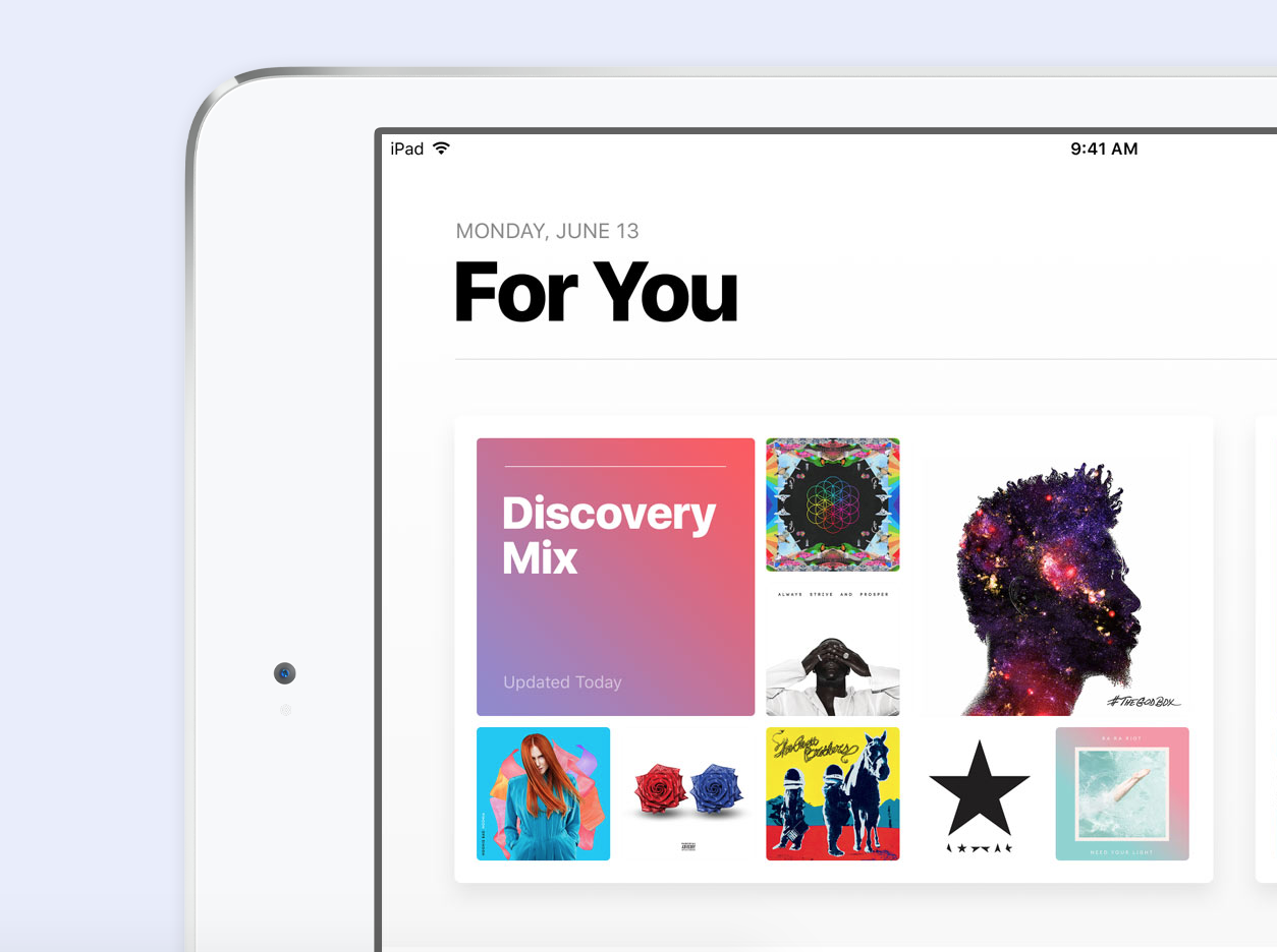
- Launch Apple Music
- Tap ellipsis
- Tap Love
I’ll be first to admit that complaining about going from two to four steps comes across as a major first-world problem, but that’s beyond the point. The point being, why is it now so convoluted to Love a song on Apple Music if the service partly depends on this action to provide better recommendations to me?
Misery loves company, so it somewhat feels good to know I’m not the only one being frustrated at the situation.
How could Apple make this right then?
Well, the answer to me is a pretty simple one: just bring back the heart icon on the Lock screen, in Control Center, and in the Now Playing widget in the Apple Music app. Maybe just display that icon for Apple Music subscribers only, because it really benefits just them.
This said, something tells me that Apple deliberately hid the Love icon for the sake of its never ending quest for simplification. In short, form once again prevailed over function.
But if Apple doesn’t want to show that unsightly heart icon, why not add 3D Touch gestures to the music widgets on the Lock screen, and in Control Center? This would surely keep the icon out of sight while still offering a quick and easy way to Love songs.
Until this is improved, I know I won’t go out of my way to Love songs, which is a shame since this feature is designed to make my experience better.