Sebastien tries to keep all his apps and folders on only one screen. I’m like Sebastien, with one difference: I never have more than one folder on the first Home screen. But just because I’m not jailbroken doesn’t mean my Home screen is a mess, quite the contrary! As a big believer in efficient organization, I take pride in my Home screen layout.
There’s logic behind every app choice and a story to be told behind every icon placement. Without further ado, here’s what’s on my Home screen, and why.
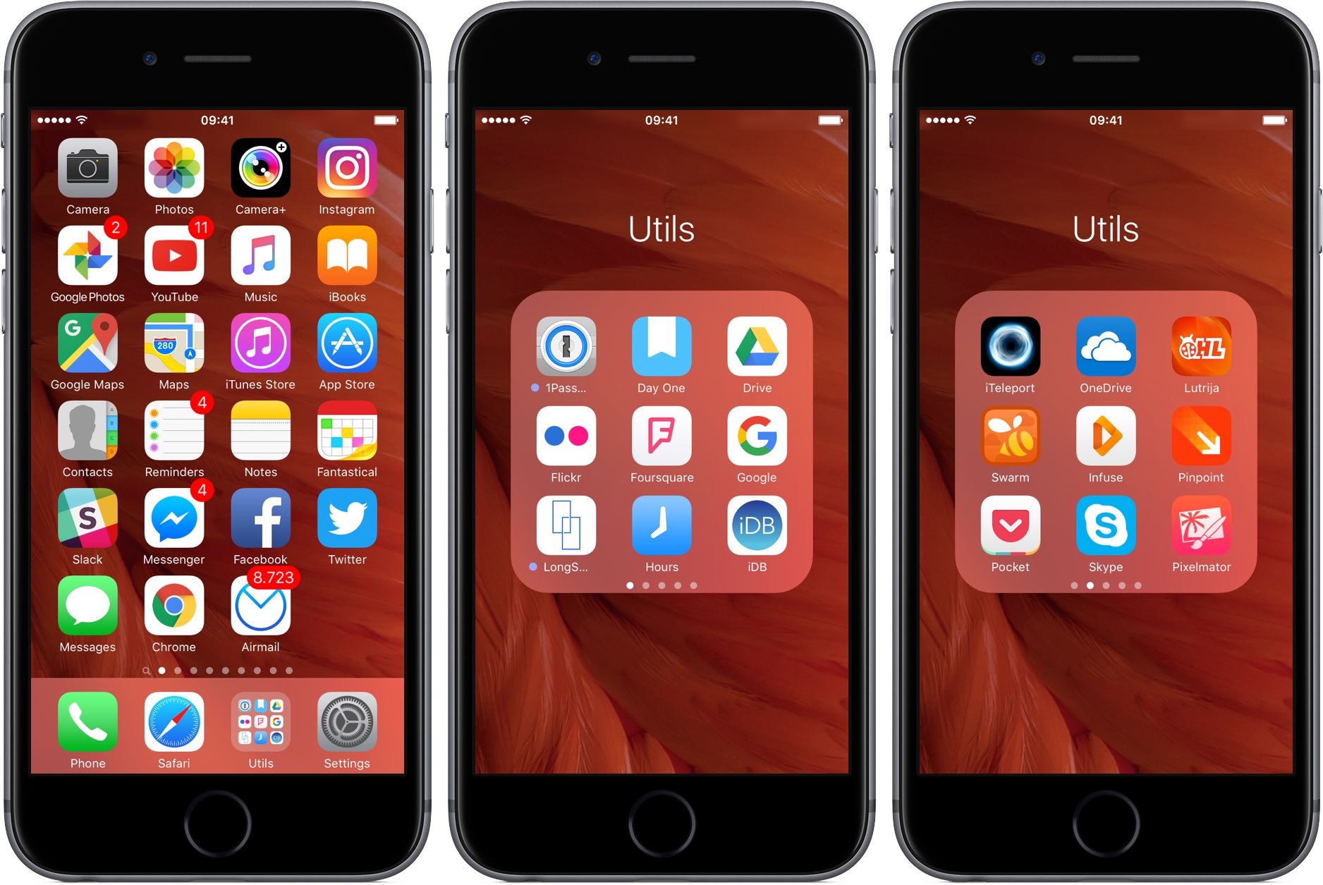
My Home screen organization
An app has to deserve a spot on my Home screen. As you can see for yourself, I don’t keep many folders on my first screen of apps aside from that one named Utils which sits in the Dock, but more on it later.
In the past, I used to manage every single Home screen on my device like an animal before realizing all I was doing is wasting my time. In a way, the first Home screen is of utmost importance to me because I can quickly jump to it from any other screen by pressing the Home button once.
With that in mind, here’s how my Home screen is organized, why I keep certain apps in certain slots and why Settings is always in my Dock. And no, that rightmost slot at the bottom of my screen isn’t empty by accident.
Top row: all about photography
Perhaps counterintuitively, I confine my photography apps to the top row. I say counterintuitively because reaching those icons in one-handed mode sometimes requires an extra step to invoke Reachability, an underestimated iOS feature that I like.
As you can see for yourself, my top row is exclusively reserved for my daily photography drivers: the stock Camera and Photos apps, in addition to Camera+ and Instagram.
Despite lacking many advanced features, the stock Camera app is still the best choice for taking impressive photos so I prefer to keep it at hand on my first screen. And as an iCloud Photo Library user with 200 gigabytes of paid iCloud storage, I enjoy my photographs in Photos, which I use for simple edits as well.
When I do have some extra time to spend on elaborate photoshoots, taptaptap’s awesome $2.99 Camera+ is the way to go. In spite of a non-standard user interface, I’ve grown fond of its varied filters for any occasion and quick editing tools.
Instagram needs no explanation, I suppose.
Second row: all about media
The second row from the top is home to media-related apps: Google Photos (it’d normally have it in the top row if there was a free slot there), YouTube and Apple’s stock Music and iBooks apps.
Even though I’m an iCloud Photo Library user, the more time I spend in Google Photos, the more I like it. To me, Google Photos is everything iCloud Photo Library was supposed to be: fast, powerful and reliable. At least Google’s app lets me pick between storing full-resolution photos in the cloud or their recompressed counterparts that take up a fraction of the space and upload much faster than Apple’s solution.
Whenever I feel like watching some kitten videos or documentaries about ballistic missiles, nuclear submarines, chemtrails, GMO and other things that interest me, I turn to Google’s native YouTube app. I like how YouTube learns from my watch history and recommends relevant clips I might, and usually do end up liking.
I’m bummed that the official YouTube app won’t let me play clips in the background without subscribing to a paid service though I’m fine with that because I don’t listen to music on YouTube. Actually, that’s what the third icon from the left is for: Apple’s stock Music app, because Apple Music gives me all the music I could possibly wish for.
iBooks? As a writer, I read a lot, and I mean a lot.
On any given day, I’d fire up iBooks to dive into one of the e-books I bought on the iBooks Store. My reading material is mostly about Apple, Google and Silicon Valley in general. Yes, I’m aware that iBooks is a less-than-ideal PDF reader. Still, I prefer reading PDF documents in iBooks because 1) iBooks syncs PDFs across devices; and 2) I’m all for integrated workflows that lessen the need to jump between various apps.
Third row: Maps and iTunes/App Store
In the third row from the top live Apple’s and Google’s mapping applications alongside the stock iTunes Store and App Store apps. I use Apple Maps for the most part because it’s integrated and has become reliable and accurate enough for my navigation needs. For some rural locations, however, Maps from Google have superior data, which is enough to give the app a spot on my Home screen.
As for the iTunes Store and App Store, even if I didn’t write about media and apps for a living I’d still want to keep tabs on the latest in entertainment so those icons would still live on my first Home screen.
The fourth row: PIM apps
Meet my PIM (personal information management) apps. As you can see for yourself, I use but a single non-Apple PIM app, Flexibits’ excellent $4.99 Fantastical. For everything else regarding contacts, reminders and notes, I happily use stock apps.
I interact with a lot of people due to the nature of my job. And as folks change jobs and cities, I dutifully update their contact cards on my iPhone in Apple’s Contacts app.
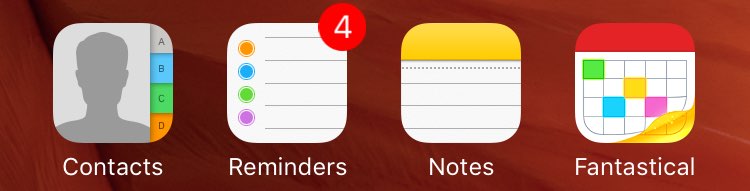
My daily errands are synced across devices via Reminders. Notes, I use as a clearing house for everything from shopping lists, article ideas, sketches and ZIP files to webpages, locations and pretty much anything that can be sent to the Notes app from other apps using iOS’s multi-purpose Share menu.
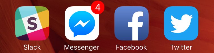
Fifth row: messaging and social
Messaging/social apps like Twitter live in the easily reachable fifth row. We use Slack for inter-office communication so I put it there alongside my favorite messaging app, Facebook Messenger, Facebook’s mobile client and Twitter’s native iOS app. As a former Paper fan, I recently switched back to Facebook’s mobile client.
As sleek and elegant as it is, Paper has always been an experimental Facebook app. After getting sick and tired of not having access to the latest Facebook features, I had to switch back to using the good ol’ Facebook app that I loathe. By the way, if you think Facebook’s iPhone app is a battery hog, you obviously haven’t used Paper.
Next up: Tweetbot.
I used to be a Tweetbot guy, but not anymore. Restricting third-party clients has made Twitter’s own mobile app the only choice for enjoying the latest and greatest features. I still use Tweetbot though far less than I used to.
I didn’t think I’d ever say this, but I’ve grown satisfied with Twitter’s app. I still miss some of Tweetbot’s tricks, but Twitter makes it up with things like Moments and Polls which are off limits to developers. And speaking of features that Twitter does expose to developers via official APIs, Tweetbot et al take forever to implement them.
Sixth row: iMessage, Chrome and Airmail
This is where I keep apps for browsing the web, reading my email and more.
First up: Messages. I don’t know if Apple will ever make the iMessage service cross-platform, but I do know this: every single iPhone owner I communicate with uses iMessages. That’s why I keep the app in the lower left where it’s super-easy to reach.
Previously, I’d open Chrome only if a website didn’t render properly in Safari. But after Chrome gained swipe-based navigation, pinch zooming and the same speedy rendering engine that Safari uses, it’s definitely deserved its own spot on my Home screen.
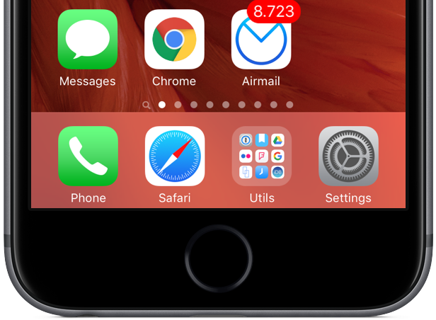
Not only does Chrome render webpages and run JavaScript just as fast as Safari, it also comes with features Apple should’ve implemented years ago, such as better tab management and seamless integration with other Google services.
As far as email goes, I was a big Spark fan.
Then I took the powerful $4.99 Airmail app for a whirl. Airmail gives me everything I need in terms of rich customization options and seamless syncing of in-app settings and accounts with Airmail for Mac. I’m waiting for Spark for Mac to arrive before giving Spark for iOS a shot at replacing Airmail on my Home screen.
About that empty app slot on my Home screen
You must have noticed an empty app slot in the bottom row that breaks the monotony of a Home screen packed to the gills with icons. As a matter of fact, I keep this slot reserved for a killer iPhone app. Although many fine apps have come and gone over the years, I haven’t given up hope on the killer app yet.
All I know is this: when it does arrive in the App Store, I’ll sure as hell be ready for it and it’s going to have the prime spot on my Home screen. You can call me superstitious, but that’s who I’ve always been.
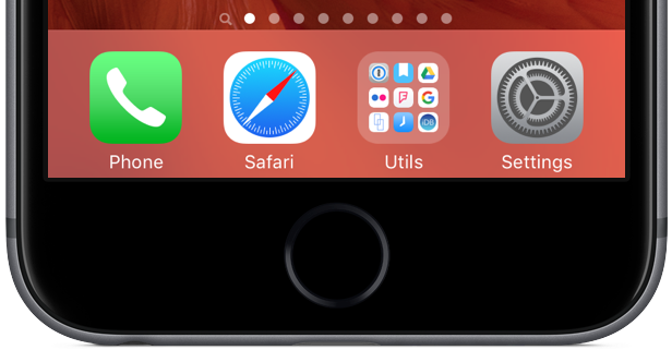
My Dock is about time-saving shortcuts
iOS’s fixed Dock at the bottom cannot hold more than four icons because my 4.7-inch iPhone 6s isn’t jailbroken so I don’t get to benefit from jailbreak tweaks like Springtomize 3, which lets you put five icons in the Dock, hide its background, etc.
I’m not complaining, though.
Because the Dock is accessible from any Home screen, I scrutinize every app I keep in the Dock: Phone, Safari, my Utils folder and Settings. The position of Phone and Safari icons in my Dock isn’t random: if you pay attention to the row of icons above the Dock, Phone is located in the first slot just as Messages above it—and both are green— while Safari and Chrome icons are vertically aligned as well—and both are browsers.
It’s a minor visual detail that matters a great deal to me.
As for my Utils folder, I stow inside it any apps that I use on a regular basis, but not as frequently to deserve a dedicated place on my Home screen.
Now let me talk briefly about Settings.
Being able to access Settings from any Home screen is absolutely crucial to me. Even if I didn’t write how-tos and tutorials, I’d still be opening Settings dozens of times on any given day because device customization is an endless process and I’ve always liked tinkering with my gear.
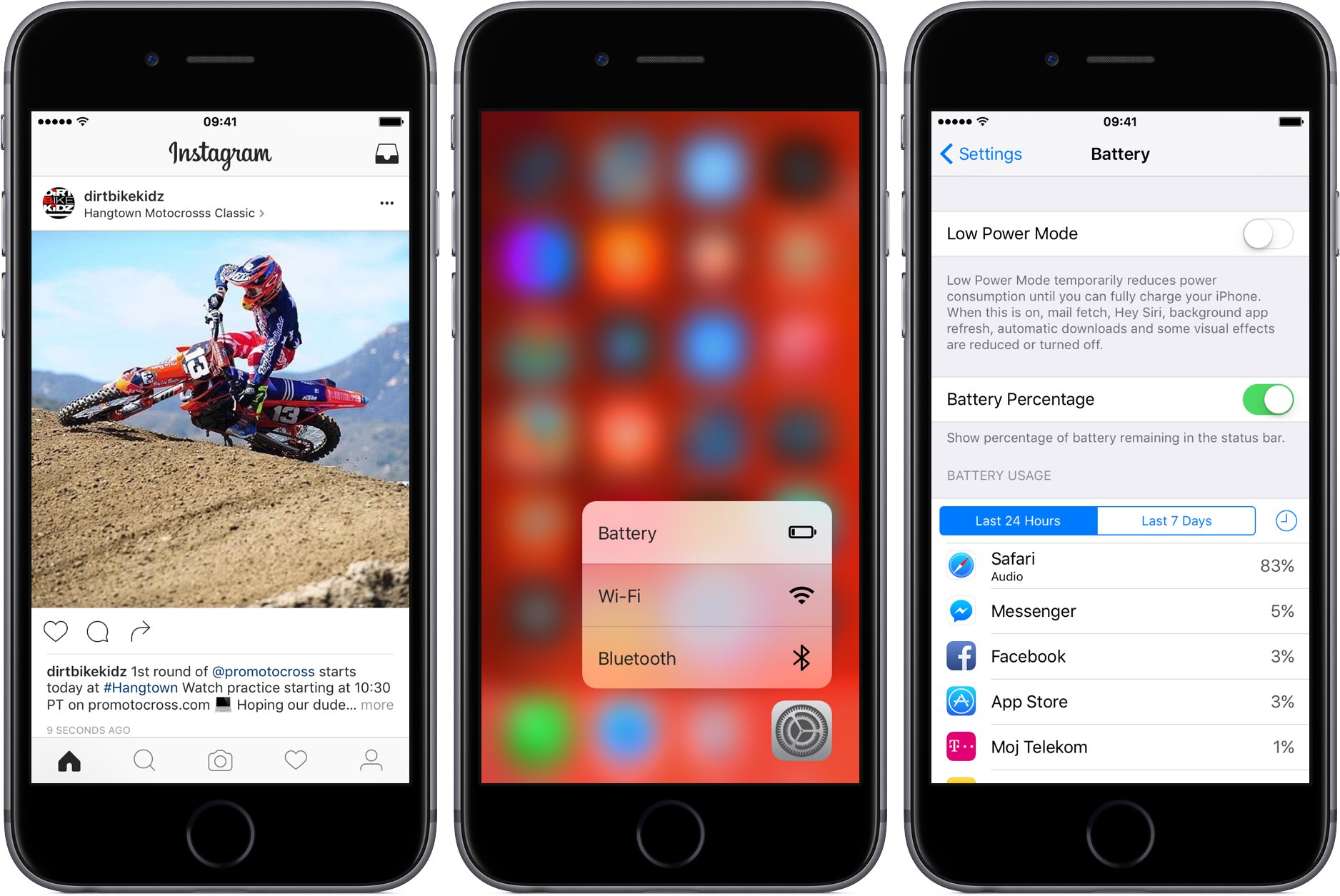
Getting to Low Power Mode anywhere from iOS in three easy steps.
But more important than that, keeping Settings in the Dock lets me toggle iOS’s Low Power Mode anywhere from iOS in just three steps, with a little help from 3D Touch: 1) press the Home button to exit an app I was using and get back to a Home screen; 2) press the Settings icon, drag my finger to highlight the Battery option in the shortcuts menu, then let go of the finger; and 3) toggle Low Power Mode on or off.
This is especially handy if I’m six levels deep in Settings as getting to the root menu would require too much swiping. And with an additional three steps, I can toggle my cellular data: 1) swipe to the right to exit the Battery section and get back to the root menu; 2) tap Mobile Data; and 3) toggle the cellular switch.
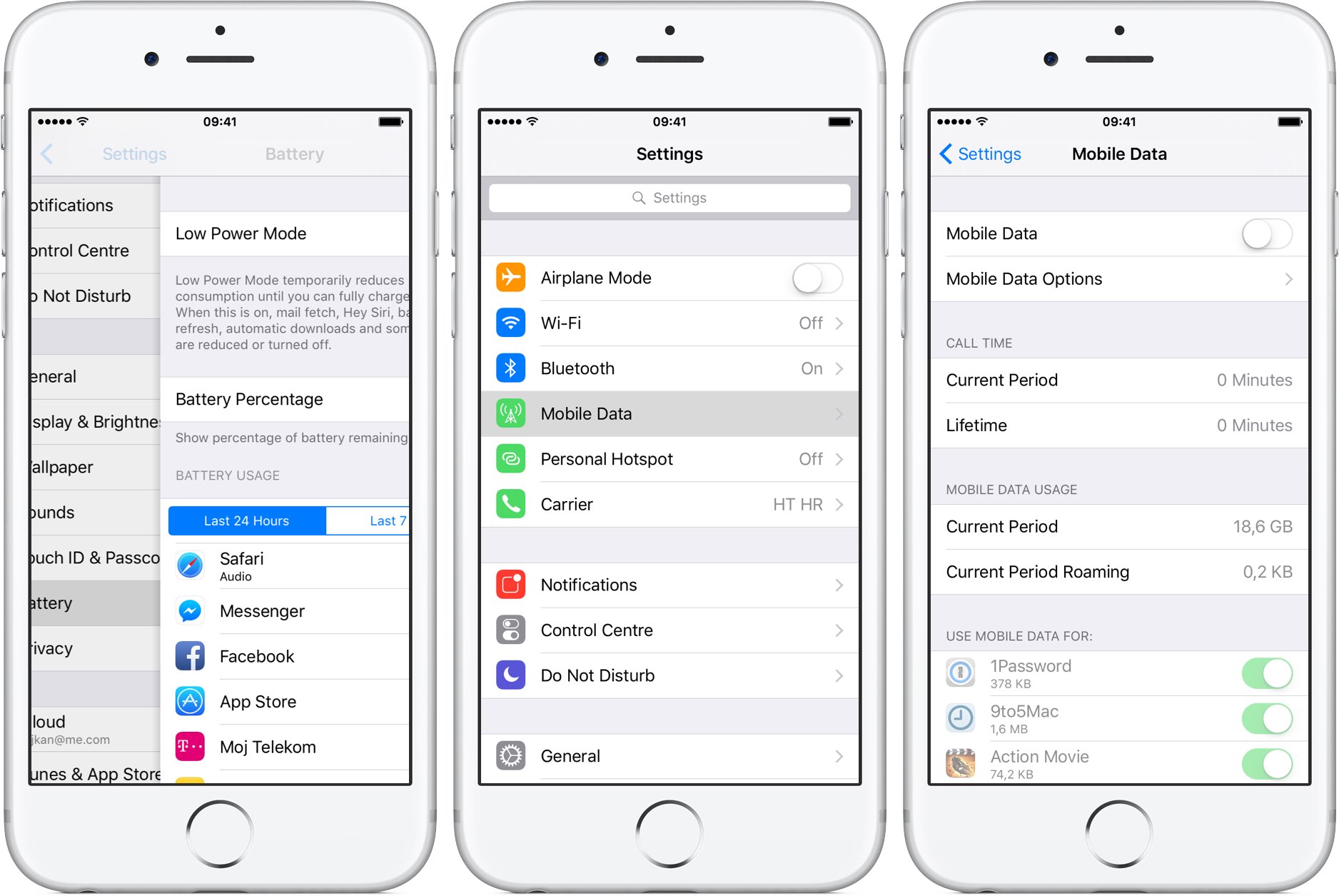
And with three more steps, I can access my cellular settings.
And with that, we conclude our tour of my iPhone’s Home screen.
The reasoning that drives my Home screen decisions might seem laughable to jailbroken users who can easily overcome iOS limitations with jailbreak tweaks. That said, I’m perfectly content with Apple’s stock iOS experience and, over time, have perfected my Home screen layout to fit my needs and help me get things done with fewer taps.
About my Utils folder
My second and third Home screen are littered with app folders. I have at least two-dozen or so folders dedicated for gaming: one folder is for racing sims, another one’s for adventures, shooters go into their own folder and so forth. But as far as my first Home screen goes, there’s but a single folder on it—Utils.
As you may have guessed, it’s in the Dock so that I can quickly access apps inside it. No matter where I happen to be in iOS, a press of the Home button takes me right to my Home screen, and then my Utils folder is just a tap away.
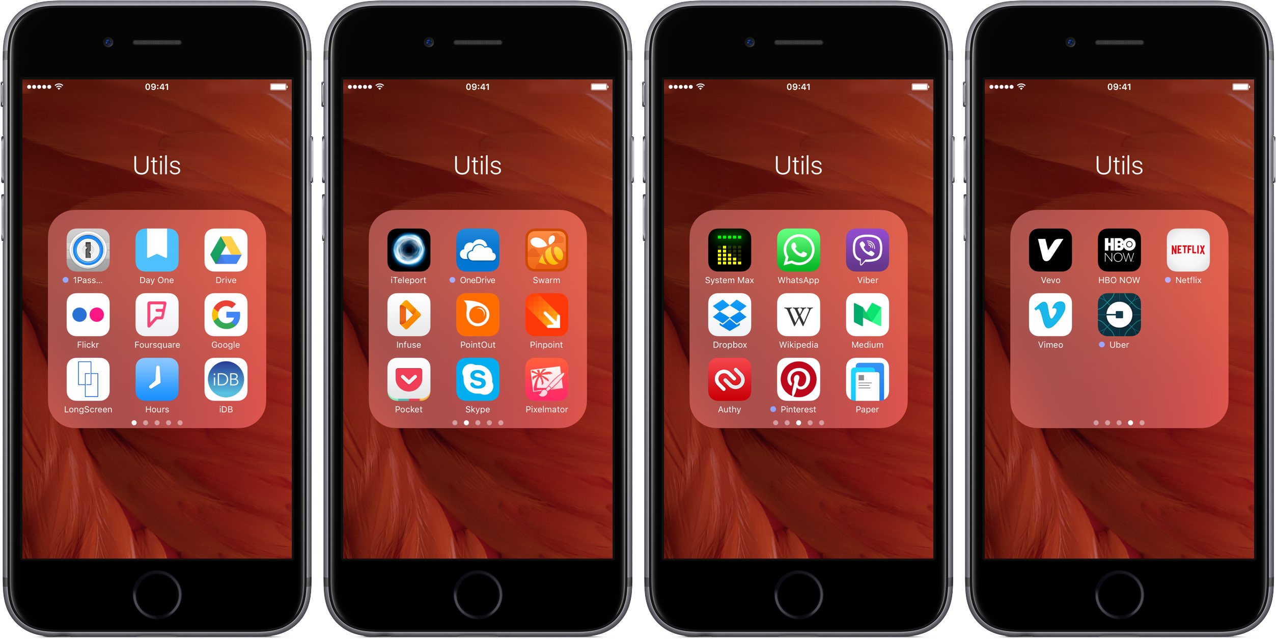
There are four pages with productivity apps inside my Utils folder:
- 1Password [Free]—Every password I use is securely stored in 1Password
- Day One [$4.99]—I keep a journal of thoughts I want to remember forever
- Google Drive [Free]—Some of my files are stored in the Google cloud
- Flickr [Free]—Flickr’s 1TB serves as my secondary Photos backup
- Foursquare [Free]—Their crowd-sourced location database is unmatched
- Google [Free]—I use Google’s native search app because of Google Now cards
- LongScreen [$3.99]—I clean up my iOS screenshots with this app
- Hours [Free]—Hours makes time-tracking easy and fun
- iDB [Free]—Our official iPhone app
- iTeleport [$24.99]—a VNC app I use to control the Mac from my iPhone
- OneDrive [Free]—Microsoft’s client for accessing cloud files
- Swarm [Free]—I’m a Mayor of many places on Foursquare
- Infuse [Free]—This app plays any MKV, WMV and other non-iOS media files
- PointOut [Free]—Another screenshot-annotating app that I like
- Pinpoint [Free]—Yet another cool app for marking up iOS screenshots
- Pocket [Free]—My preferred read-later service
- Skype [Free]—In case someone calls me on Skype
- Pixelmator [$4.99]—The most powerful image editor on iOS
- System Max [$0.99]—System/hardware information
- WhatsApp [Free]—There’s no escaping WhatsApp these days
- Viber [Free]—Same as WhatsApp
- Dropbox [Free]—I have files on Dropbox as well
- Wikipedia [Free]—Much better than browsing the mobile Wikipedia website
- Medium [Free]—A place to read thoughtful write-ups
- Authy [Free]—This app generates my two-factor authentication codes
- Pinterest [Free]—I stalk other people on Pinterest
- Paper [Free]—The full-screen Facebook experience
- Vevo [Free]—Best place to enjoy music videos
- HBO NOW [Free]—I’m a cord-cutter and it’s a Game of Thrones season!
- Netflix [Free]—Watching Friends over and over again
- Vimeo [Free]—Some of the best indie documentaries are on Vimeo
- Uber [Free]—Sometimes I hail an Uber
There’s actually a fifth page of apps in my Utils folder, but these are for my eyes only.
iDownloadBlog authors share their Home screens with you
I bet you’re dying to learn what’s on Sebastien’s Home screen. I also bet you’ll be happy to learn that in the coming days and weeks our writers will share their personal Home screen setups with you, our loyal readers.
Share your Home screen with other readers
If you want to share your set up, feel free to send us an email.
Assuming your email is carefully written and edited, we may publish it on the site. We cannot emphasize enough that to be considered, your post has to be well crafted and free of typos and other grammatical mistakes.
And as always, feel free to chime in with your thoughts in the comment section below.