Check out these eleven essential tips for improving your iPhone photography skills and composing stunning shots to capture the world around you.

Thanks to its great photo quality and the bunch of handy editing tools in the Photos app, the iPhone has become the world’s most popular digital camera. However, even an excellent camera and world-class photo editing tools can’t turn a bad photo into a good one. Therefore, the most effective and straightforward way to enhance the quality of your photos is to learn about composition.
1. Turn on the grid and leveler
One of the most crucial tools for improving composition is built right into your iPhone’s camera. Yes, I’m talking about gridlines, which are two horizontal and two vertical lines separating the iPhone’s screen into three equal parts, both horizontally and vertically. Additionally, modern iPhone cameras also have a built-in leveler to help you straighten and compose your shot better.
To turn on either or both, go to iPhone Settings > Camera and enable the switch next to Grid and Level.

Gridlines are absolutely essential for following the rule of thirds (the next tip) and for other applications, such as keeping the horizon straight. I recommend that you keep the gridlines on at all times until you automatically think about the scene in terms of composition.
2. Follow the rule of thirds
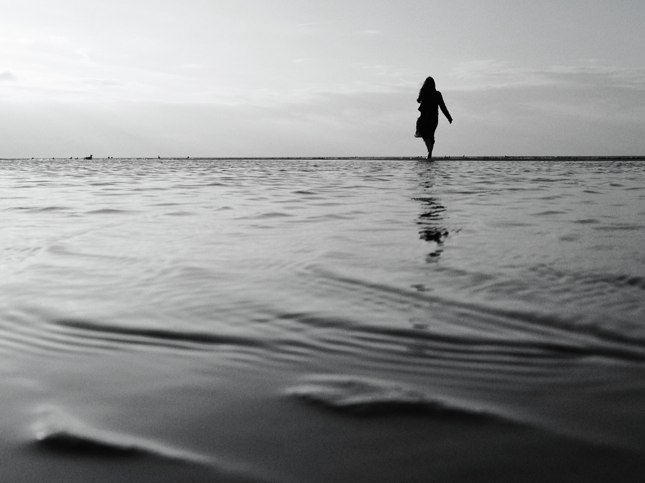
The primary application of gridlines is the rule of thirds. In a nutshell, the rule of thirds is a guideline suggesting that the most important part(s) of the image — known as the subject(s) of the image — should lie at one of the four points where the gridlines intersect.
These four points are the most powerful areas of the image, and our eyes are naturally attracted to these areas first. So whatever you really want to emphasize in an image, like the human silhouette in the photo below, should go to one of the four intersection points.
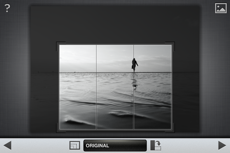
While it’s best to apply the rule of thirds when you’re taking photos, you can also do it in cropping. The iPhone’s powerful camera gives you plenty of room for improving your images through cropping, as I’m doing here using the Snapseed app.
The rule of thirds also suggests that the most important lines in the photo — both horizontal and vertical — should be placed along one of the gridlines. In this example, I’ve followed this guideline by placing the horizon along the top horizontal gridline.
Following the rule of thirds has allowed me to create a more harmonious composition while at the same time emphasizing the bizarre walk-on-the-water nature of the photo.
3. Don’t place your subject in the center
A common mistake made by novice photographers is placing the main subject of the photo, such as the lighthouse in this example, right in the center of the image.

This, of course, contradicts the rule of thirds, which states that the main subject should be located at one of the four intersection points. Even if you don’t want to follow the rule of thirds religiously, it’s a good idea not to place your main subject at the center of the image.

Placing the main subject even slightly off-center makes the composition a lot more harmonious, while at the same time putting more emphasis on the subject.
4. Balance the image diagonally
One of the most important compositional guidelines is the diagonal principle. In a nutshell, the diagonal principle states that the most important parts of the image (i.e., the main subjects) should be placed along the diagonal.
If all the crucial areas of the image are located either at the top or the bottom or on the left or the right side, the image is out of balance. The solution is to place the main subjects of the photo along the diagonal, as seen in the example below.

In this photo, the most important subjects are the red rocks at the top left and the smaller gray rocks at the bottom right. If there was nothing of interest at the bottom right, the photo would be out of balance. By aligning the crucial parts of the composition diagonally, I was able to balance the image both horizontally and vertically.
5. Make use of leading lines
Leading lines are lines that quite literally lead our eyes in a particular direction. Ideally, leading lines should not be perfectly horizontal or vertical, and they should lead our eyes toward the main subject. Different roads and footpaths are commonly used as leading lines, though almost any distinct lines can be used for this purpose.
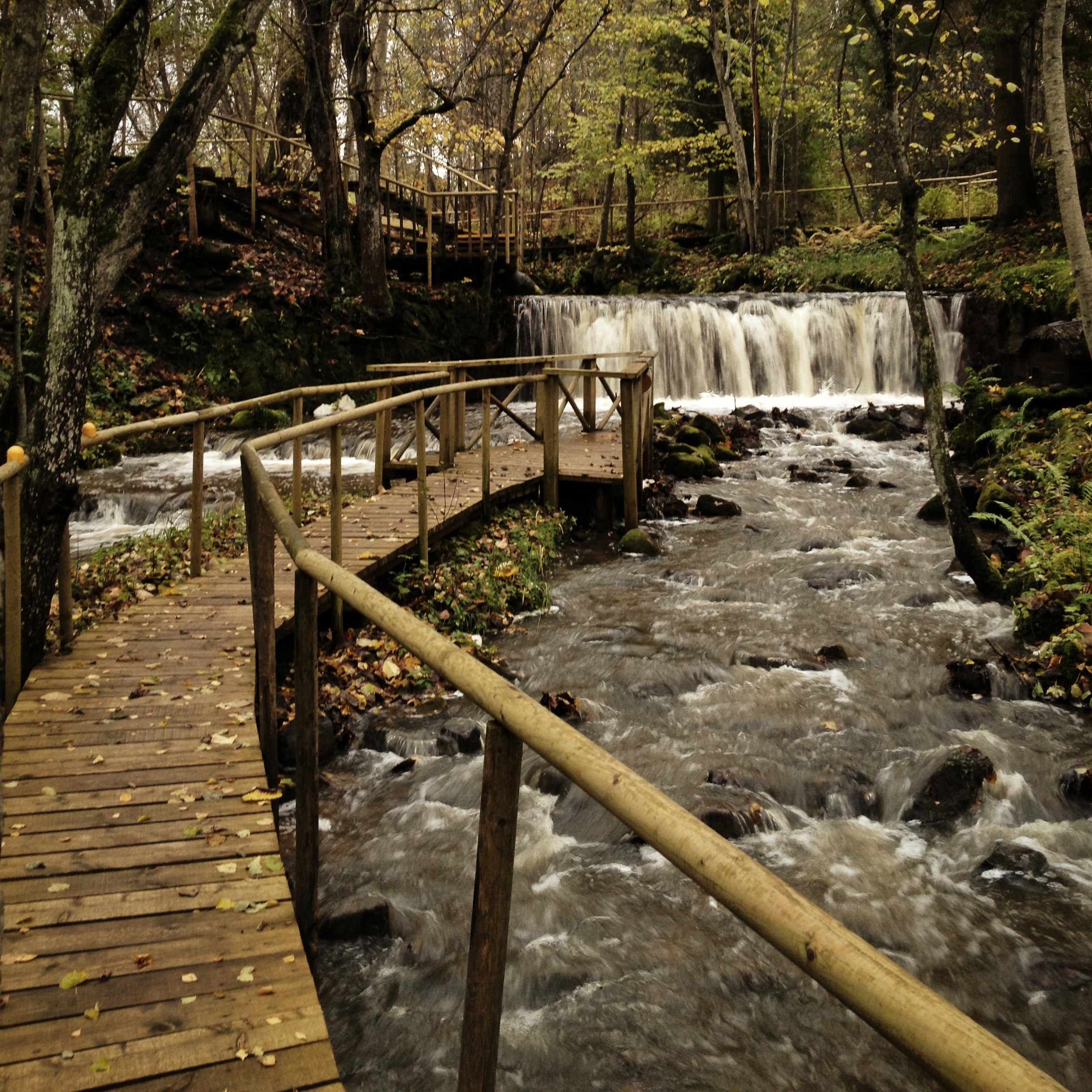
In this photo, the wooden bridge works as a leading line as it draws our attention toward the waterfall in the background.
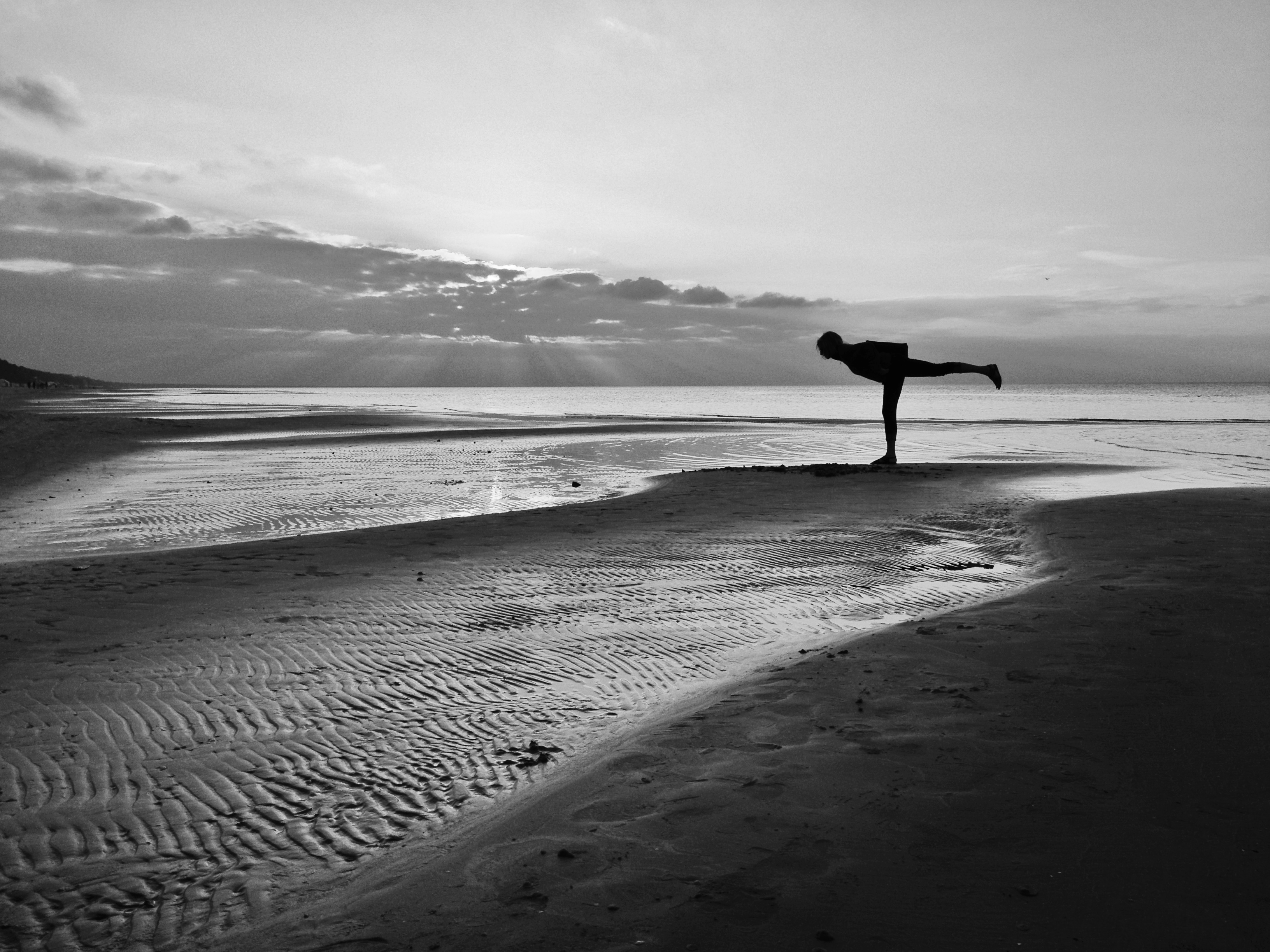
In this photo, the paths of dry sand that go through the scene diagonally from the bottom left function as leading lines, drawing our eyes directly to the main subject of the photo.
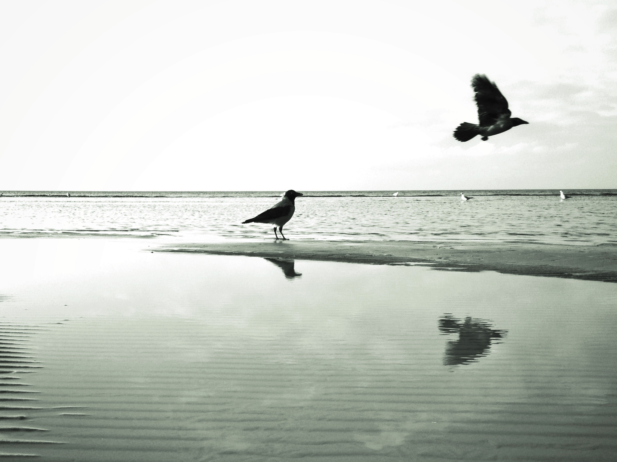
6. Follow the direction of movement
Even though photography is a stationary medium, photos often have an implicit direction of movement. The human eye is very used to people, animals, bikes, and cars moving forward, and it naturally expects to see the same in a stationary scene. And whenever there’s any kind of movement, our eyes naturally tend to follow in that direction.

So whenever you capture a scene that has an implicit movement, like the bike moving to the right in the photo above, you should leave enough space inside the frame for the eye to follow that movement. If this bike were positioned towards the right side, the eye would quickly go off the frame, and the resulting composition wouldn’t be harmonious.
7. Focus on eyes in portraits
In portrait photography, a person is always going to be the main subject of your photo. But how can we apply the rule of thirds if a person’s face takes up almost the entire frame?

When you first look at a person in real life or in a photo, the first thing you naturally look at is that person’s eyes. So in portraits, the most important part of the image is a person’s eyes, followed by their face, and finally their body.
To apply the rule of thirds to portrait photography, you should always place the eyes of the subject at one of the top intersections of the gridlines. Which one of the two? That’s what the next tip is for.
8. Follow the gaze of your subject
Remember the tip about following the direction of movement? The same idea also applies to portrait photography, as human eyes naturally want to follow the gaze of another person to see what they’re looking at. So in portraits, you should always place your subject so that there’s enough space in the direction toward which the subject is looking.
9. Keep it simple
Steve Jobs used to say, “Simplicity is the ultimate sophistication,” and he was clearly onto something. One of the easiest ways to create a well-composed photo is to keep the scene simple and clear of any distractions. The following photo has only one subject, which gives the scene perfect clarity, which ultimately results in harmony.
10. Make use of empty space
This photo illustrates another important compositional principle: the use of empty space in photography. In general, compositional guidelines such as the rule of thirds work great for portrait or landscape photos, but not necessarily for square compositions.
One thing that works extremely well for square images (but not so much for other aspect ratios) is placing your subject at the very edge of the scene and leaving everything else unoccupied, as seen in the photo above.
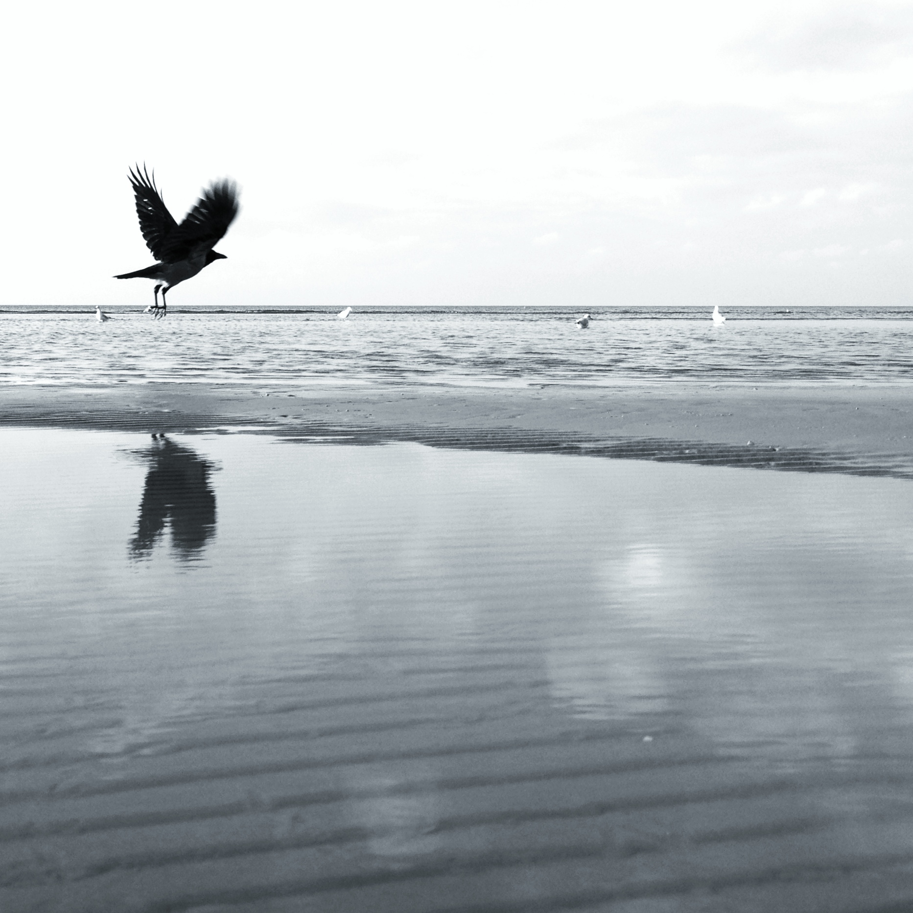
11. Break all the rules
Finally, don’t let any of these compositional guidelines restrict your creativity. While these principles are certainly useful in many photographic situations, it’s far more important that you keep experimenting and stay creative at all times. The following photo breaks several compositional guidelines that I explained in this tutorial, and yet I love it exactly like this.
For more, check out: