
I’ve always felt that the watch itself should be almost an afterthought in the never-ending discussion pertaining to what Apple’s rumored iWatch should be. ‘You’re thinking about it all wrong’ instantly comes to mind whenever new iWatch concepts hit the web. Looking at the current crop of mockups, their predictability and untenableness is starting to feel depressing and really killing all the fun for me.
But there’s some hope left as 3D artist Todd Hamilton took it upon himself to improve upon Thomas Bogner’s Nike FuelBand-like iWatch concept, taking his idea to the next level of awesomeness. It’s right after the jump: have a look at the renderings and dare tell us it’s not the best iWatch concept you’ve seen thus far…
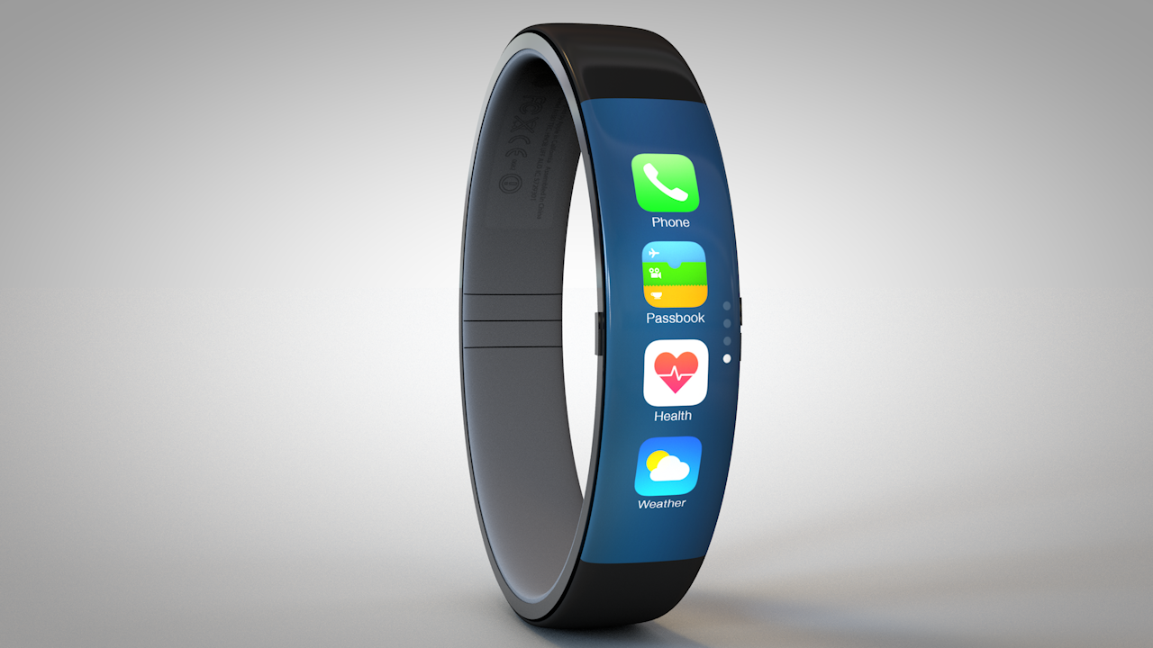
I’m loving the curved touchscreen display on the front.
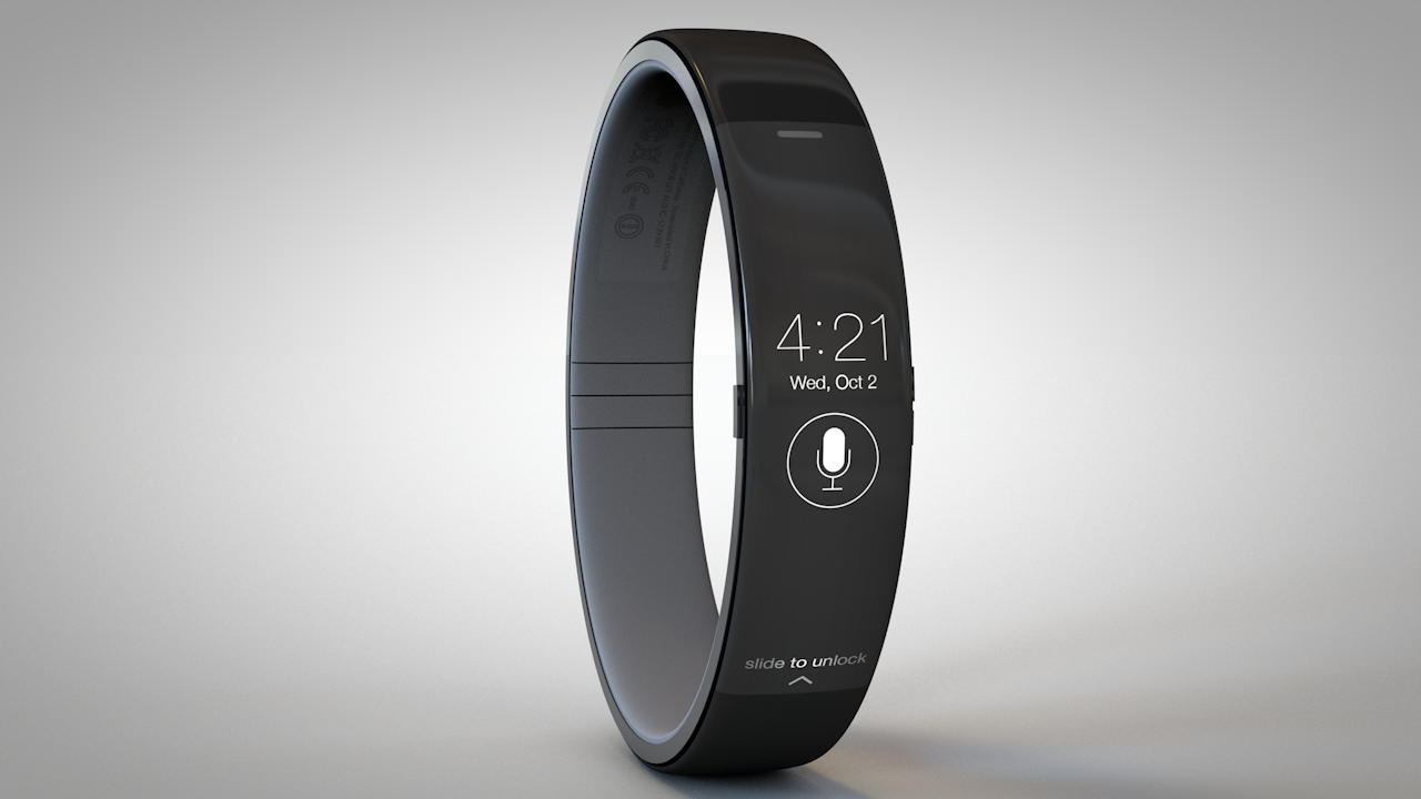
Seen top of post: the Lock screen.
Right below: your Home screen. Notice a page controller on the right. Swiping up or down moves between pages of apps and hitting the Home button takes you back to the lockscreen, the author explains.
This video showcases how the Phone app could potentially work.
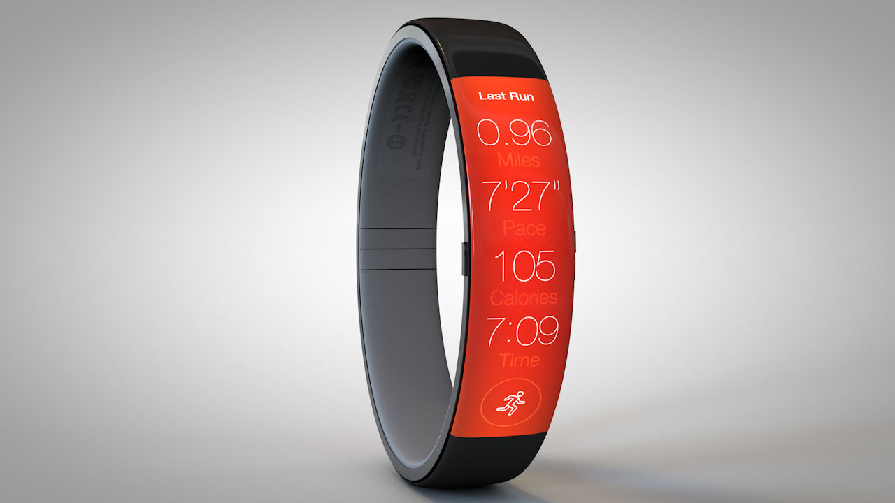
And this is what running should be like.
And, of course, Siri. There’s your time (the ‘watch’ part in ‘smartwatch’), date and a tappable button to activate the voice assistant. “From here the possible actions are: tap to use Siri, swipe up to unlock, or pull down to view notifications,” says Todd.
What’s missing is life/health tracking.
Apple recently hired two biosensor experts from medical devices firms so there’s a great deal of chance that the iWatch might contain advanced biometric sensors to constantly monitor your blood chemistry and body condition, stuff like glucose levels, your heart rates and so forth.
Bloomberg learned from sources that in addition to motion and sleep/life tracking, the iWatch will indeed monitor heart rates and other health-related data.
Todd cautions on his blog that any FuelBand-like device should be really mindful about the orientation of its interface. The artist set out to create this concept as a case study of sorts on good wristwatch UI design, the blog post explains.
“It needed to feel natural on the wrist and look like something Apple would actually produce,” reads the post.
Is this the best iWatch concept to date?