
The Safari browser in iOS 7 has undergone a complete overhaul, and as a result, it’s significantly more usable. As third party browsers continue to gain in popularity on the platform, Apple has responded with a renovated Safari that is leaps and bounds better than its predecessor in many ways.
In this in-depth walkthrough, we guide you through every new facet of Safari in iOS 7. We show you how to get more out of Apple’s revamped default browser.
It’s very safe to say that Safari in iOS 7 is an absolute gargantuan update. There’s tons of new stuff here, including many hidden features that aren’t readily apparent unless you do a lot of tinkering around. As a part of our ongoing iOS 7 walkthrough series, we’re going to go step-by-step through every new feature in Safari for iOS 7.
Please check out the table of contents below for each section pertaining to the features to be found in Safari.
Table of contents
- Navigation
- Keyboard shortcuts
- Searching and browsing
- Landscape mode
- Tabs
- iCloud Tabs
- Private Browsing


The nice thing about Safari on iOS 7 is that it’s very similar to its predecessors from a pure usability standpoint. True, as explained above, there are loads of new features and refinements to be found, but at its core, you’ll find it to be familiar.
The new Safari isn’t such a radical change that upgraders will feel alienated, but there are enough new elements that it’s worth exploring and explaining.
The first most obvious thing you’ll notice about the new Safari is its visual redesign. Unsurprisingly, Safari has adopted the new iOS 7 styling, which ushers in a new direction from a visual perspective. Everything from its app icon, to its tab interface has been reimagined.
Navigation
Prior to iOS 7, the searching and browsing duties were handled by separate input boxes at the top of the browser window. On the left, you had an address bar, which was dedicated specifically to URL entries. On the right, sat a search box, which was dedicated to searches.
When Google released its Chrome browser, it did away with the concept of having multiple input boxes, instead deciding to merge them into one “omnibox.” After using Chrome, it feels very antiquated when you use a browser that still designates separate duties to the boxes, and Apple realizes this. For that reason, Apple has gone on to merge both boxes into one on the iOS 7 version of Safari.
After you type in a normal address and tap go, the desired web page should load as normal. You’ll begin noticing a big difference when you start to scroll down the page as you peruse the content of the page. The address bar will zoom out and reduce in size, and the buttons at the bottom of the page will disappear. This allows for more visible page content. Here’s an animation that shows how the address bar reduces in size:

And here’s how the buttons look at the bottom of the screen when scrolling:
![]()
Fortunately, Apple’s engineers were wise enough to allow users to quickly input content into the search bar without scrolling back to the top of the page. A simple tap of the status bar/address bar area yields its full sized version. As reader, ahnfeldt, notes, you can also tap near the bottom of the page to reveal the interface.
Safari will also display the full address bar and buttons when you perform a hard scroll back towards the top of the page, or when you reach the bottom of the page and the rubber banding animation begins. If you scroll up a page slowly — as when carefully reading — Safari will keep its interface hidden to encourage reading. It’s pretty slick how the whole thing works.
The only real potential downside I can see to this new methodology is for users who use the “scroll to top” gesture often. When you tap the status bar in iOS 6, the page automatically scrolls to the top as a means to quickly get back to the top of the page. When the address bar is reduced in iOS 7, a tap of the status bar will enable the full status bar instead of scrolling to the top. You’ll then have to tap the status bar again in order to engage the “scroll to top” gesture.
Ultimately, this is a much better use of screen real estate when comparing iOS 6 to iOS 7. Although some may reason that iOS 6 is superior in the way it handles page scrolling, because it completely hides the address bar, iOS 7 has two clear advantages:
First, iOS 7 keeps a minimized status bar, so that you always know what page you’re on when browsing content in Safari. Second, because the buttons are now hidden in the iOS 7 version, you actually gain more real estate in Safari on iOS 7, despite the presence of the reduced address bar!

More real estate is never a bad thing
Although my test wasn’t exactly scientific, I’m guessing that users probably gain 22 more pixels of available content when using iOS 7. That may not seem like much, but Apple has made it easier to identify content, while at the same time increasing screen real estate.
Gestures play a bigger role in iOS 7 as a whole, and Safari is no exception. New to Safari are two new gestures for going back and forward through your page browsing history. iOS 7’s Safari browser allows you to drag from either the left or right edge of the screen to go back or forward respectively.
Safari stores snapshots of the last page view, so that you’re able to gain context of the page you wish to go back or forward to. Once you fully navigate to the previous or next page, the page will refresh to pull in the most updated content.

Gestures are a big part of Safari in iOS 7
These gestures are awesome for a few reasons, the main one being that you can perform them while the app is in full screen mode with the buttons hidden. This means that you can easily navigate around Safari while enjoying the benefits of its increased real estate. In other words, you can have your cake and eat it, too.
Keyboard shortcuts
Some users might panic when they see that iOS 7 lacks the handy .COM button present in iOS 6. This button allowed users to quickly input popular top level domains. Taping it once inserted the ubiquitous .COM, while tapping and holding the button presented options for other TLDs like .net, .edu, .org, etc.
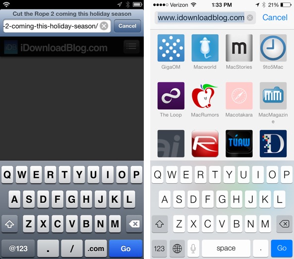
Yes, iOS 7 lacks a dedicated .COM button…
In iOS 7, there is no dedicated .COM button, but the functionality is still there in some sorts. While it’s true that these is no dedicated .COM button, the period button now acts as its replacement. Tapping and holding the period button will present a list of all of the popular TLDs.
…it makes up for it with the TLD period button shortcut
Since .com is by far the most popular TLD, a tap-hold-quick release gesture will quickly allow you to insert .TLD with little delay. True, it’s not as fast as having a dedicated .COM button as in iOS 6, but the need for that probably isn’t as large as you think it is, especially with Safari’s revamped combined search/address box.
Searching and browsing
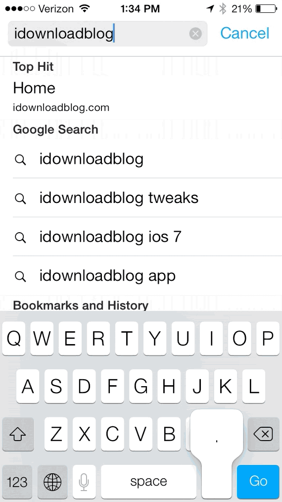
The combined search and address bar is a powerful new tool that shouldn’t be underestimated.
A huge difference between iOS 6 and iOS 7 when it comes to search feedback
In its current form in iOS 7, it’s generally capable of retrieving four different types of results:
- Top Hits – high ranking results from domains you’ve previously visited
- Search Results – results from your default browser
- Bookmarks and History – results from saved items in your history and bookmarks
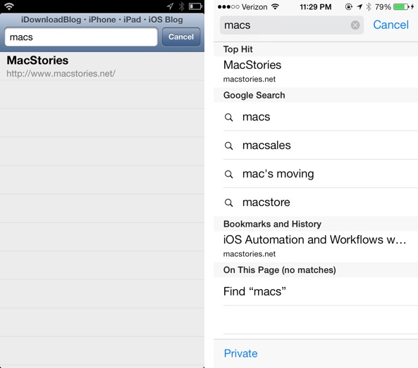
- On This Page – results found on the current web page
All four result types are displayed as you type in characters in the address bar.
Landscape mode
The landscape mode that we enjoyed with iOS 6 introduced full screen landscape browsing to the mix. On iOS 6, there was a button dedicated to switching between normal and full screen modes while in landscape orientation.
As you would expect, iOS 7 has nixed this dedicated full screen button in favor of a full screen mode similar to that which is found in portrait mode.
As you begin to scroll, the top portion of the UI, including the status bar, and the bottom bar containing the app’s buttons hides from view. This works exactly like it does in portrait mode, except that the top portion of the UI, including the status bar, is hidden as well.

Notice the button overlays while using the full screen mode found in iOS 6
Since iOS 7 introduces gestures for navigating back and forward, the translucent overlays for back and forward are also a thing of the past. iOS 7 brings a completely clean full screen landscape experience, with absolutely no UI elements on screen to interfere with your browsing.

Full screen mode in iOS 7 is completely devoid of these elements
Of course, you can still quickly regain the address bar and buttons bar just by scrolling up briskly. The velocity sensing scrolling will quickly snap these vital elements of Safari back into view for your usage.
Tabs
If you’ve ever used Safari on iOS prior to iOS 7, then you’ll know exactly what to do. In fact, if you’ve ever used a modern web browser on a mobile device or on a desktop, then it should still feel second nature.
Upon launching Safari, you’ll see the address bar at the top of the page, and a set of buttons at the bottom of the page. In the mobile versions of Safari, there’s no concept of a “Home page” like there is on desktop browsers. In other words, it’s just a blank page when you open a new tab.
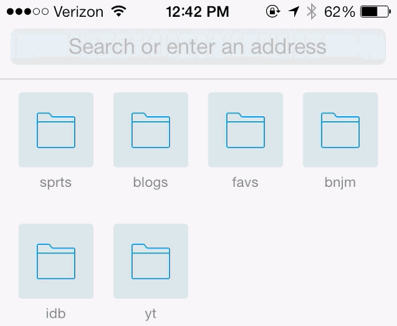
What is new in iOS 7, however, is the ability to view your bookmarks when opening new tabs. If you have Safari synced to your iCloud account, then the bookmarks found in the bookmarks bar on the desktop version of Safari, will be found on each new tab opened.
What’s even better is the fact that the bookmarks are updated on the fly when you change them on the desktop version of Safari and vice versa. For instance, if I delete a bookmark from the bookmarks bar on the OS X version of Safari, the bookmark will disappear from the new tabs page on the iOS version a few seconds later. If I rearrange the order of the folders on the mobile version of Safari, the order of the folders will shortly thereafter reflect the new positioning on the desktop version’s bookmarks bar.
Moving favorite folders with a tap-hold-drag gesture
While on the bookmarks page, you can easily rearrange the order of the bookmarks by performing a tap and hold gesture. Unfortunately, outside of rearranging the icons, you can’t do any other editing features from this view.
Apple no longer places an arbitrary limit on the amount of new tabs you can have open at any given time. In previous versions of iOS, only 8 tabs were allowed to open at once. If you tried to open another tab, the new tab would overwrite the oldest tab in order to stay within the threshold limit.
Whereas the incumbent iOS 6 could only display 2-3 tabs at the same time (and even that’s a stretch), iOS 7 can display 5-6 tabs at the same time due to its new rolodex inspired interface.
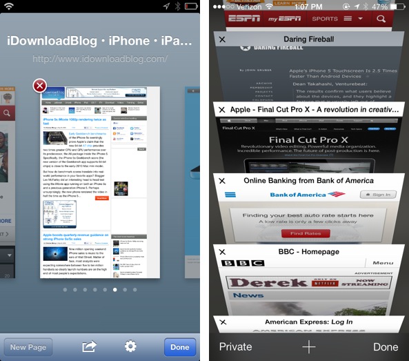
The new tab interface is lightyears better on iOS 7
Gestures also play a role in tab management. While in tab view, there are two gestures are available. The first gesture is a tap and hold gesture that allows you to rearrange the tab order:

The second gesture is a left-flick gesture that allows you to remove a tab. You can, of course, also tap the ‘x’ button in the upper left-hand corner of a tab to remove it as well:

iCloud Tabs
With iOS 6, Apple introduced a new feature called iCloud Tabs. This feature lets you access tabs that were open on other iCloud linked devices from any other iCloud linked device. This made it possible to access tabs open on your iMac from your iPhone, from your iPad to your iPod touch, etc. It’s basically a way to continue your browsing experience while switching over to another device.
In iOS 6, the implementation of iCloud Tabs was a little lacking. It required you to delve into your bookmarks in order to access a folder dedicated specifically to iCloud Tabs. This method of access iCloud tabs required too many steps. As a result, I found that I didn’t bother using iCloud Tabs, or I simply forgot they existed altogether.

Quickly access open tabs on other devices
In iOS 7, iCloud Tabs play a more prominent role in the experience. The big difference here is that they’re quickly accessible from the new tab interface, which makes sense seeing as they are tabs themselves. To access iCloud Tabs on iOS 7, tap the tab button, and scroll down past the last open tab until you see a list of tabs under each device linked to your iCloud account.
Private Browsing
Private browsing was such a hassle to use in earlier versions of iOS, that I didn’t even bother fooling with the feature. I’m sure I’m not alone in my sentiments. In iOS 6, you had to exit Safari, open Settings, open the Safari preferences, and then enable Private browsing. To add insult to injury, you then had to deal with a prompt asking you if you wanted to close all of the open tabs in Safari.
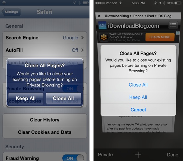
It’s much easier to use Private browsing mode in iOS 7
Other third party browsers, including Google Chrome, made it a lot easier to use Private browsing from right within the app. Apple seems to have learned from this mistake, and has now included private browsing settings directly in the iOS 7 version of Safari.
To access Private browsing, tap the new tab button, and then tap the Private button located in the bottom left-hand corner of the screen. You’ll still be prompted about closing all tabs, but at least this way you can quickly enable or disable private mode without exiting the app.
To differentiate between private and normal modes, Apple has again adopted a darker UI scheme to identify private mode. In the example below, the private mode is on the left while regular mode is on the right.
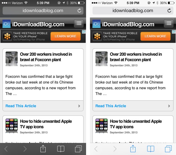
Private browsing mode versus normal browsing mode UI differences

iOS 7 has ushered in a lot of new improvements to the bookmarks interface for Safari. As I showed you earlier, your bookmarks bar (aka Favorites), are now displayed whenever a new tab is opened. There’s also a new tabbed interface when perusing the bookmarks section of the app. Instead of the old way of displaying iCloud Tabs and Reading List as mere folders within the Bookmarks section of the app, things have been rearranged in a more cohesive and concise manner.
At the top of the new bookmarks page you’ll see three tabs: Bookmarks, Reading List, and a new feature for iOS 7 — Shared Links.
Bookmarks Tab
The Bookmarks tab contains a list of all of your bookmarks, including folders and individual bookmarks, Bookmarks Bar, which has been rebranded as Favorites, and browsing history. The result is a look that appears a lot less cluttered and confusing than the one it replaces. Compare the two bookmark views below; iOS 6 is on the left side and iOS 7 is on the right:
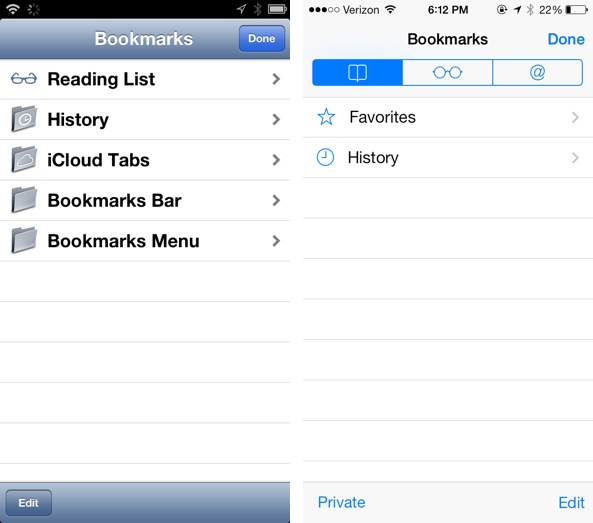
iOS 7 ushers in a cleaner looking Bookmarks tab
Another nice thing about the iOS 7 version of Safari’s bookmarks tab, is that you can choose to enter private mode prior to engaging any of the links found within your Bookmarks, Reading List, Shared Links, etc. The Private button is always available in the view in the bottom left-hand corner, just like in the new tab view.
History
Subtle changes continue to be the theme, and History is not exempt from the changes. The History is again, like many other facets of iOS 7’s Safari revamp, improved. The changes are slight, but they’re just enough to make a difference.
For starters, the history is no longer relegated to boring folders organized by date. Instead, we’re greeted with a running list of history items, sorted by day, and for more recent history items, sorted by time of day. For example, you’ll see headings like This Evening, This Morning, Monday Afternoon, etc. Again, it’s a subtle change, but it lends more context to history items.
History now includes the URL of the associated page. When trying to located a website in your history in an efficient manner, it’s all about context, and again, having URLs available for you to view, along with the page’s title, lends quick context to the search.

Enhanced time sorting and URLs add more context to history on iOS 7
Apple still has yet to add the ability to delete individual items from history, which is unfortunate. You can clear out the history, but it’s either all or nothing. Considering that you can individually clear out items on the desktop version of Safari, it seems like a no-brainer that this feature would be included in iOS.
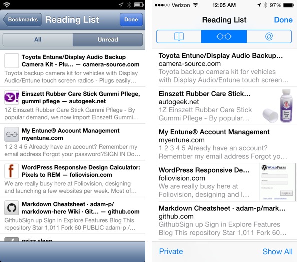
Reading List
In iOS 7, Reading List has its own section in the Bookmarks Tab, instead of being relegated to a folder like in iOS 6. The functionality of Reading List on iOS 7 remains unchanged for the most part.
There has been a relocation of the All/Unread toggles, in that there’s now just a single toggle located in the bottom right-hand corner of the screen.
The subtle upgrades bring added improvement to Reading List on iOS 7
I did notice that preview images for articles are displayed differently in iOS 7. On iOS 6, the favicon for the site related to the saved page is used. On the iOS 7 version of Reading List, favicons are eschewed for real images that lend additional context to the article. If no adequate preview images can be found, then no image is used at all. In my opinion, this is a much better method than using favicons, which are usually low resolution, and provide little to no detail about what the article might contain.
The Up Next feature in Reading List encourages continuous reading
Another new item that can be found on the iOS 7 version of Reading List is the new “Up Next” feature. Instead of having to go back to the main reading list menu in order to consume the next article, you can simply scroll to the bottom of the page and it will automatically pull in the next article for your consumption.
Shared Links
A new feature found exclusively in iOS 7, Shared Links brings all the links posted by the folks you follow on Twitter in one convenient place. It’s basically a way to extract all of the links posted on Twitter for easy review on the web.
Taping on one of the Links found here will load the linked content, along with a header bar highlighting the person who tweeted out the link. Sadly this header bar provides no additional functionality, in that you can’t link to the person’s timeline, copy the URL, etc.
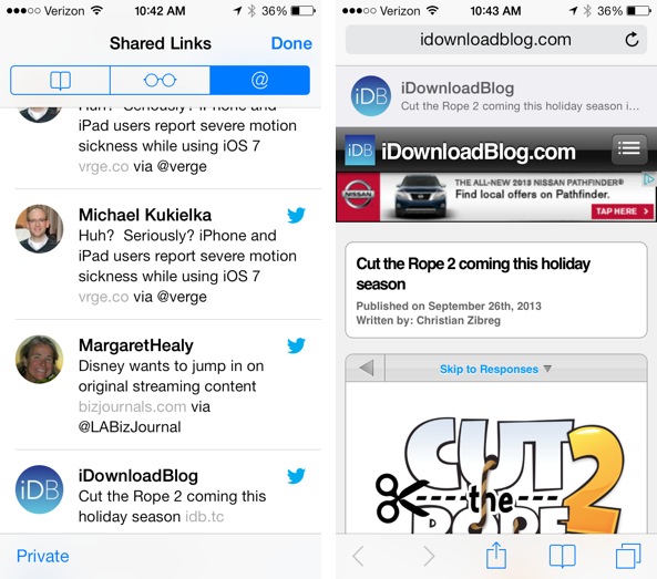
Tapping on a shared link loads the link with a reference to the Twitter poster
This same Shared Links feature can be found in the upcoming OS X Mavericks desktop release. On Mavericks, you can browse shared links from Twitter and from LinkedIn accounts. On OS X, the feature is quite a bit more fleshed out, allowing you to retweet the message, search links, view the original post on Twitter, etc. The iOS version of Shared Links is bare bones, it allows you to open the link, pull to refresh all links, and that’s about it.
The lack of the ability to search links is something I definitely miss from its desktop counterpart. As it stands, Shared Links seem like an afterthought on the small screen. The feature would benefit greatly if it adopted some of the features found on the desktop version.
Reader mode
Distraction free reading is a big deal these days, and Safari has had such a feature for some time now. Like pretty much everything else in iOS 7, Reader mode has been changed. Apple has decided to make Reader mode a lot simpler and more consistent with the overall Safari experience.
To activate Reader mode on iOS 6, you need to tap the “Reader” button that appears to the right of the URL in the address bar. To do so on iOS 7, you need to tap the paragraph button found to the left of the URL.
The changes to Reader mode may be deemed as good changes, or bad changes, depending on how and how much you used the feature in times past. Right off the bat, I can tell you that some people are going to be disappointed to find that Apple removed the ability to adjust the font on the fly.

Reader Mode looks better on iOS 7, but it lacks on the fly font size adjustment
The font button and the share button have been axed in iOS 7’s Reader mode in favor of the normal address/status bar combination found throughout the rest of the app’s UI. The result is that of a more consistent experience that lacks some of the features found on older versions of iOS.
One feature that I really appreciate about the new Reader mode is that video embeds now display properly. I also find that images tend to be more to scale, and the default font and links look more appealing than in times past.
Sharing
If there’s one area that’s remained more or less the same between the two version of iOS, it’s sharing. Granted, there are some major UI overhauls in iOS 7, and it introduces the new AirDrop feature, but outside of those two details, everything else feels pretty much the same.
AirDrop sharing is definitely worth mentioning, though, as it makes it extremely easy to share web sites quickly with whoever’s in your vicinity with an iOS 7 device.
To use AirDrop, tap the share button, and then tap the recipient’s avatar. The recipient will almost immediately receive a pop up notification indicating that someone wants to share a web site. A screenshot of the site will appear along with its URL. You can then decide to accept or reject the share. If you accept the share you’ll be immediately taken to Safari.
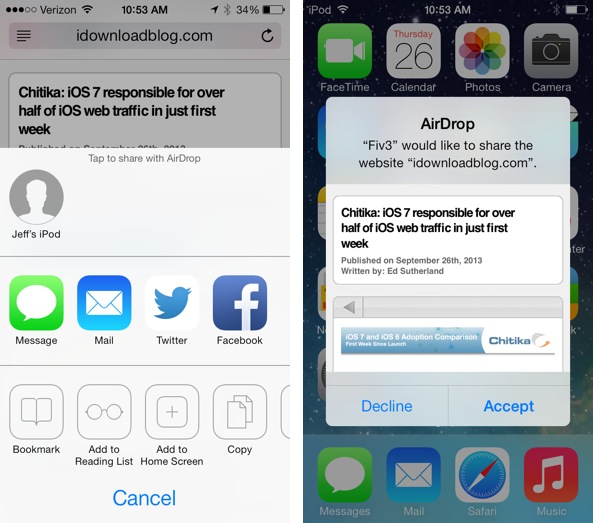
AirDrop sharing is a quick and seamless way to share links between iOS devices
AirDrop is a feature that may seem simple by nature, but if you have friends or family with iOS 7 devices, it’s an absolute killer feature when it comes to quickly sharing websites. Of course, it’s not just strictly for sharing random URLs, it can be used to share a variety of files amongst a variety of apps.

One of the biggest areas of change when comparing iOS 7’s version of Safari to previous version is its settings. Safari has undergone quite a change with regard to its preferences, and there are a lot of new options and features to dig through.
Some of the new features can greatly improve the user experience, so I think it’s imperative that you become familiar with them if you wish to get the most out of the refreshed app.
General
As mentioned, many of the settings have been rearranged in iOS 7. You may see some features that used to appear in one section, now fall under the General section of Safari’s preferences. The pop-up blocking option is a prime example of this. For this part, I’ll address each major change one-by-one, and discuss why it may be useful to you.
Search Engine
The same as iOS 6 and below. You can choose between making Google, Yahoo!, or Bing, the default search engine.
Passwords & AutoFill
This section has undergone a great overhaul in iOS 7. You can now view saved passwords and info related to the password. You’ll be required to enter in your passcode in order to gain access to such information.
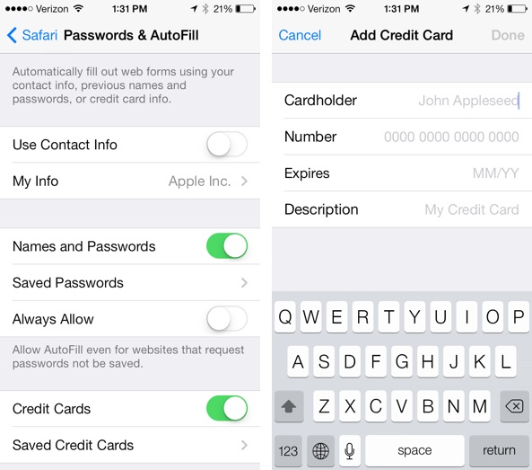
The ability to save credit card data is new to iOS 7
You’ll also notice a new section for saving credit cards. Like the passwords, you can view saved credit card data as well.
Favorites
A brand new addition to Safari’s preferences in iOS 7, favorites allow you to designate specific folders to the Favorites that display when you open a new tab, search, or enter in a URL in the address bar.
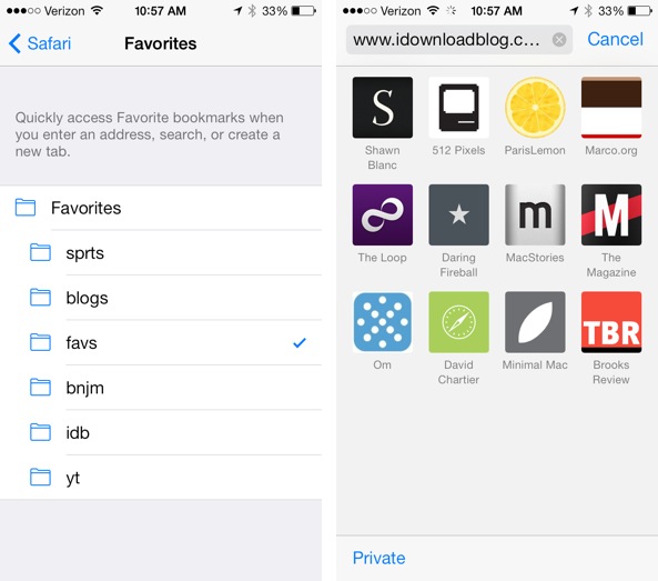
Favorites customization is an easy to overlook new feature in iOS 7, don’t miss it
This is basically the equivalent to the Bookmarks Bar in Safari of old. What’s great about this option is that you can designate a specific folder containing all of your favorite websites and links to display using this option. This is one of the best new features to be found in iOS 7.
Privacy & Security
Not too much has changed here, but you will find a few handy toggles added to the mix.
Do Not Track
Back in 2011, Apple added a Do Not Track option to the desktop version of Safari. Do Not Track allows you to opt out from having your browsing activity tracked for advertisement purposes. There’s still quite a bit of debate as to whether or not sites actually respect the option, but that’s a debate for another time.
Smart Search Field
Inside this new panel, you’ll find two new toggles — Search Suggestions, and Preload Top Hit. These toggles directly impact the unified search/address bar that now appears in Safari. The Search Suggestions toggle allows you to disable the suggestions that appear as you begin typing search terms. These suggestions stem form the default search engine, which will more than likely be Google unless you opt to change it.
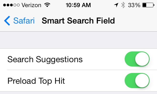
Enable preloading and suggestions
The next item, Preload Top Hit, is another useful new feature. As you search, Top Hits — previously viewed websites that appear in your list of suggestions — will load in the background.. This makes it so that the site more or less instantly appears if/when you decide to tap on it.

Safari for iOS 7 is Apple’s response to popular third party browsers on iOS. It’s so much better than its predecessor in nearly every single way. Whereas I used to find myself using Google Chrome without debate, these days I’m a quite torn. I’ve been using Safari much more than Chrome since I updated to iOS 7, and it’ll likely stay that way outside of a few specific usage cases.
Even with as deep as I’ve gone with this walkthrough, you will no doubt find subtle changes here and there that I’ve not discussed. It can’t be understated how much of an upgrade iOS 7 is over iOS 6 in general, and the browser differences help to accentuate how much better iOS 7 is as a whole.
What do you think about the new Safari in iOS 7? Will you use it as your full time browser, or will you be sticking with a third party solution? Share your thoughts, comments, and observations down below.