With the first iOS 7 beta now available to Apple’s registered developers, Twitter is on fire with both praises and complaints from those who have downloaded and installed the software to their devices. At first blush, a lot of people seem to dislike the redesigned home screen icons – and I bet some folks will actually miss skeuomorphism in iOS 7.
Those who do love the new iOS 7 look tend to be equally passionate about the subject. We knew changes in iOS 7 would be polarizing and I’m still bipolar about it.
That being said, today we’re asking you to participate in our little non-scientific poll and vote on the subject of iOS 7 redesign. Please disregard iOS 7 features, this poll is strictly focused on finding out whether or not iOS 7 is aesthetically pleasing to your eye…
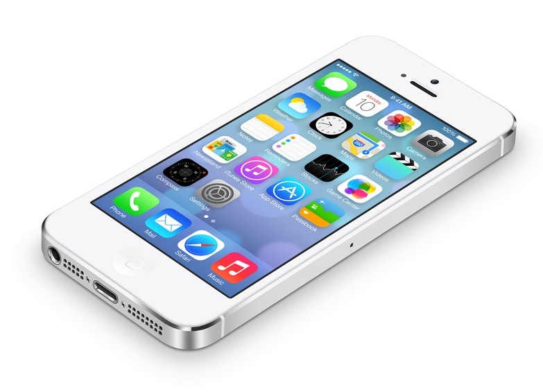
First, check out a few screenies, via Killian Bell and Sjoerd Reitsma.
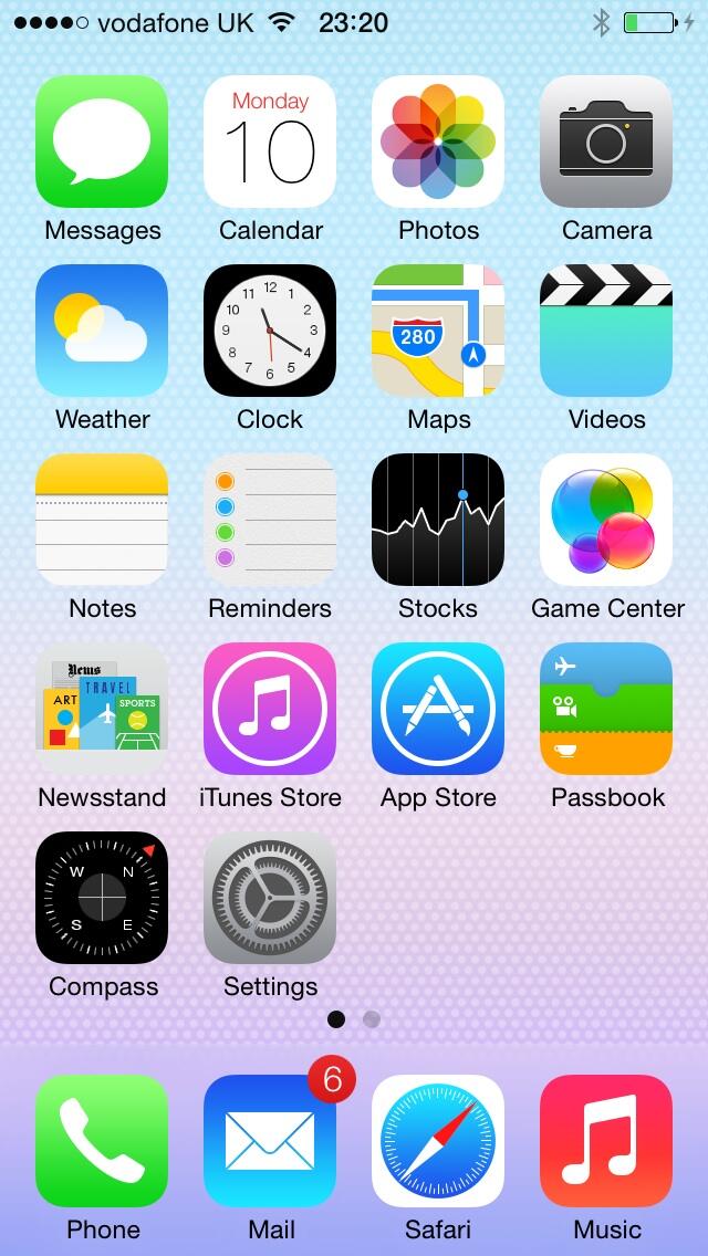
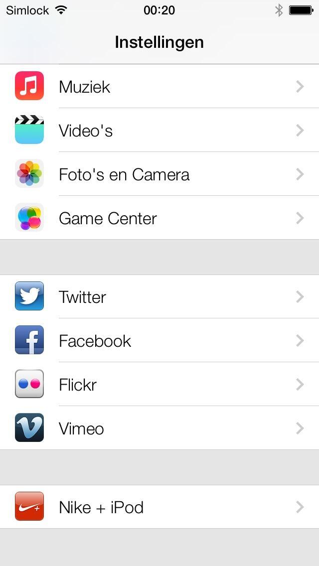
Home screen with default wallpaper (left) and Settings (right).
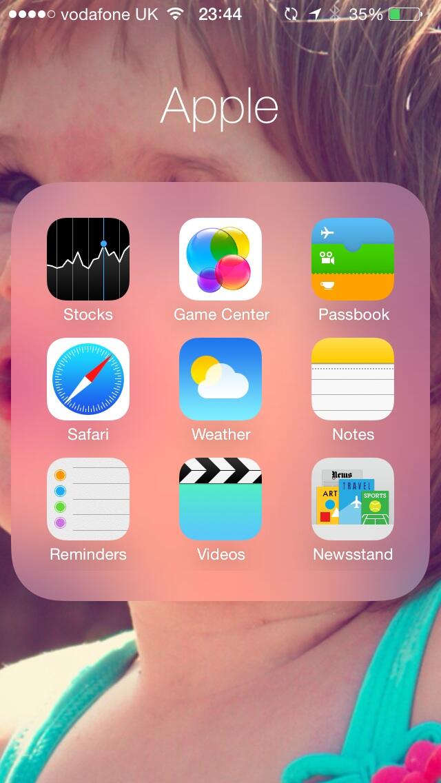
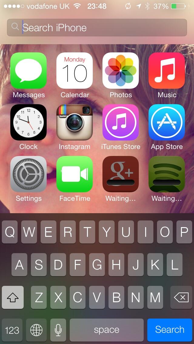
Folders (left) and Spotlight (right), now accessible by pulling down on any Home screen.
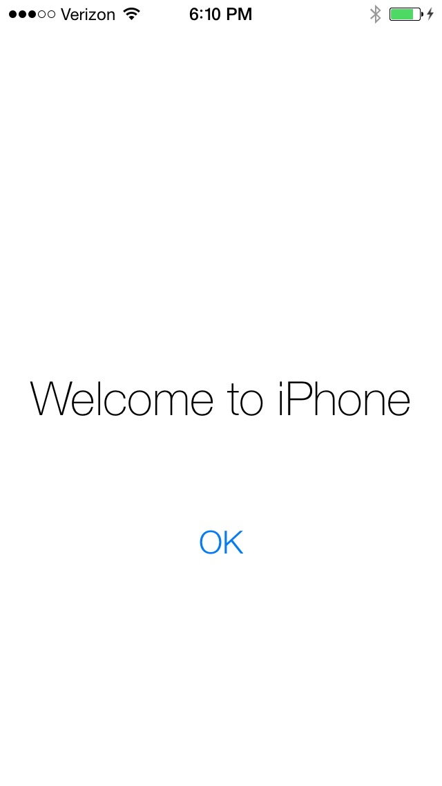
They even revamped the iPhone setup screen.
It doesn’t get any flatter than this, does it?
Before you jump to conclusions, know that screenshots really don’t do iOS 7 the justice it deserves. Trust me when I say that iOS 7 looks much better in motion, especially with shadows and subtle animations.
Please cast your vote below.
Feel free to chime in with your thoughts down in the comments.
I have a feeling this one’s going to be, well, pretty polarizing.