When the Apple Watch was revealed, it displayed a fairly drastic UI change from the way a typical iPad or iPhone works. The UI showcased many app icons on screen and once, and they could be zoomed in and out via the watch’s digital crown.
That UI seems to fit in fairly well with the watch, given that device’s limitations on screen real estate. But how would a similar UI work on the iPhone? Would it even work at all?
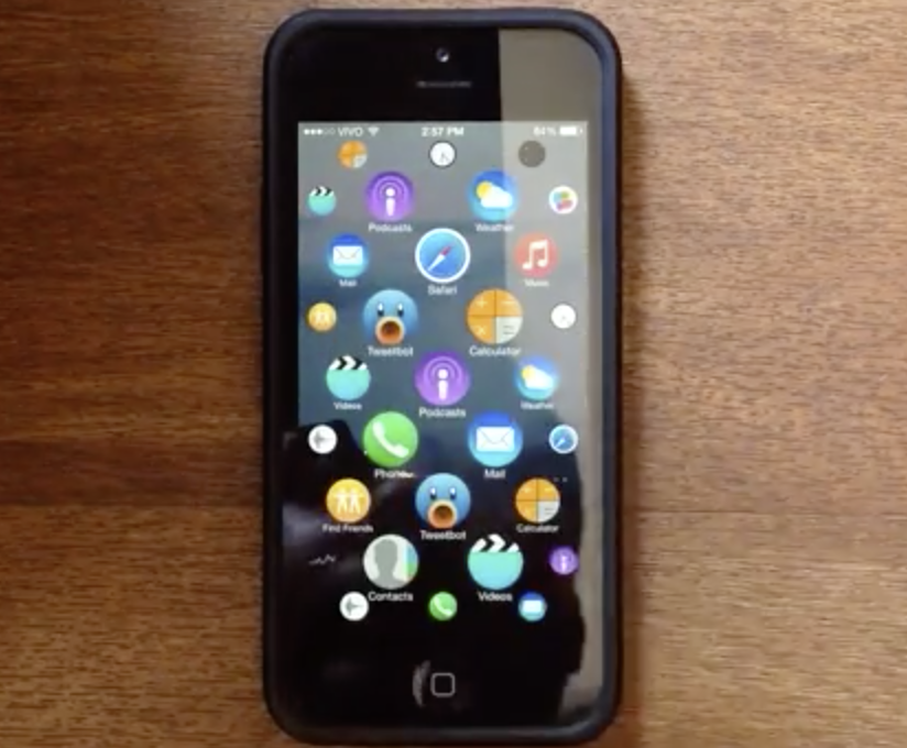
Developer Lucas Menge helps to answer that question via an open source mockup showcasing the Apple Watch UI on his iPhone 5s. The result is a fairly eye-opening display that may convince some that the Apple Watch UI could indeed work on a large screen device. Have a look inside at the awesome video, and let us know what you think.
One of the key differences between this mockup and the Apple Watch UI is the presence of icon labels—something the Apple Watch UI is devoid of. Otherwise, you can use a two-finger pinch gesture to zoom out or zoom in, and use a single tap and drag gesture to peruse all of the app icons on the Home screen. Tapping an app icon will launch the respective app, and tapping in an area where there are no icons will zoom out and display all of your app icons.
This is obviously a huge departure from the way iOS works now. Since its inception, back when it was called iPhoneOS, Apple’s mobile operating system has always used a standardized row/grid layout for icons, with additional pages to store additional icons. It’s a very systematic approach, and some believe that it’s starting to get a bit stale.
Menge’s inspiration came from a post made by fellow Apple blogger Michael Steeber. Steeber’s original mockup can be seen here.
Do you think this would be a good direction for iOS to take in the future? It would certainly serve as an answer to those that state that iOS never changes.
Whatever your thoughts, be sure to watch the video; it’s seriously impressive stuff.