Airbnb, an online service for people to rent out lodging, has rolled out a major update to its iPhone application earlier today.
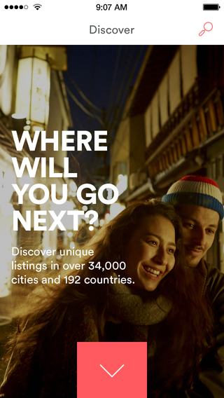
The software has been redesigned from the ground up for a much cleaner appearance so you’ll immediately notice richer colors and more vibrant photography “inspired by Airbnb experiences all around the world.
The app now uses Airbnb’s controversial new logo (more on that later) and the web interface has been overhauled, too, as part of the company’s larger rebranding effort. The refreshed Airbnb 4.0 is now live in the App Store…
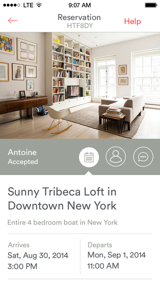
As of today, Airbnb’s website and mobile apps have largely gone flat, with a few functional tweaks here and there. Booking trips, managing your listings, and other features continue to work the same way as before.
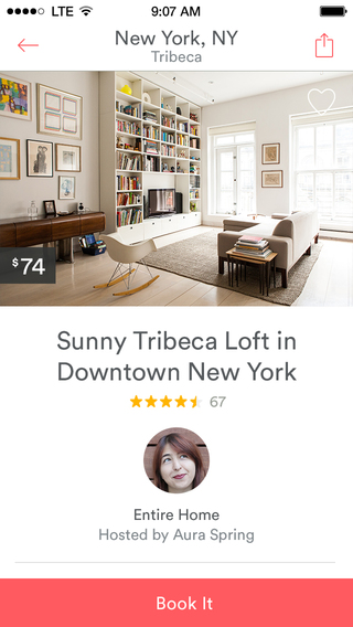
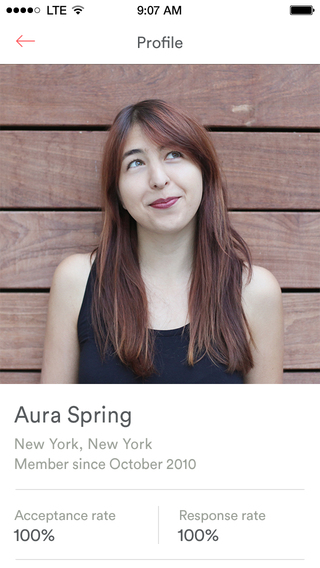
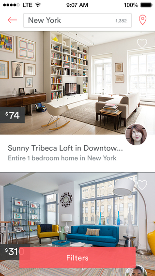
Airbnb’s Discover feed now uses your location to show nearby listings and destinations. There’s also a brand new Listings page with way bigger images the upper half of the screen, followed by important place details such as ratings, a photo along with the description of the host, amenities, cancellation policy and what not.
Oh, and the booking widget now remains visible on the website as your scroll through the listing pages.
And now, allow me to introduce you to Airbnb’s fabled new logo.
![]()
The new appearance and whole rebranding is credited to London-based design shop DesignStudio. The rebranding revolves around the Bélo, a symbol of belonging which the company says is at its core.
Check out the promotional video below.
https://www.youtube.com/watch?v=7Hs0C2UvVBY
If comments on social media are anything to go by, Airbnb’s symbol of belonging drew mixed responses.
Some joke it was inspired by Pied Piper (if you’re a fan of the Silicon Valley TV show, you’ll get the joke), for this dude it’s a lot like Sweethome’s and girls think it’s just a tweaked heart symbol turned upside down.
There’s four body parts the new AirBnB logo looks like—none of which you’d want for a logo unless you sell sex toys. pic.twitter.com/bGNBkshZEB
— Dan Saffer (@odannyboy) July 16, 2014
DesignStudio even put together this animated GIF to explain the thought process behind the new logo. The rebranding work is thoroughly detailed in blog posts by Airbnb and DesignStudio.
![]()
If I may opine, that GIF wasn’t very explanatory.
The logo does look like a lot of things, as exemplified by Buzzfeed’s timely article headlined “18 Things That Look Like The New Airbnb Logo.” Also, don’t miss out Valleywag, Gizmodo and TechCrunch‘s take.
The design is surely a bit familiar, as evidenced by the bellow composition, and even Bloomberg TV saw fit to react live to it.
Airbnb 4.0 is available free in the App Store.
The iPhone-only download requires iOS 6.0 or later.
And your take? Is the logo an absolute home run or does it look majorly obscene?
One thing can’t be denied: Airbnb sure knows how to keep itself in the headlines.