
What is iTunes nowadays? Is it a jukebox application for Mac and Windows PCs, as it was conceived as such more than a decade ago? Is it the storefront software found on your iOS devices. A device management solution, perhaps?
Could it simply be a media player with a built-in music store? A video store, you say? Sure! A podcast store? That, too! A books store?
It’s all of these things combined, and then some more.
This is precisely why folks have grown increasingly frustrated by iTunes. And herein lies the problem with iTunes, as we know it today: whatever the app is these days, there’s no escaping the fact it’s become hopelessly bloated, counterintuitive and just way too cluttered.
That’s why UK-based designer Brye Kobayashi set out to lay out his vision for a total iTunes revamp, taking inspiration from iOS 7 while borrowing certain concepts from Apple’s stock Music app for the iPhone and iPad. It’s pure minimalism, looks gorgeous and I want it now!
Th product of this brainstorming is a clean experience that get rids of all the clutter to let you focus on the task at hand and encourage content discovery.

Brye started off by identifying issues with the current iTunes, which in his mind mostly involve cluttered design that populates the interface with a bunch of quick links taking valuable space.
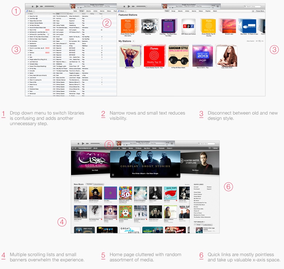
Small typeface, multiple scrolling lists and the confusing drop-down menu to switch libraries (which debuted in iTunes 11) are not helping either. Taking it all in, this is what he thinks device management in a revamped iTunes should look like.
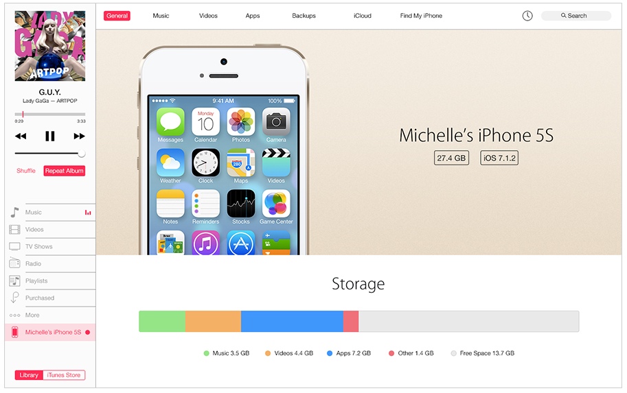
This is your Library.
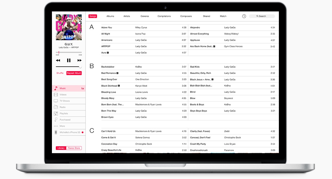
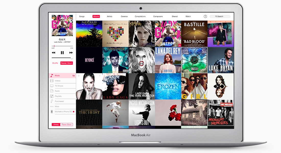
I also love the minimalist design of the Music view.
No matter how you look at it, iTunes is a mess.
The interface is just confusing and that’s saying a lot given Apple’s famous attention to detail and expertise in building sophisticated user interfaces. There are countless quick links and iTunes Store links, all vying for my attention so I eventually end up listening to my music using iTunes’s mini player because I hate interacting with the app unless absolutely necessary.
More images are available on Brye’s blog, including a nice iTunes Store overhaul.
So how do you like this concept?
And what’s your opinion about the current state of iTunes? Have countless updates and years of development backfired and should Apple simply redo the software from the ground up, as rumored?