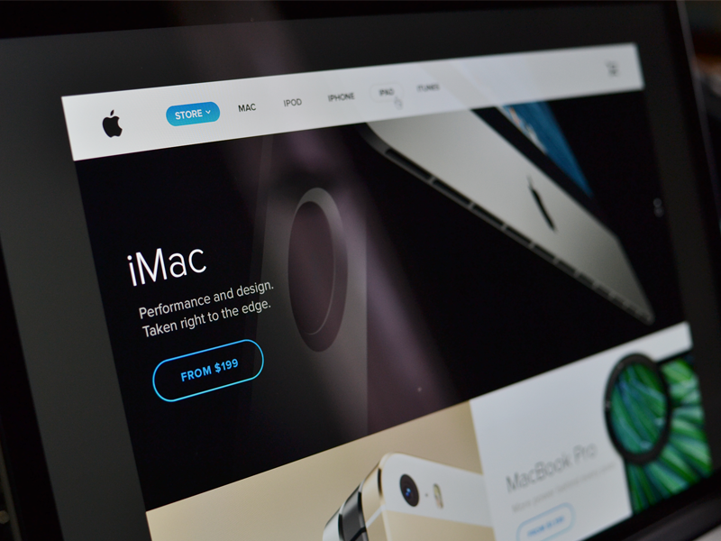
Milano, Italy-based user interface designer Sebastiano Guerriero has envisioned this great looking full-on Apple.com redesign which has left me speechless this morning.
I’m especially digging the uniformity, focus on large images with less text and single-colored buttons that much resemble the design language of iOS 7.
But what’s really floored me is his awesomely flattened navigation bar at the top. I know Apple has removed some of the shine and depth to it over the years.
But – but – Guerriero’s version is so much better! I’m not exaggerating, his mockup is an eye-candy and puts Apple’s current website design to shame, hands down. But don’t take my word for it, jump past the fold and have a look yourself…
That’s some really sharp and clean design.
By the way – a $199 iMac? I’ll take ten!
Hopefully, Apple is paying attention to Guerriero’s work.
As Jony Ive is now in charge of both hardware and software design and Apple, here’s to hoping that he’ll lend his magic touch to Apple.com and bring it up to date with the overall direction seen in iOS 7 and, partially, in OS X Mavericks.
Let’s not forget Apple’s incoming head of retail, Angela Ahrendts, who will be in charge of both Apple retail and online stores – a first for a SVP of Retail at Apple.
During her tenure at the British luxury fashion house Burberry, Ahrendts really nailed their online presence and hopefully she can do the same for Apple by working with Ive to take Apple.com to the next level.
Guerriero wrote on his Dribble that he’s currently working on an experimental redesign of the App Store.
Can’t wait to see that one!
Isn’t this concept a beauty?
Sound off in the comments.
