It seems like every time I post a screenshot of my Lock or Home screen, I’m inundated with tweets, Facebook messages and even the odd Google+ message asking how I created the minimalist, clean effect. It looks very different to the stock iOS experience, and offers some features that Apple refuses to offer, and I rather like it!
After the most recent flurry of questions I thought it best to put together a short blog post together detailing what apps or tweaks I used, along with the important settings required to recreate my Home or Lock screen.
So, without further delay, let’s get started…
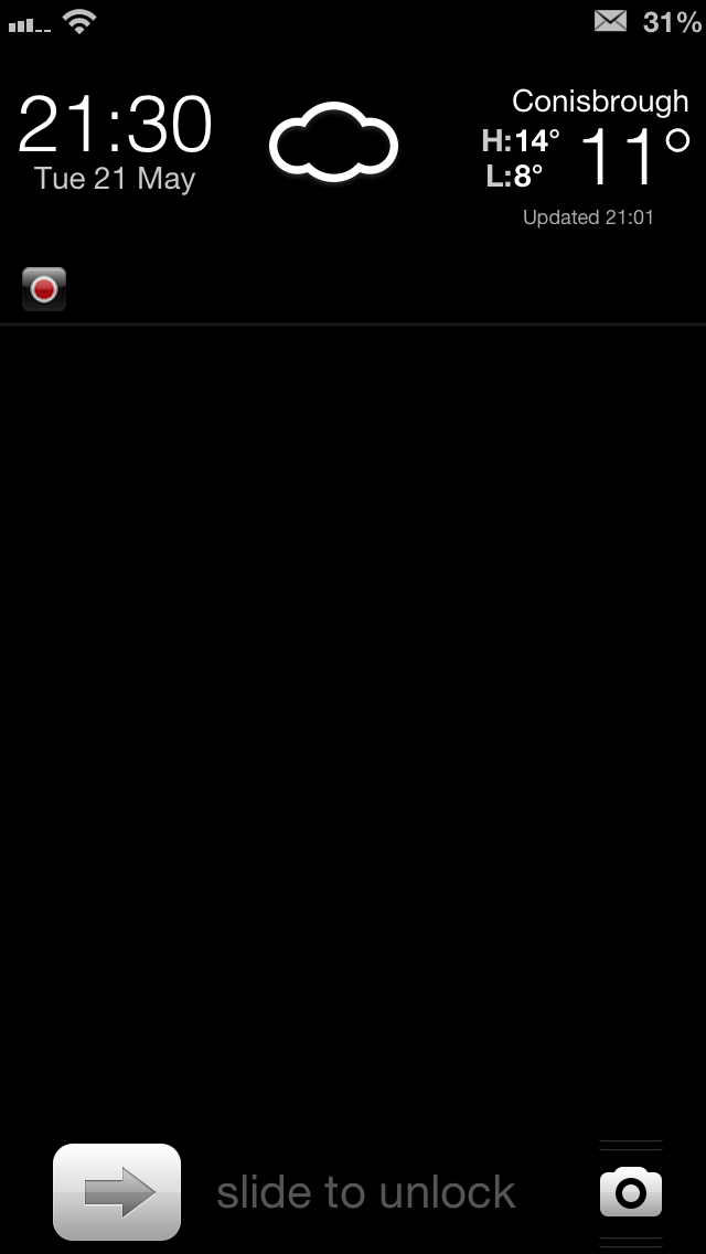
Lock screen
Let’s start off with the first thing you see when you begin to use your iPhone – the Lock screen.
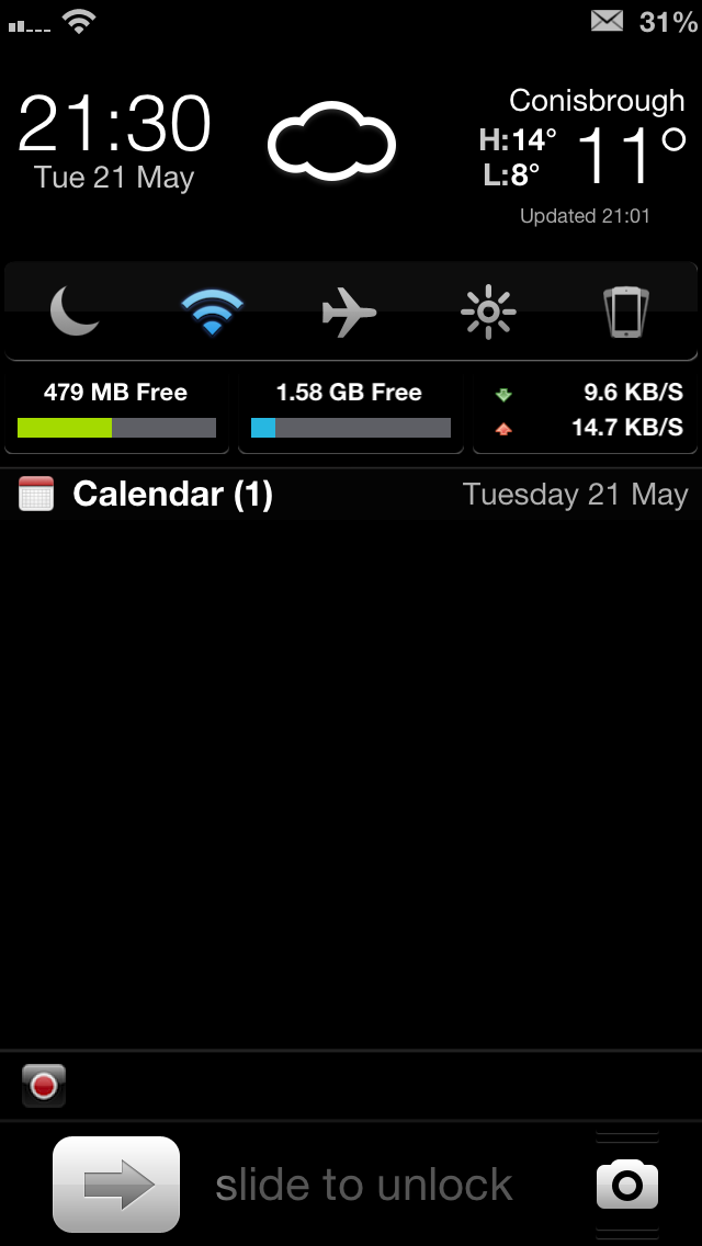
The main change here is the addition of LockInfo 5. The way Apple handles notifications on the Lock screen as stock just doesn’t suit the way I work. Having notifications disappear after the handset has been unlocked, never to return, is a real pain for me. That’s why LockInfo’s persistent notifications is a must-have, and all its other features are just a bonus.
Those features, like the pull-down widget drawer, may have just been a bonus at first but have become more useful over time. Having quick access to Airplane mode for example, or being able to see how fast an app is downloading are things that I’ve come to rely on. Having the weather right there is nice, too, though far from a necessity
Speaking of widgets, that stats widget is N Stats Widget, and the one that houses quick toggles is the famous NCSettings. Both free. Both awesome. Share Widget and Compose handle quick composure of Tweets, Facebook updates, emails and iMessages but they’re only shown in Notification Center, rather than the Lock screen mainly due to some bugs with the keyboard not working in certain situations.
I also used SubtleLock to move the unlock slider and camera grabber to the bottom of the screen, and Winterboard theme ClearLockScreen to remove the background coloring. That works on the clock, too.
A slight aside, but the weather widget’s icons have been changed to Meteocons NC Weather, again via Winterboard. I just prefer the black & white look, you see.
Home screen
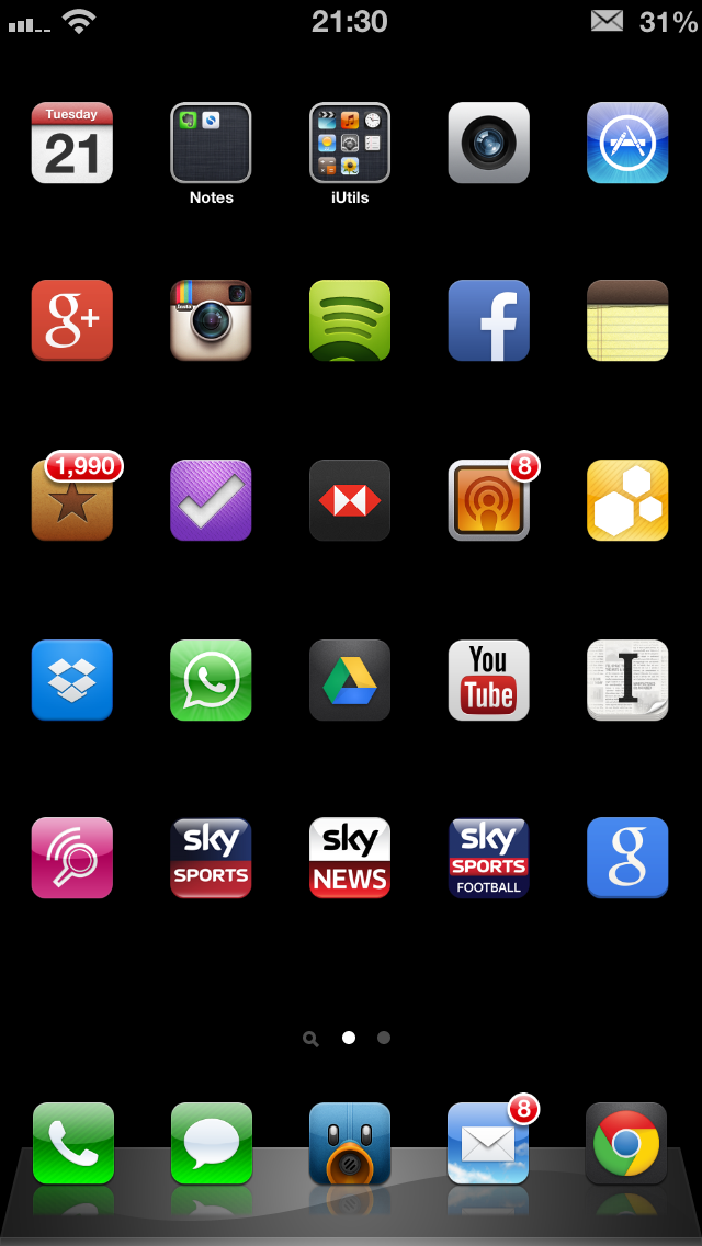
When it comes to my Home screen, I actually have two versions that I keep flicking between – both basically the same with one difference: a widget.
Icon-wise, it’s all stock. The only difference here is the addition of Springtomize 2 so that I can make the icons smaller than usual (sized at 65%), remove the labels, and have five icons per row. I know all the icons on my Home screen, and I use Spotlight to launch apps on other screens, so I don’t need the labels cluttering the view up. It all goes towards creating the minimalist feel I like so much, and I’ll never understand why Apple ships that high resolution screen only to slap huge icons on top of it.
So, about that widget that I keep flicking on and off depending on what mood I wake up in. It’s powered by Dashboard X 2.0 and the widget is the same one I have on the Lock screen and Notification Center, which is why I keep deciding not to use it. I’ve not found any battery or stability issues when having it there, it’s purely an aesthetic issue. Take it or leave it.
The whole thing is brought together by a perfectly black wallpaper on both the Lock and Home screens which, with a black iPhone 5, makes icons and notifications look like they’re floating in thin air. Awesome.
Hopefully that will clear the screenshots up for those trying to replicate my set up. There are countless themes and icon packs on Cydia, but they’re all about cluttering things up more than they need to be. For me, I want everything to get out of the way, showing the information I want and giving me access to what I want, when I want it.
The fact it looks awesome is just a bonus!