With Apple’s high-end iPhone 8 rumored to feature a notch in the middle of the iOS status bar at the top of its seamless screen, Max Rudberg has come up with some thought-provoking mockups that highlight how the Cupertino firm could own that pesky break in the OLED display.
His mockups are also full of smart ideas regarding potential changes to the iOS user interface on iPhone 8 that would afford a much more convenient bottom-oriented navigation.
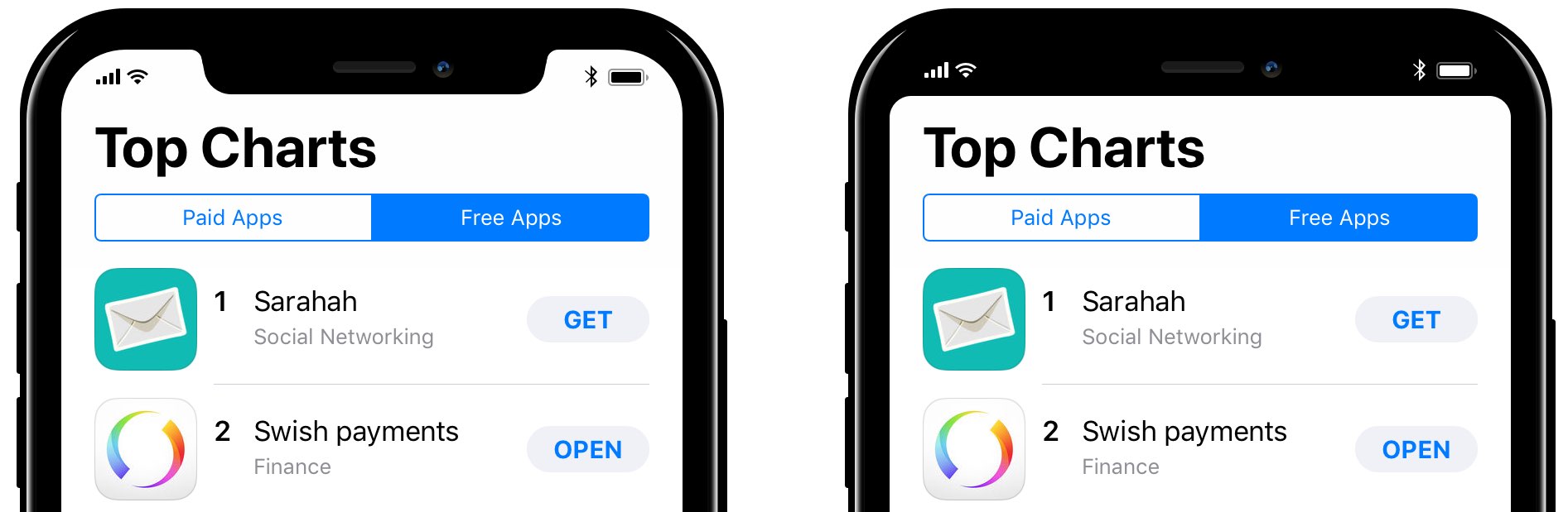
To illustrate this, he used the screenshots of the App Store’s Top Charts section.
As you can see for yourself, he’s basically calling for a split status bar at the top that could integrate the title bar as well, with a so-called function are at the bottom hosting a virtual Home button in the middle and title bar controls docked on the sides.

Left to right: App Store on iPhone 7 with the current iOS user interface; splitting the notch on iPhone 8; hiding the notch; and lastly, hiding the notch and blending the bottom bar.
For example, the App Store’s “All Categories” and “Apps” links could move from the top of the interface to the bottom, making it super easy to use apps on the device in one-handed mode.
The bottom area could host app-specific shortcut akin to the new MacBook Pro’s Touch Bar.
Rudberg said:
Beforehand, I was fond of the idea of blending the status bar with the hardware, but seeing the mockups like this, I’m not so sure. Blending the status bar with the hardware makes the screen seem smaller than it is and the result is less striking.
I’m now leaning towards that Apple will embrace the notch.
Docking the title bar controls to the function area at the bottom may not even require too much effort from app makers because UIKit could do most of the heavy lifting due to the way app interfaces are constructed in Xcode.
Of course, all of this is pure speculation at this point because we know virtually nothing about the changes that may be coming to iOS with the release of iPhone 8.
Interaction designer Brad Ellis leans towards completely ditching the navigation bar in favor of reach navigation, like with Android, because burgeoning screens mean the distance between the navigation bar at the top and our thumbs has grown.
He wrote in a Medium blog post that Apple should stop sticking important buttons to the top of the screen because “better navigation is within reach.”
How do you like Rudberg’s ideas so far? Should Apple own and fully embrace the notch or attempt to hide it as much as possible, do you think?
And how would you deal with the notch situation if you were on the iPhone team?
Lets us know in the comments!