
Apple’s drab-looking Apple ID website, the place where users go to manage everything about their Apple IDs, has been updated with a fresh new coat of paint. Instead of the boring color-less look of old, Apple has adopted an up-to-date bold new look for its hub focused on managing passwords, devices, and other vital account information.
Apple has even incorporated its main site’s header links into the update to make appleid.apple.com feel more like an extension of Apple’s main website instead of an offshoot site that you visit when you have issues with passwords or authentication.
One of my favorite parts of the redesign is the new two-step verification screen. If you have two-step enabled, you’ll be presented with a slick-looking scrolling list of all valid authentication devices to choose from.
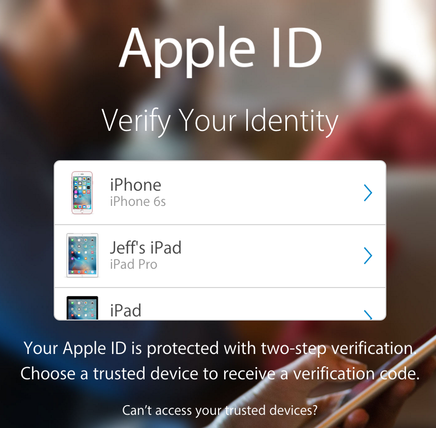
The new slick looking two-step verification scrollable list
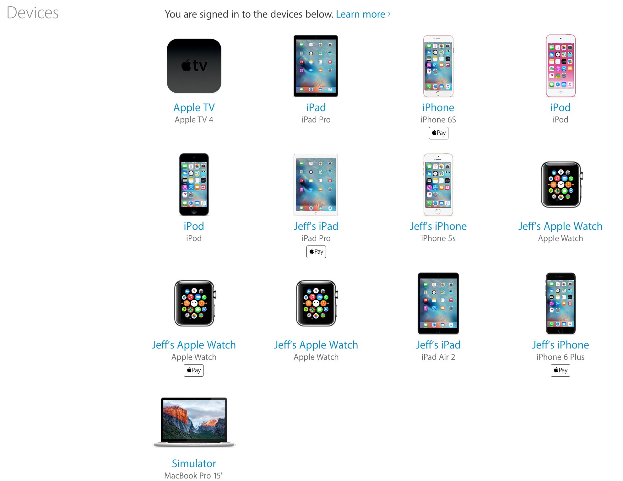
Another part of the update that I enjoy is the new Devices section. In this section, you’re given a visual list of all devices currently tied to your account. It’s there where you can glean key details like Apple Pay status, serial number, phone number, IMEI, etc.
The first step is admitting you have a problem…
Apple’s Apple ID website has been long overdue for a redesign, but I think it’s safe to say that the wait was well worth it. It looks good on the desktop, and looks even better when running on smaller mobile devices like the iPhone.
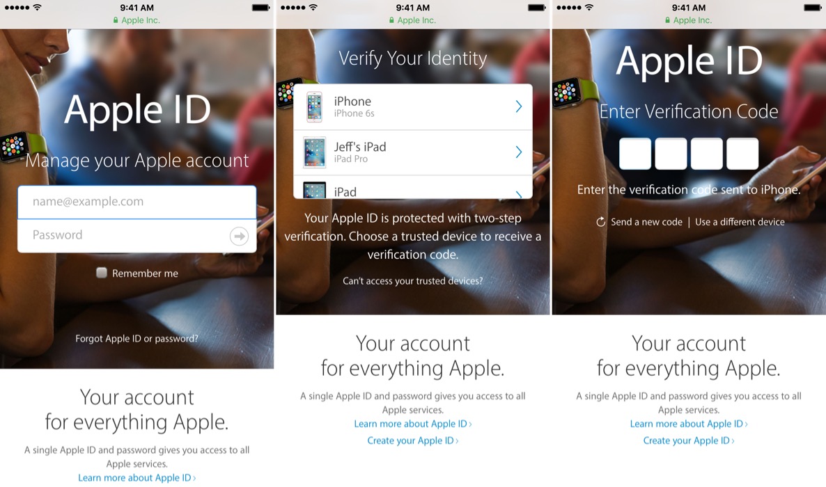
Looking good on the iPhone
What do you think about the fresh new look? Do you like it?