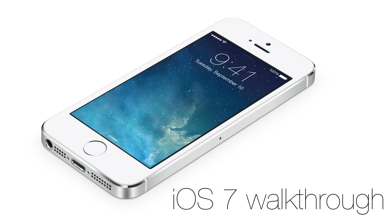
iOS 7, as you’re likely already quite aware of, is an absolute huge departure from the status quo. Apple has completely abandoned the design concepts that it established in the 2007 debut of the iPhone, which have been prevalent up until now. The operating system that was once known as iPhone OS, now resides on numerous devices, from various iterations of iPhones, to iPads to iPod touches. The design language has been fairly consistent across the board since its inception.
So why the big change? After iOS head-honcho Scott Forstall’s ouster, Apple decided it was time to go in another direction. Its operating system, looking a bit long in the tooth, was in dire need of an overhaul. With Forstall gone and renowned hardware design specialist/Steve Jobs right-hand-man Jonathan Ive now in control, iOS is headed in a remarkably different direction.
iOS 7 is the result of said new direction, and it’s a radical departure from iOS of old. All of the design language, from the biggest feature down to the smallest, has been completely replaced with something new. Even the ringtones and alerts that we’ve grown to love (or hate) from previous iterations of iOS have been replaced.
What we have now is an operating system that feels slightly familiar, but is basically a completely new experience, at least from a visual and sensory perspective. For that reason, we’ve deemed it appropriate to go in-depth with many of the various aspects of change in this walkthrough. The goal of this walkthrough is to provide you with a complete and comprehensive look into what makes iOS 7 tick.
iOS 7 represents a bold new direction for Apple post Steve Jobs. It’s a huge step for a company that has lived in the shadow of its beloved co-founder since his passing. This is the first footstep out of that shadow. This, ladies and gentlemen, is iOS 7.
Note: this is a “living” document. We will be updating and adding more parts to this walkthrough during the day and coming days and weeks. Please check back often for the latest.

- Home screen
- Lock screen
- App switcher
- Folders
- Notification Center
- Control Center
- Spotlight
- AirDrop
- Wallpaper
- Sounds
Device compatibility
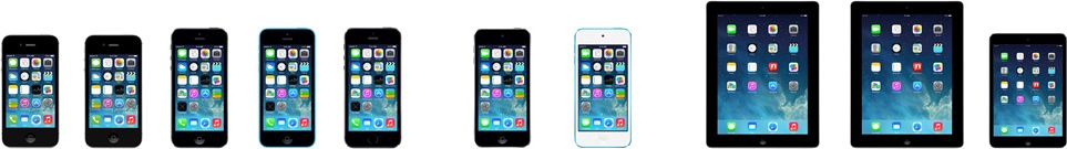
iOS 7 is compatible with all retina enabled iPhones, including the iPhone 4. iOS 7 will also work with all iPad’s starting with the iPad 2. Here is a full list of the devices that iOS 7 is compatible with:
- iPhone 4
- iPhone 4s
- iPhone 5
- iPhone 5c
- iPhone 5s
- iPod 5th generation
- iPad 2
- iPad with Retina Display
- iPad mini
Bear in mind that not all of features are supported on every device. For example, AirDrop is available only on the iPhone 5 and later, Siri on iPhone 4s and later, etc.
How to prepare for iOS 7
The best way to prepare for iOS 7 is to first backup your device to iCloud or to iTunes before performing an upgrade. Not only should you ensure that you backup the content on your device, but you also should save all of your downloaded apps to iTunes. That way, once you perform a restore after installing iOS 7, all of your compatible apps will reappear as they were.
The following video will show you the proper way to backup your iOS device.
Installation and Setup
There are a few ways that you can go about installing iOS 7 on your device. The three most popular (sorted starting with the easiest) methods are as follows:
- Software update (OTA)
- iTunes update
- iTunes restore
The Software update option can be found within Settings app. Simply go to Settings > General > Software Update to check and see if you have an iOS 7 OTA (over the air) update available.
The Software update option will automatically carry over all of your files and settings, as will the iTunes update option. The iTunes restore option will not carry over any settings, and you’ll have to restore a backup manually to get back your data.
Here is a video highlighting some of the installation options, along with a step by step walkthrough of iOS 7’s newly redesigned setup wizard:
Restoring content
If you opt to go the third route and go with a fresh install via an iTunes restore, you still have the option of restoring your data from backup. To do so, connect your device to iTunes, and click the Restore Backup option. Select your desired backup (usually the most recent) and watch as the restore completes. Here is a video showing how easy it is to restore backed up content via the iTunes Restore Backup option:

A lot of folks distinguish iOS 7 as being different due to its flat coat of paint. While that is true, it’s not the main distinguishing factor between it, and previous iterations of iOS.
Not until you go hands-on with iOS 7 do the differences begin to become remarkably obvious. For instance, invoking the app switcher, launching an app, exiting apps, and opening folders are all met with new animations. These animations are what really set iOS 7 apart from anything else Apple’s made in mobile.
Instead of operating on a 2D plane, a simple x and y axis, iOS 7 introduces a new z axis for true 3D movement between its various elements. Unlock a device running iOS 7 and you’ll see what I mean. The Lock screen is brushed aside as all of the Home screen app icons zoom into view from the foreground.
When you launch an app, it’s the same basic principle. The app zooms into the foreground, leaving the Home screen in the background, behind the launched app. Close the app, and yes, the app is zoomed out to reveal the Home screen once again.
The app switcher plays along perfectly with the new mechanics. Instead of opening up from the bottom of the screen, the iOS 7 app switcher serves as a middle layer — one that’s between the Home screen and the full screen apps. Folders, as you would expect, work much the same way.
In my opinion, iOS 7’s layout makes a whole lot more sense than its predecessors. Older versions of the software feel restricted and two dimensional, while iOS 7 adds a subtle third dimension — the z-axis — to the mix.
Apple was able to pull all of this off without alienating its users who are accustomed to the way iOS works. For that reason, the majority of its users will be able to step right in and start using iOS 7 with little to no learning curve. It’s different, but it’s not unfamiliar enough to where it feels foreign.
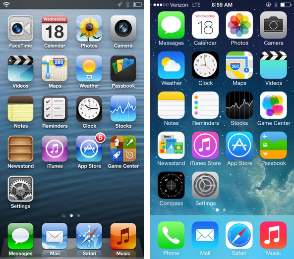
Home screen
Since this is what you’ll see more than any other feature on your iPhone, I’d like to talk about the new Home screen. While the basic functionality and user experience for the Home screen remains the same as with previous version of iOS, there are some definite differences to be found in iOS 7.
The biggest and most obvious difference is the new app icons. Not only do the new icons enjoy a more round shape, the stock iOS icons have been completely overhauled with an “iOS 7” look. The buzzword going around prior to iOS 7’s debut at Apple’s World Wide Developers Conference was “flat.” While that’s somewhat applicable, it doesn’t really tell the whole story.
The big story with iOS 7’s icons, and iOS 7 as a whole, is its riddance of skeuomorphism. Skeuomorphism was more than just 2013’s favorite buzzword, it’s something that both Steve Jobs and Scott Forstall reportedly swore by. Skeuomorphism is when a a digital element of design mimics its real world counterpart. It’s something that’s heavily featured in all versions of iOS prior to iOS 7.
A good example of skeuomorphism is the Notes or Voice Memos app. Prior to iOS 7, The Notes app looked like a real world legal pad, and the Voice Memos app came with replica of an old-school condenser microphone. In other words, it resulted in a familiar look that users could quickly identify.
When you take a look at these same apps in iOS 7, you’ll notice that the yellow lined paper is no longer present in the Notes app, and the Microphone has been axed in the Voice Memos app. The result is an app that looks less familiar, and as a result, less dated.

The Voice Memos app looks completely different in iOS 7
While the lack of skeuomorphism has resulted in a significantly more modern looking design, it also means that newcomers to the platform may have a more difficult time distinguishing which apps do what. It’ll bump the learning curve up a notch or two for those who have never used iOS, because those users won’t be able to relate the stock apps to their real world counterparts as easily as was possible in prior versions of the software.
With that said, I think that this change had to happen. iOS was looking very outdated and old. This new coat of paint has gone a long way into reinvigorating the platform, making it seem more modern, futuristic, even.
The icons are still a heavy area of debate, though. Along with ditching the real world relationships with regard to the look of the apps, the icons, and interface in general, is significantly brighter and vibrant. Apple has adopted bright icons with much less depth than iOS of old. The result is something that looks more up-to-date, but at the same time, seems a bit childish in the process.
iOS 6 on the left, iOS 7 on the right
While I found the icons to be a bit of a shock at first, they have grown on me as I’ve used iOS 7 on a day-to-day basis. I’m sure that after some usage you’ll feel likewise. In fact, I outright prefer nearly all of the new icons when compared to their older counterparts.
Lock screen
Another place in iOS where you’ll spend a significant amount of time is the Lock screen. As you would expect, it too has been completely revamped to match the overall styling of iOS 7.
The big thing that stands out here is the font. Apple has adopted a slimmer, more elegant font style called Helvetica Neue Ultralight. It’s still the same old Helvetica that we all know and love, it’s just stylized to look a lot more dainty in appearance.
The new font appears all throughout iOS, but nowhere is it more noticeable than the Lock screen. The Lock screen’s clock is much more pronounced than it was in iOS 6, and there’s no background behind the font to distract you.
Unlocking your device still requires the familiar slide to gesture, except that instead of sliding a single bar, you’re essentially sliding the entire Lock screen page when unlocking the device. In fact, you can slide to unlock anywhere on the Lock screen.
It’s also definitely worth mentioning that you can now access Notification Center directly from the Lock screen. This, coupled with the new Control Center overlay, lends a much better Lock screen experience than on previous versions of iOS. This feature alone would make it hard to go back to older iOS versions.
App switcher
iOS 7 adopts a new card based app switcher that has quite a few advantages over the legacy iOS app switcher. The most obvious benefit gleaned from the new app switcher is the fact that you now have full screen preview of your running apps.
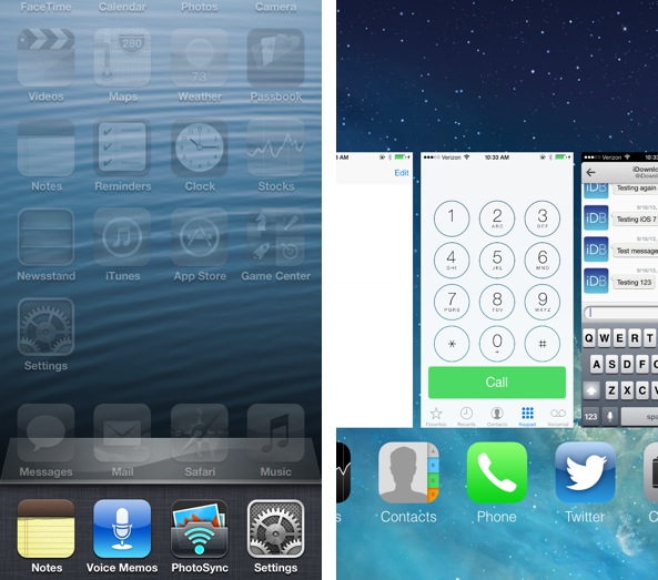
The app switcher is immensely improved in iOS 7
Full screen previews aren’t just for show, no, they allow you to gain context of running apps before you decide to open then or close them. Speaking of closing running apps, this no longer requires you to tap and hold on an app icon like in previous version of iOS. In iOS 7, Apple has taken a page from PalmOS, and uses an upward swipe gesture to dismiss running apps.
The only downside I see with the new app switcher, is that you can only see three running app previews at the same time. Since the app previews obviously take up more real estate than a simple app icon, this is understandable.
With that being said, app icons still appear beneath the full screen app previews, and you can choose to tap on the icons instead of the app preview windows. It’s a stretch, but if you position the app switcher just right, you can see up to five app icons at the same time, and it’s possible to interface with the app icons in order to perform switching more efficiently.
Folders
The z-axis comes into play once again with iOS 7’s folders. Instead of opening up within the 2D plane as they did on previous versions of iOS, folders in iOS 7 open in 3D space, much like apps themselves.
While you still can’t embed folders within folders, you’ll be happy to know that Apple at least decided to meet us half way, in that we now have pagination. For the first time ever in stock iOS, you can have multiple pages within a folder, much in the same way as you have multiple pages on your Home screen.
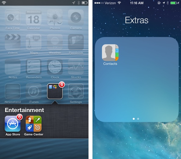
Old folder style versus new and improved folder style
Needless to say, folders are a lot more useful in iOS 7, and can hold a lot more stuff. The result of this change is (hopefully) a lot less clutter on user’s Home screens.
Notification Center
Notification Center in iOS 7 feels like much less of an afterthought this go ’round. Not only is it more appealing from a pure visual perspective, (linen is gone thank goodness) but it’s a lot more informative.
In iOS 7, the Notification Center is split into three different panels: Today, All, and Missed. The All panel is the more traditional Notification Center view that legacy users will be familiar with.
The big feature is the new Today panel, which hosts all sorts of useful information for users to digest in a glance. At the very top of the Today panel is today’s date, followed by a forecast of the current weather conditions, highs, and lows.
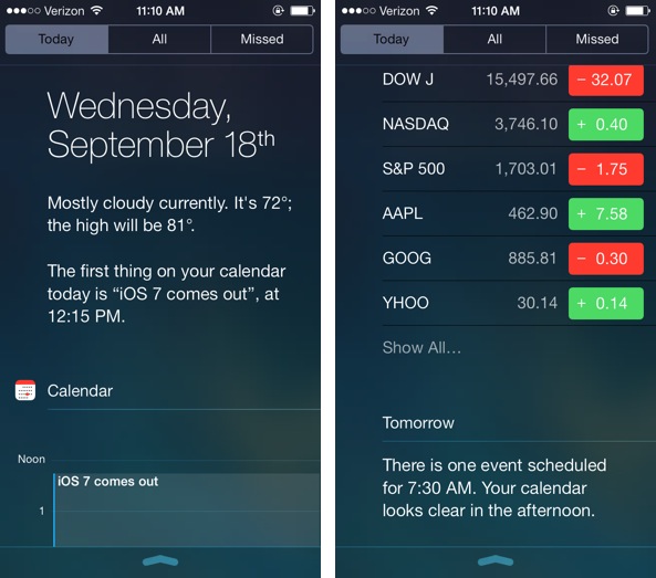
The new and improved Notification Center in iOS 7
Underneath the weather resides information regarding any appointments you have setup in the Calendar app, followed by a newly redesigned stocks widget, and a brief look at tomorrow’s schedule. All of these features can be customized using Settings > Notification Center.
One of the really cool things you’ll come to appreciate about Notification Center is how it can display next destination times. After some usage, iOS will begin to learn your life patterns, and know when you travel to certain places at certain times. It’s then able to automatically let you know how long it’ll take to reach certain destinations without you even asking.
I think Notification Center is a huge leap over what we had in iOS 6. I like the fact that Apple didn’t go to extremes and try to jam tons of incidental information down our throats just for the sake of trying to flesh it out.
Control Center
Control Center is one of the few legitimately new features in iOS 7. I’m not talking about refreshed, or updated, I’m talking a 100% from scratch brand new feature. Control Center is akin to the menu bar on a desktop machine, or for you jailbreak users out there, SBSettings.
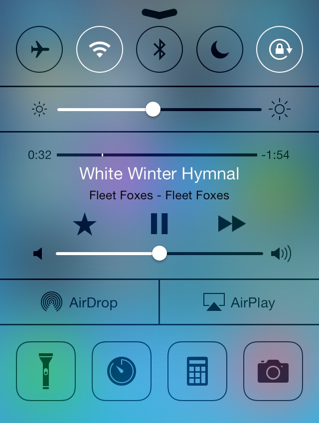
Control Center is a panel that you can access from the bottom of your screen by performing a slide up gesture; it’s basically the inverse of Notification Center.
Like Notification Center, Control Center can be accessed at any time, and from any app (if you allow it to do so via its preferences in the Settings app). It basically brings four main features to your fingertips: toggles, music controls, AirDrop & AirPlay, and quick shortcuts.
Let’s break each feature down one-by-one:
Toggles
The quick toggles allow you to do something that iOS users have been clamoring about since the original iPhoneOS — quickly toggle specific features of the device on or off. While some may not be satisfied with the toggles that Apple decided to include in Control Center, or the fact that they can’t be customized, I think users should be happy about this first step.
Maybe iOS 7.1 will bring more fine-grained control over the experience. Until then, I’m just glad to finally have quick toggles.
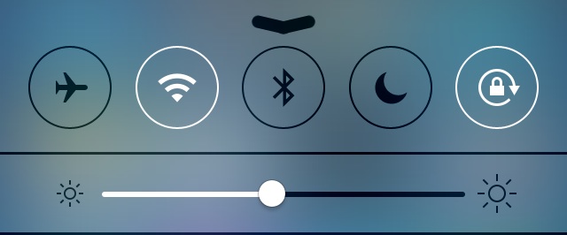
The toggles that Apple includes are as follows:
- Airplane Mode
- Wi-Fi
- Bluetooth
- Do Not Disturb
- Rotation Lock
- Brightness
True, it’s a pretty anemic list that would greatly benefit from customization, but I think we can all agree that these are probably the five most popular toggles for the average user.
The toggles work just as you would expect — tap the toggle once to toggle its setting on or off. You’ll know it worked when the toggle turns white, and you also get a little notification at the top of Control Center when you toggle an item on or off.
The only toggle that doesn’t work this way is the brightness toggle. That’s because it’s not really a toggle at all, but a slider that can easily be adjusted using a slide gesture.
iPhone users should rejoice, because this is the first time that we’ve been able to adjust the brightness properly without venturing into the Settings app. iPad users at least had an option to adjust brightness in the traditional app switcher.
Music Controls
The music controls found in iOS 7 are fairly straightforward. You may be disappointed to find that no album art for the currently playing track is displayed in Control Center, but outside of that, everything is pretty much the norm. Users can go back, skip, pause and play music, adjust the volume, and scrub the currently playing track.

The music controls are sandwiched right between the toggles and the AirDrop/AirPlay sections. I have to admit that it all looks a bit cluttered, especially with the lack of album art to immediately make it distinguishable from the rest of the Control Center interface.
If you happen to be user Apple’s new iTunes Radio feature, then you’ll be happy to know that you can star favorite tracks right from Control Center, or from the Lock screen for that matter.
AirDrop
The AirDrop section found within Control Center isn’t actually AirDrop in itself, but a toggle that allows you to quickly turn the feature off or on. You can turn it off, enable it for contacts only, or enable it for everyone right from the convenience of Control Center.
![]()
If iOS featured a centralized file manager, then it would be possible to send files from AirDrop directly from Control Center. Until Apple takes this much needed step, however, you’re relegated to sharing files from within specific apps.
AirPlay
The AirPlay option found within Control Center is the exact same feature that can be found on older versions of iOS with AirPlay. From here you can select specific AirPlay targets, and if the host supports it, enable AirPlay mirroring.
Shortcuts
The shortcut option found within Control Center allows you to quickly launch a set of specific apps and toggle the LED flash for flashlight functionality. The flashlight option is brilliant, and a much needed option for stock iOS.
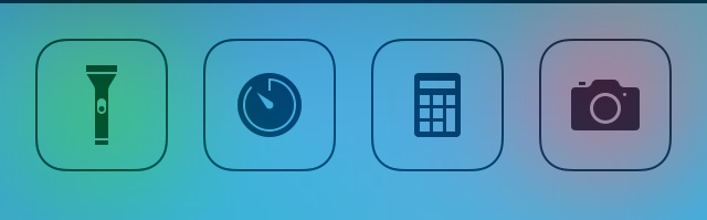
The other three app shortcuts, Timer, Calculator, and Camera, are a bit disappointing. It’s not disappointing because you have quick shortcuts to those apps, it’s disappointing because this is a big missed opportunity by Apple to lend its users a bit more user customization.
The shortcuts within Control Center cannot be customized at all. You’re stuck with the four default shortcuts, and that’s it. If we can customize which notifications appear in Notification Center, then it only makes sense that we should be able to customize the shortcuts appearing in Control Center. Never use the Timer? Well, that’s just too bad.
Spotlight
Spotlight search was hated by many iOS users, because it featured its own dedicated page in older versions of iOS. A lot of users felt that the presence of a dedicated page for Spotlight search was overkill.
Apple has responded by eliminating the dedicated Spotlight page in favor of something new. Instead of swiping over to the left most side of the iPhone’s Home screen layout, all you need to do now is swipe down to invoke the redesigned Spotlight search.
This new implementation accomplishes at least two things: one, it eliminates the dedicated search page that many deemed to be unnecessary, and two, it allows you to access search quickly from any Home screen page.
AirDrop
Although the AirDrop feature shares the same name with its OS X counterpart, the two features are disappointingly not compatible with one another. You can use AirDrop on iOS to share files between iOS devices, but not between OS X and iOS devices.
With that said, AirDrop on iOS is a reasonably cool feature to have. It essentially allows you to share files with another iOS user without any messy passwords or cumbersome setup. Files are shared using a combination of Bluetooth and WiFi, so both must be enabled.
To see a demonstration as to how AirDrop works on iOS, have a look at our video walkthrough below:
Keyboard
The keyboard, while lacking any new features from a function standpoint, has been overhauled with a look that’s more aligned with the rest of iOS 7. It looks and feels exceptionally modern, especially when compared with the outgoing keyboard.
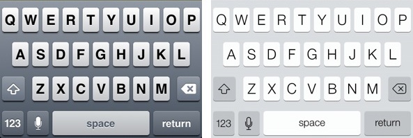
Old keyboard versus new keyboard
It would have been swell if Apple took some of the great tweak ideas from the jailbreak community, and added a bit of extra function to the mix. To be more specific, I wish that Apple would have added something like SwipeSelection to the keyboard, which would make it much easier to select text on the small iPhone screen.
Wallpaper
There’s a new feature in iOS 7 called the parallax effect. It’s basically a gimmicky feature that allows you to have a 3D effect when you move your device around. iOS 7 is comprised of various layers, all with some amount of transparency. The bottom layer — the wallpaper — is thus affected when the parallax effect is enabled.
You can get a better sense of what this effect is and how it works by watching our video and reading our previous report.
Also new in iOS are a bunch of new static and dynamic wallpapers. The dynamic wallpapers are different from the basic parallax effect, in that they themselves are animated. We’ve covered all of the wallpapers in our video roundup. Have a look below to see them all in action:
In total there are seven dynamic wallpapers and 33 static wallpapers. Many of them have been designed with the new iPhone 5c colors in mind, and as you might imagine, the combination looks great.
Sounds
As mentioned previously, iOS 7 is home to a host of brand new ringtones and audible alerts. While the legacy sounds are still present as classic sounds, the new sounds are front and center. We’ve compiled a video that lets you hear every new ringtone and alert sound present within iOS 7, you can enjoy it below:
Seeing as that the outgoing sounds were starting to get a little stale, I’m happy to hear some new refreshing sounds in iOS. The new ringtones are well done, and I already have quite a few new favorites to select from.

Best feature
If I had to pick one feature from iOS 7 to label as the release’s crowning achievement, it would have to be Control Center. Even in its initial form, Control Center brings so much to the table that’s been desperately needed since iOS’ inception.
It might sound simple, but the lack of the ability to adjust simple settings on the fly is one of the most compelling reasons for jailbreaking the iPhone. Now that we have a native built-in way to toggle Wi-Fi, Bluetooth, Brightness, and the Flashlight, I think a lot of the people who used to jailbreak for that reason will be ecstatic about Control Center.
iOS 7 brings a ton of new things to the table, and it’s difficult to just select a single feature and crown it as being the best. But, If I have to pick one single area where I think iOS was benefited the most, it’s without a doubt Control Center.
Worst feature
The worst feature is actually not as bad as many make it out to be, and certainly not as bad or as shocking as it was when iOS was initially revealed. The worst feature is/was, at least at one point and time, the redesigned app icons.
Let’s be honest here, rarely has something in iOS been as polarizing as iOS 7’s redesigned app icons. When they were first revealed at WWDC 2013, I was almost sure that I heard a collective grown across the entire tech landscape.
I think it’s safe to say that none of us expected the iOS 7 app icons to look exactly as they did when they were revealed. Of course, we all expected them to be “flat” but probably not as wacky and far out as they seemed when they were first shown.
In hindsight, though, Apple made the right move, especially when you look at the iPhone 5c, the company’s new iPhone for the masses. iOS 7 was made with the colorful iPhone 5c in mind, it’s that simple. With that considered, the app icons don’t seem nearly as bad as they seemed back during WWDC.
I still question some of the design choices for some of the app icons — I’m looking at you GameCenter — but most have grown on me. At the end of the day, it’s hard to really peg the worst feature on a design choice that ultimately turned out to be the right decision. The app icons seem to get less and less offensive every day.
If there was one glaring flaw, one missing feature that we all expected to see when iOS 7 was revealed, it’s quick reply for Messages, Mail, etc. The lack of quick reply in iOS is simply unacceptable at this point and time. I think that’s a fine candidate for the worst feature, or at least the worst omission in iOS 7.
Should you upgrade?
Yes, upgrade.
The only reason I wouldn’t recommend upgrading is if you’re worried about losing your jailbreak. Even then, I’d tell most jailbreakers, all but the most devout, to go ahead and take the plunge. Even the best jailbroken iPhone is far inferior to iOS 7. Yep, it’s just that good.
This is an operating system that’s truly futuristic and refined. No one feature really stands out as being amazing, but it’s the cumulative effect of all of the adjustments and refinements that makes iOS 7 a memorable release.
Final thoughts
iOS 7 is but the first step in Apple’s design restructuring under Jonathan Ive. The iOS we once knew as imagined by Scott Forstall is no more. This is Apple’s new direction, and it’s truly exciting to see what they’ll do going forward.
When you think about it, the way this company was able to turn around, and create what, in some respects, amounts to a brand new operating system from the ground up, can’t be emphasized enough. What they’ve done is basically unheard of, and it’s a testament to the talent that still remains on campus in Cupertino.
iOS 7 as we see it today probably isn’t exactly what Apple has in mind as far as long term goals are concerned. It’s just the initial step, a reboot of sorts, and there was probably only so much they could iterate during this initial release.
I think the big upgrade is going to be iOS 8. It’ll be the first post-Forstall release where Apple doesn’t have to work on rewriting everything. They can focus on key improvements that they’d like to make to the OS as a whole. Today’s release was all about righting a ship that was headed a few degrees off course. Now that the compass is pointing true north, I think we’ll see some amazing stuff at next year’s WWDC.
Despite unfounded fears from Wall Street. Despite many a tech journalist wishing to proclaim Apple as creatively bankrupt. Yes, even despite increasing competition from companies like Samsung, Apple is here to stay. The iPhone 5c, and to a greater extent, iOS 7, is proof of that. And for that reason, it truly is a great time to be an Apple fan.