![]()
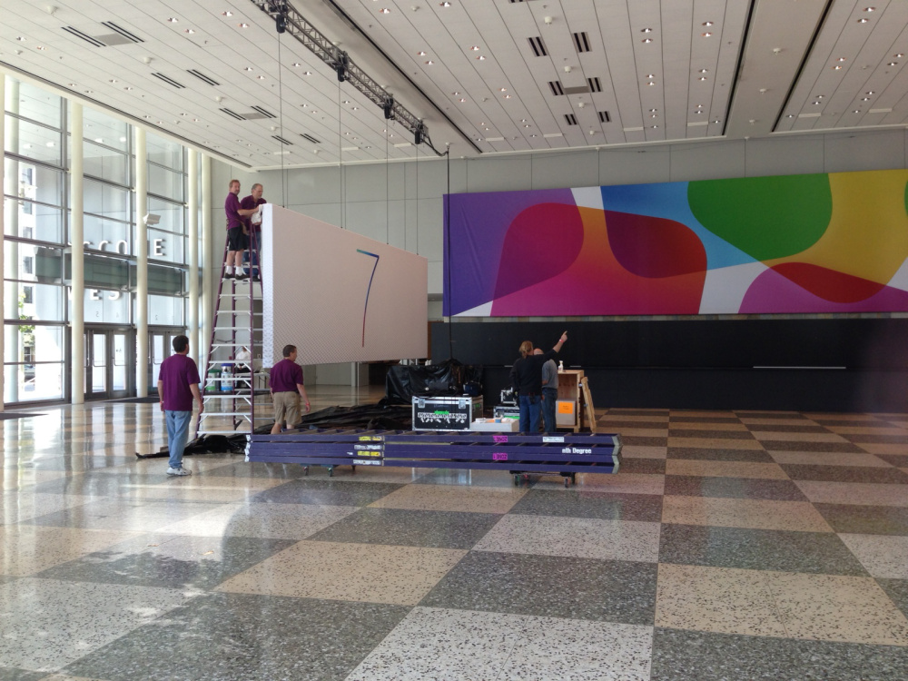
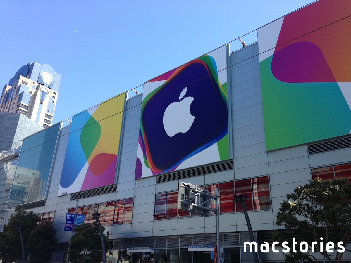
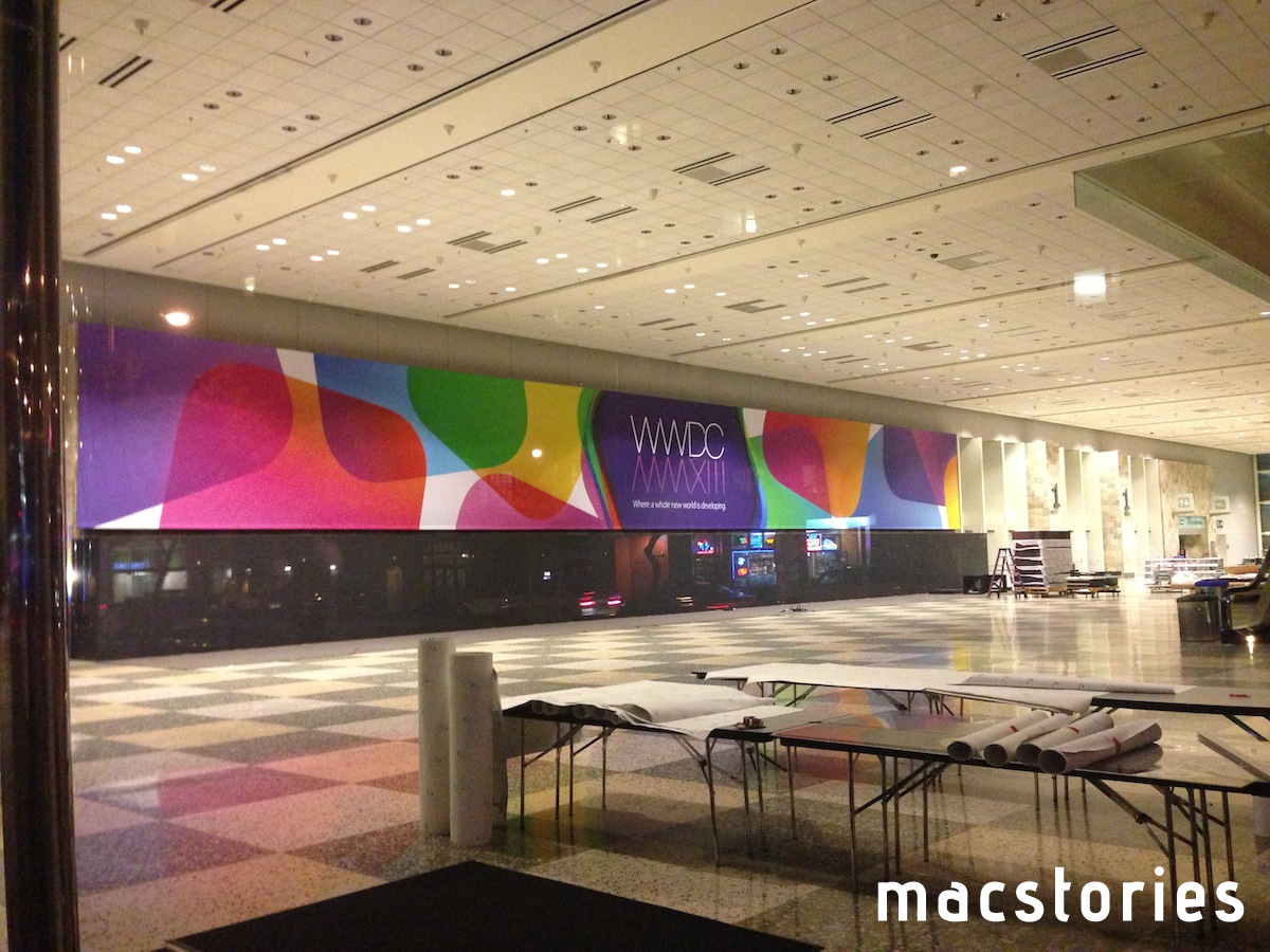
Apple yesterday started dressing up the Moscone West building ahead of Monday’s keynote. The banners depicting flat icons hint at the iOS 7 redesign while revealing the conference slogan: “Where a whole new world is developing”.
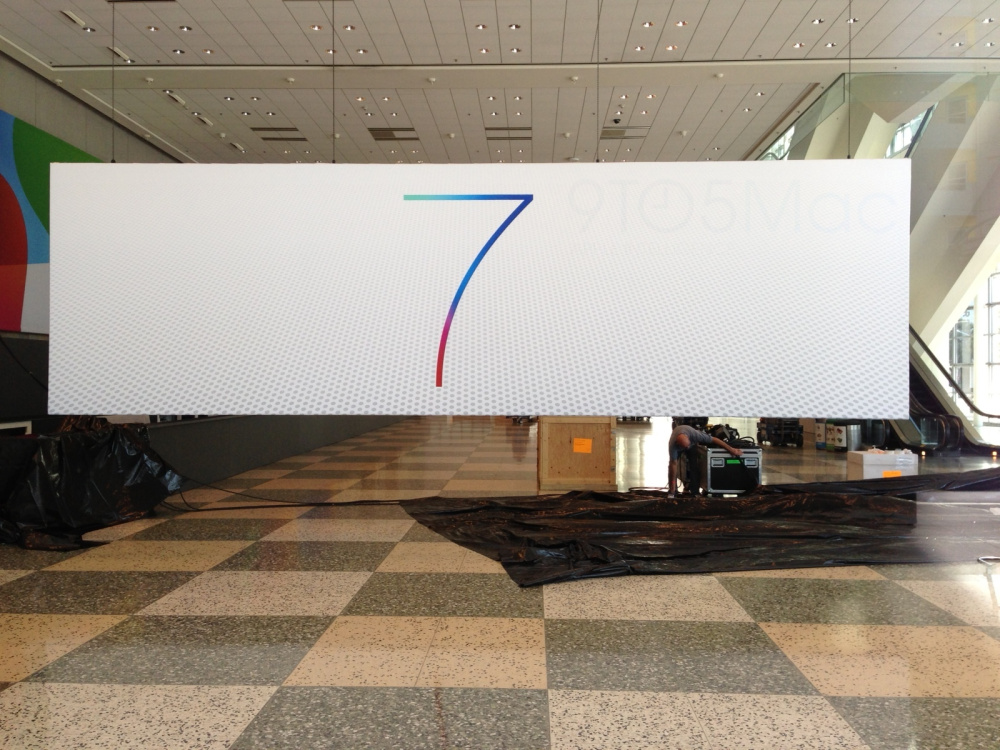
Numerous photographs of both the interior and exterior have arrived since and today we capture a glimpse of what looks like the official iOS 7 logo.
Unlike past graphics-heavy iOS logos, the newly revealed signage outside San Francisco’s Moscone West depicts an elegant and very thin “7” against the white background. As you could imagine, it oozes minimalism and stylishness, which are said to be key themes behind the major iOS 7 overhaul.
Yes, 7 could mean anything and yes, we’re pretty sure Apple meant iOS 7…
The photograph was captured by MacStories.
Two more, via 9to5Mac.
Maybe the people who made the iOS 7 logos for Moscone know nothing about iOS 7 either. Just like the black, white, flat WWDC app designers.
— Mark Gurman (@markgurman) June 7, 2013
And this is the OS X logo, as depicted on one of the banners.
![]()
Could an all-white ‘X’ signift the simplification of OS X, too?
BTW, MacStories also has a bunch of other high-res WWDC banner photos here.
Notice how the “7” is colorized using the same scheme seen on the WWDC 2013 logo.
The colors, according to people in the know, are a subtle hint at a Jony Ive-fied iOS 7, where each stock app has adopted its own color theme against a white base.
“While the core elements of those apps are mostly white, each app has been given a unique button color,” Mark Gurman of 9to5Mac recently described.
@llsethj Don’t be so flat.
— Jay Yarow (@jyarow) June 7, 2013
People have also gotten excited about the following banner covered in white cloth.
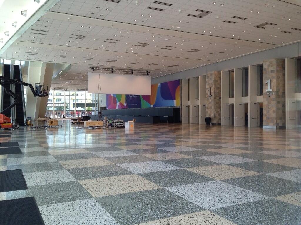
Image via Mark Gurman.
We’re still figuring out whether this one’s yet to be glued or perhaps Apple has a last-minute surprise up its sleeve.
Let the guessing game begin, we’re down in the comments.