Today’s a leaks day, folks. First we learned that Apple will be kicking off the upcoming WWDC with a 10am PT keynote come June 11, then a cool-looking aluminum backplate surfaced to reveal a couple nuggets concerning a sixth-generation iPhone and now a set of photos from “a trusted source” (aren’t they always?) show off the exciting new 3D mapping functionality of the re-worked Maps app in iOS 6.
Oh, and Apple also launched the official WWDC 2012 app. Taking it all in, we can now conclude with a reasonably high degree of probability that folks in Cupertino are ready to ditch the familiar blue theme in iOS and supplant it with a fresh new sexy silver look.
How’s that? Read on…
The first hint came via Boy Genius Report which published leaked photos of the enhanced Maps app in iOS 6.
The program reportedly rocks a brand new three-dimensional view, with editor Jonathan Geller observing in his article (emphasis mine):
BGR has obtained exclusive information and photos of parts of Apple’s new Maps app from a trusted source, and the app features a refreshed user interface including a brand new navigation bar.
This bar, we’re told, is silver instead of blue.
And if that wasn’t enough, Geller speculated that “since the current Maps app follows the standard blue iOS color scheme, we think it’s possible Apple might shift toward a silver color theme in iOS 6 like on the iPad”.
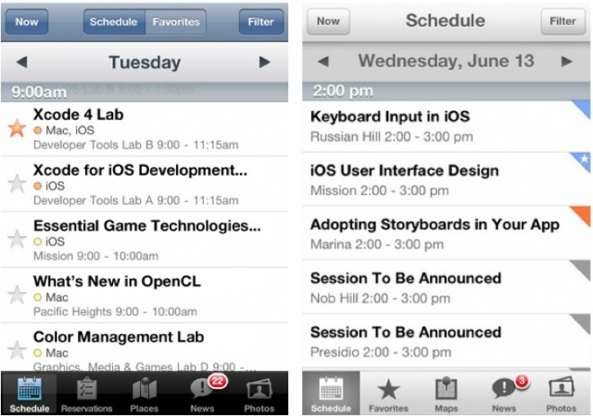
We originally dismissed Geller’s thinking as convenient speculation until Killian Bell, writing for Cult of Mac, pointed out a similar change in Apple’s official WWDC 2012 app.
If a picture speaks more than a thousand words, this one speaks for itself.
Killian noted:
Unlike last year’s app — which featured a black bar along the bottom and a blue bar along the top, like traditional iPhone apps — this one sports silver bars and buttons both top and bottom.
It’s also worth pointing out that Apple’s been transitioning its iLife suite on the Mac toward the silver appearance, iPhoto being the perfect example.
Plus, a number of stock iPad apps sported silver appearance from day one, including Maps and YouTube, for example.
If you ask me, the new look – apart from being fresh and novel – is a lot easier on the eyes and more elegant.
It just looks right.
Proof #3.
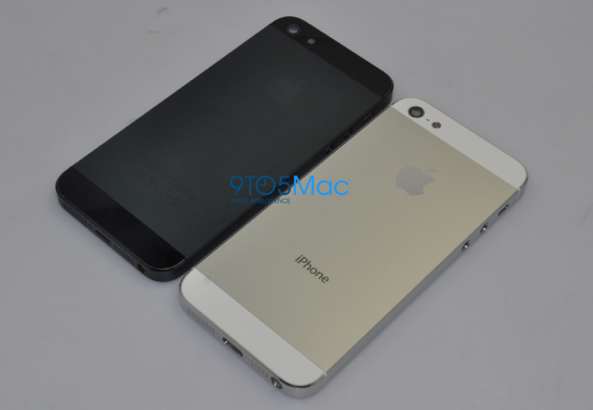
Image via 9to5Mac
That is a supposed backplate of a sixth-generation iPhone in both black and white, apparently an early production component. As you can see, it’s aluminum-clad back tells us the next iPhone could revert to a tad industrial look akin to the original model.
This just makes a whole lot of sense to me.
When you take a look at your iMac and examine both its exterior and what’s on the screen, it just all falls into place appearance-wise.
The shiny, stunning look and feel of its aluminum chassis is seamlessly reinforced with a grayish theme of OS X Lion.
Everything’s kinda fusing smoothly into this aesthetically uniform and pleasing experience: the hardware, the software and the industrial design.
Who’s to say Apple isn’t about to re-imagine the iOS software and mobile devices along the same lines?
If this silver user interface appearance is really in the cards, here’s to hoping they will consistently apply it system-wide because Apple’s not terribly known for consistency with these things.
So, would you prefer your next iPhone to have an all-metal backplate augmented with brand new silver theme in iOS 6?


