Google today announced that it’s making a number of new changes to its mobile Google News site. Well, the changes have already been made, and News readers on Android and iOS devices should start seeing them over the next few days.
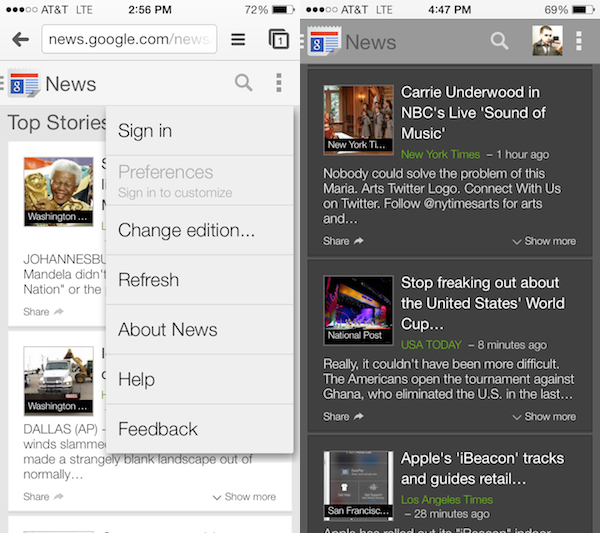
Among the changes are an improved overall look-and-feel, making it easier to read and track separate stories, and the ability to customize the web application by changing the theme from light to dark, adjusting the font size, and more…
Here are the full release notes from Google’s blog (via 9to5Mac):
“Here are just some of the highlights:
- Improved overall look-and-feel making it easier to read and track separate stories.
- Ability to customize the webapp to suit your taste by changing the theme from light to dark, the font size and opting for a larger “story card” with more information per story at your fingertips (from the Settings menu, at top right).
- Simplified navigation to any section within News; just click on the Google News icon (top left) to see a list of available sections (including any custom sections you created).
- Easier integration with Google Feedback located in the menu at the top right.
Additionally we have ensured that some favorite desktop features have been included such as:
- A weather gadget in the Local section.
- The popular “Editors Picks” option.
- Social posts from Google + related to the story are included in the article cluster.
All of this can be accessed by visiting news.google.com from the Chrome/Safari browser on your iOS or Android device. Google says that it’s launching in the United States first and plans to bring the same experience to all international editions soon.