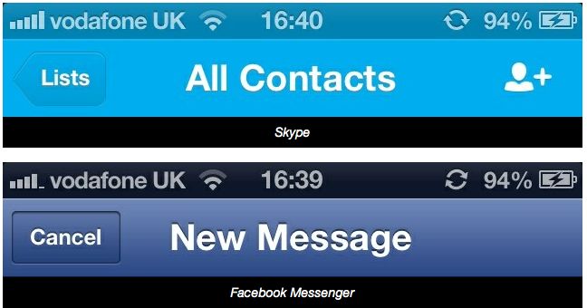
Here’s another little tweak in Apple’s upcoming iOS 6 mobile operating system that didn’t got any mention at yesterday’s WWDC keynote. According to the agile Reddit community, the status bar in iOS 6 changes color to match the app you’re running.
This subtle visual hint doesn’t seem to work with all apps (yet) so it’s probably something that needs to be enabled by third-party developers. It’s kinda cool, check out the screenies right below…
This has been first spotted on Reddit (via Cult of Mac). Even some of stock apps do this, like Settings and Mail that change the status bar to blue when in the foreground.
As you can see in the above screenshot, both the latest versions of Facebook Messenger and Skype apps already support this functionality.
Of course, a bunch of apps on the App Store override standard status bar with their own version of the navigationbar class so it wasn’t immediately clear whether the operating system itself paints the status bar automatically for apps that otherwise would use the standard status bar or if this is something that needs to be enabled via new APIs.
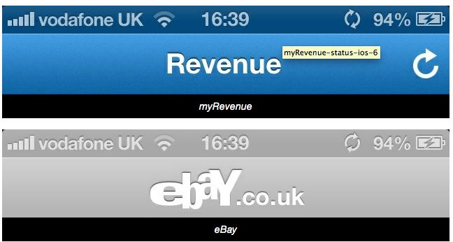
Here’s another screenshot of the myRevenue and eBay apps.
I’m not sure what to make of this.
If I’m running an app, I’m running an app and I don’t need any additional hint. Matching my status bar to the currently running app’s color theme does nothing to enhance my experience.
Quite the contrary, it’s a visual distraction.
Apple attempted a similar thing by introducing translucent menu bar in OS X Leopard, provoking an outrage from the Mac community that eventually led to a new toggle in Snow Leopard to switch off this annoying “feature” in Settings.
Something tell me jailbreak developers will soon create a tweak to take care of this.
What do you guys think?
