With the Apple Watch Home screen, Apple introduced a new layout and design that is a departure from what we have all been accustomed to with iPhone and iPad. Instead of favoring rows and columns of square-ish icons, Apple had to rethink the user interface and introduced us to an infinite and honeycomb-like fluid grid of apps devoid of pages, folders, or dock.
One could argue this design paradigm modernizes the Home screen as we know it, but beyond the new and refreshing look, I’ve had a hard time getting used to it and actually find it useful. As a matter of fact, I don’t find it useful at all. It is absolutely gorgeous to look at, but it is also a terrible mess to use. Organizing apps, looking for apps, and being able to accurately tap on their icons is something that I have had a difficult time with.
Organization
On its website, Apple says that “the arrangement of apps is simple and orderly,” but I beg to differ.
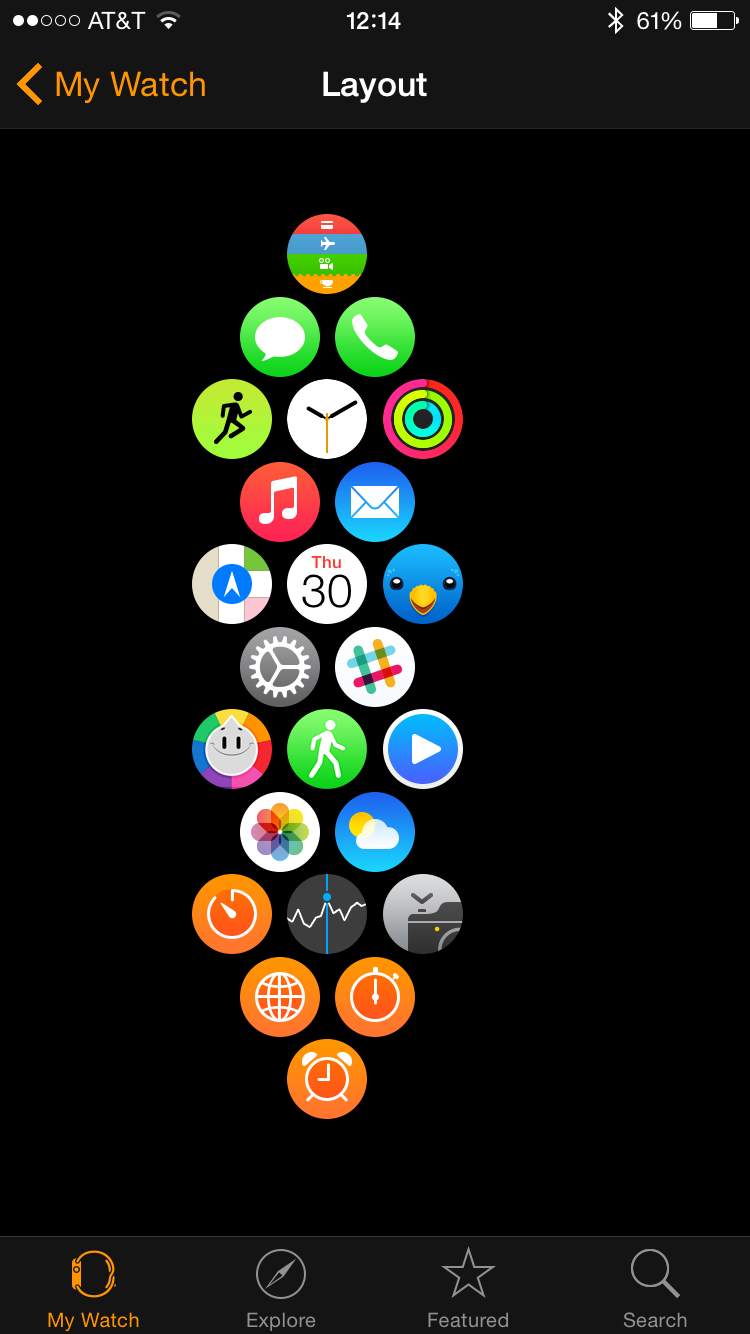
In essence, moving apps around on Apple Watch is actually not complicated. Simply tap, hold, and drag the app where you want it to be, directly from the device or from the Watch app on iPhone. The problem occurs if you’re actually trying to keep your apps organized in some sort of intelligent layout, rather than just leave icons wherever they end up being. Moving one app somewhere may automatically move another one where you don’t necessarily want it to be. And because of its honeycomb layout, apps that are moved don’t always snap where you expect them to.
Some users have showed creativity in the layout of their Home screens, and I’m happy that Apple has given us the limited freedom of not being tied to the iOS grid style of rows and columns, but as an organization standpoint, I personally believe it’s a mess.
Navigation
According to Apple, “turning the Digital Crown allows you to navigate nimbly and precisely, without obstructing your view.” That is completely true, except that the most important screen where I don’t want to obstruct my view is the Home screen, where I am unable to use the Digital Crown for navigation, as it is used to open whatever app you managed to place right in the center.
My layout is optimized for vertical scrolling
In itself, this is not a big deal, as scrolling up, down, left and right with my finger is actually much easier and more natural than using the Digital Crown, but to me, the honeycomb layout makes it harder to really find what I’m looking for.
Tap targets
Maybe the most limiting consequence of this Home screen design is that not all app icons are the same size on the Home screen. You have the center icon, which is the larger one, and by extension the easiest to successfully tap. Then you have the six icons that are directly around the center icon in a different size. Finally, you have several other sizes for the satellite icons.
I completely understand the reasoning behind the various sizes. This is what makes the Home screen flow like it does in the visually appealing way it uses, but as someone who likes things consistent, and simple, this just doesn’t work for me, and sometimes makes it challenging to accurately tap on the icon I intend to, especially when on the move.
Now to open an app, I have to scroll, make sure I bring the icon of the app I want to launch as close to the center as possible to make it as big as possible, then tap on the icon. As a comparison, on iOS, I see a grid of icons of similar in size. The tap target is the same size, no matter what. It is consistent, and it looks cleaner to my taste.
As a workaround, there is the option to Reduce Motion in the Accessibility settings of the watch, which, on top of preventing various animations, resizes all the Home screen icon to a fixed size. This is merely a workaround to my first world problem, though.
A simpler layout?
Again, I really like the way the Home screen looks on Apple Watch. What I’m not a fan of is how usable it is. Call me crazy, but I wish Apple gave us the option of going back the good old iOS grid style we’re all used to. It could be an accessibility feature too, as I’m pretty sure it would make it easier for someone with vision or motor disabilities to navigate the Home screen.
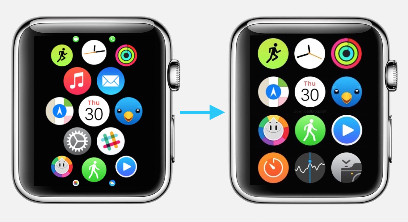
After a few minutes in Pixelmator, I came up with what, to me, would be a more helpful layout. Twelve icons, all of the same size, easily arrangeable, and organized in a clean and consistent manner. The added bonus is that you would be able to use the Digital Crown to scroll up and down. It doesn’t look as slick as what Apple came up with, but it is arguably more efficient from a usability standpoint.
I don’t have much hope for this to happen though, unless we are able to jailbreak Apple Watch. I’m confident the graphic and interface designers at Apple have spent countless hours figuring out what the best layout for the Home screen would be, and they concluded that what we have now was indeed the best solution. Besides the modern look and feel, I just fail to understand the real benefits of the current Home screen layout.
Am I the only one?