Much has been said about Apple’s management shakeup that happened last October. If Scott Forstall’s departure came out as a bombshell, the fact that Jony Ive, Senior Vice President of Industrial Design, was made the head of the newly created Human Interface group was less of surprise.
Now in charge of everything design, Ive has been expected to give iOS a facelift by getting rid of, or at least by minimizing all use of skeuomorphism in Apple’s mobile operating system. But it doesn’t stop here!
Something we’ve been hearing for a while when talking about Ive’s possible take on an iOS makeover is the word “flat”. Not flat as in boring. Flat as in simpler. This was confirmed last week when 9to5Mac reported that according to their sources, iOS 7 might be black, white, and flat all over.
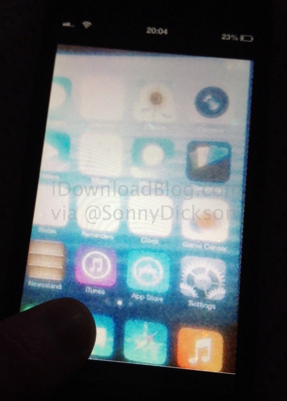
What does that mean for parts of the UI such as app icons? Our friend Sonny Dickson got his hands on a blurry screenshot showing the Home screen of an iPhone running iOS 7. The image quality is terrible, but with the help of talented designer Surenix, we were able to reproduce some of these icons to give you an exclusive look at what some stock app icons on iOS 7 might look like.
If we had to describe the changes in one word, that would be: unified…
![]()
When you look at the current state of stock apps icons, it seems that all of them were designed by different teams. Most of them have a different look. They don’t have unified features that tie them all up together. Some of them have a gloss effect. Some of them don’t. Some of them have borders. Some of them don’t, etc…
From what we’ve seen, we believe Jony Ive’s touch on iOS 7 will homogenize the look of Apple’s stock apps icons. Below are some of the major differences we’ve discovered.
Icon gloss effect: gone!
The first thing that caught my eyes when looking at these icons is that the gloss effect is now gone. Apple first introduced this effect when iPhone OS first came out six years ago. Through its SDK, Apple currently allows developers to either easily add a gloss effect on an icon, or not.
As Surenix explains, each app icon is supported with three different layers. The bottom layer is the drop shadow that all icons sport at the bottom. The secondary layer adds the the gloss effect to an icon. The top mask layer crops the corners of the icons, giving it that unified rounded corners look. We believe the secondary “gloss” layer will not be used for Apple’s apps any longer, and won’t likely be used for third party apps as well.
![]()
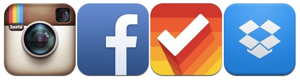
If all the app icons that are currently on my iPhone are any indication, it seems that most developers have actually started going away from the glossy effect and already use a flatter look. It makes sense, especially for applications that are available on different platform. Instagram, for example, wouldn’t want to have a gloss effect on its iOS icon, but no gloss effect on its Android app icon.
A few good examples of this lack of gloss can be seen on the icons of Instagram, Facebook, Clear, and Dropbox.
Apple’s own stock apps themselves don’t always have a gloss effect. Here are those that do:
- App Store
- Music
- Photos
- Phone
- Voice Memos
- iTunes
- Compass
- Stocks
- Weather
- Clock
- Safari
- Messages
And here are those that don’t:
- Calendar
- Settings
- Camera
- Maps
- Game Center
- Contacts
- Videos
- Notes
- Calculator
- Passbook
- Reminders
As you can tell, it’s about fifty fifty. Thirteen of Apple’s own stock apps come with the gloss effect, while 11 don’t.
Should Apple decide to indeed drop the gloss effect from its own app icons, it wouldn’t be too surprising if it also removed the option from Xcode itself. The result would bring more consistency across Apple apps and the thousands of third party apps out there.
![]()
Weather icon temperature: gone!
Although not a fan of skeuomorphism, it looks like Jony Ive decided to bring a little more real life elements to the Weather app icon by adding a few clouds to it.
Noticeably, and from what we can tell, the icon finally dropped the ever static 73 degrees temperature, which didn’t really make sense to begin with, and might even be confusing to older iOS users who may think the Weather app icon reflects current local weather conditions. Removing the 73 degrees temp from the icon is a smart move.
Icon borders: gone!
Do you know what set the Settings and Reminders app icons apart from all other stock icons? They have a border. These two are the only icons among the 24 stock app icons that have a defined border.
Of course, having a border is highly inconsistent with the rest of the stock icons set, which probably explains why it looks like the Settings icon will get rid of this border. While we couldn’t have a good look at the Reminders app icon, it wouldn’t be surprising if it lost its border too.
Diagonal stripes: gone!
While we can’t really tell from the leaked screenshots, Sonny Dickson tells us he is very confident he saw a “more plain” Phone app icon, without the diagonal stripes. This was also confirmed from another source who called the Phone and Messages app icon “all flat” on iOS 7.
As you can see on Surenix’s rendition of this icon, it looks flatter and cleaner. But more importantly, it looks more consistent with other icons such as the Music icon.
Why Apple used diagonal stripes on the Phone and Messages icon in the first place is a mystery. If the inconsistency of the Phone and Messages app icons drove you crazy (I know it drove me crazy), then you will probably welcome this flatter look.
Bigger is better?
A subtle design change was brought to the camera app icon. The lens is now slightly bigger, covering more real estate on the icon. In my mind, bigger lens, means easier to identify on the screen.
![]()
Miscellaneous
There are two icons we weren’t really sure about. The Game Center, as you may be able to see on the leaked screenshot above, looks white with a couple blue and yellow round shapes. Could these be boxing gloves? We don’t know for sure so we left this one out. The other icon we didn’t render is the Videos icon. It seems that it now sports a triangle-shaped “play” icon, but we weren’t sure either and left it out of this post for this reason.
Unified icons
As you can tell, there are no dramatic changes here, only subtle ones that bring more consistency and conformity across the Home screen. It seems that those that were expecting big, flat square icons will be disappointed. However, those who like continuity and consistency will be glad to see that some elements of iOS 7 will still look very familiar while bringing delicate changes.
Of course, nothing is set in stone and things could change up a bit before WWDC.
Thanks to Sonny Dickson for sharing this info with us, and thanks to Surenix for his great design work and help with making sense of those changes.