This is a guest post by Giulio Michelon, proud designer and CEO of Belka, the Italian studio that designed and developed the iDB app. We’ve asked Giulio to come here and share his experience developing the app, from the initial concept to the final product. Part 1 was published last week, and part 3 will be published next week.
In the previous part, we talked about the lo-fi design, which mostly iterates on the basic ideas and concepts. In this part I will talk about the high-fidelity design and the actual implementation of the product.
From low-fi to pixel perfect
After talking with Sebastien about how the app was supposed to work, we had to make it visually attractive. We love nice and clean design, which is why we iterated on different proposals and decided for the best one.
Can you spot the winning iteration? Probably not, because it’s not here!
As you can see, the high-level design is very demanding: we had a couple of different choices. The main differences between the pixel perfect design and the low-level design are:
- In the low-level design, the problem to tackle is usability, which is usually already defined by the majority of other apps.
- In the high-level design, there’s taste involved, and that’s why it is usually harder. To tackle the problem we started with a broad range of choices.
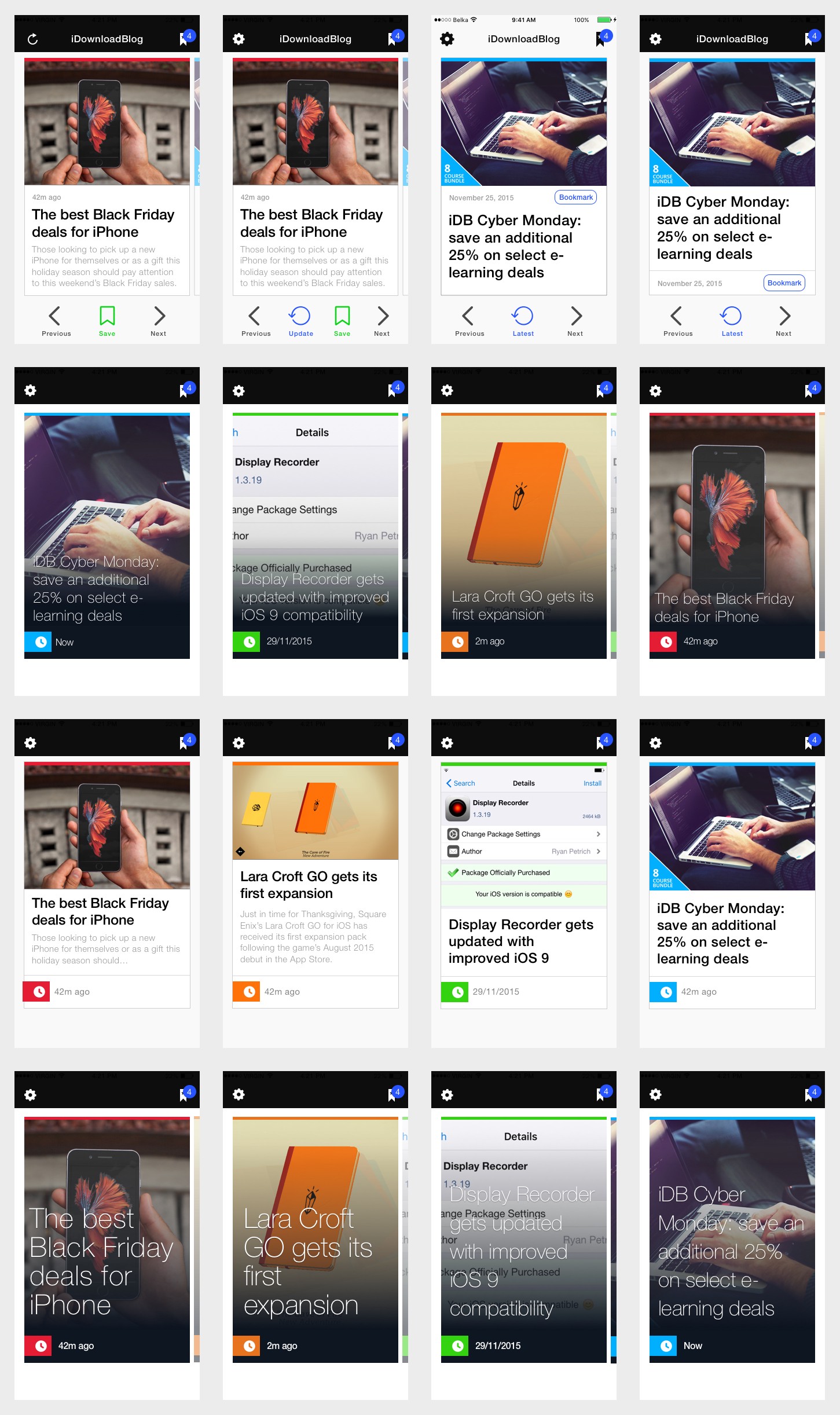
After tweaking and discussing with Sebastien about colors, other apps styles, and much more, we came up with a polished and well-defined version of the Card layout.
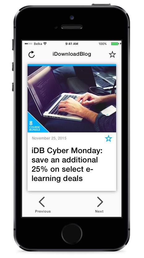
The almost final version
The Card layout has been tweaked again during the development from this version, but it’s mostly in his final form.
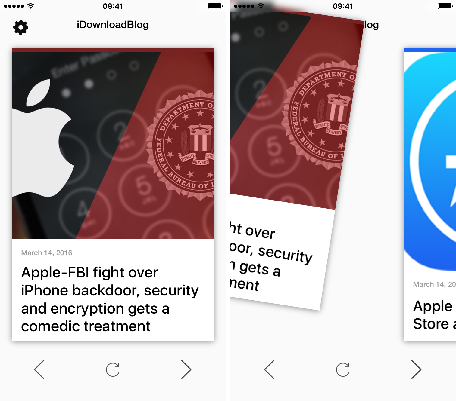
We followed the same path for the Article view, in order to get a visually pleasant and highly readable result.
From design to working code
Once the design part is done, it is time to open Xcode, a tab with StackOverflow and put the developer hat on.
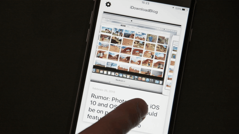
The main issue in this app has been the swiping gesture. It looks nice and simple, but in reality that single feature represents 40% of the entire development. Animations on iOS are very hard, and Sebastien expected nothing less than the perfection from us.
We didn’t design the swiping gesture before the implementation. Instead, we decided to use the Tinder card animation as the expected result. Below you can see the final result.
The other feature that needs to be highlighted is the connection with WordPress. iDownloadBlog.com is built on WordPress, and we had to link the existing database, in order to let the authors of the website write and post their articles from the same interface. We made sure to make it convenient for them by not altering the WordPress dashboard at all.
I don’t want to bore you with the details of the implementation since probably most of you aren’t developers, so instead, I’ll give you some random trivia about the app:
- The app has 98 implemented features. Does this sound a lot? It’s interesting to consider that this is a relatively simple app.
- The iDB app contains a whopping 8,020 lines of code.
- The most consumed food by Luca (our lead iOS engineer) during the development was Canederli. This helps his brain produce high quality code. Look at the next point to know how good it works.
- The app has been 99.6% crash-free in the first three weeks. Canederli is amazing. We’re sorry for the 0,4% of users who’ve experienced crashes. We are working for you right now.
- The app is entirely hand-crafted in Italy, like Ferraris.
That’s all for this post about how we build the iDB app. In the next (and last) act, we will cover the Apple Watch app and some secrets. Stay tuned!
If you have any question about the high-level interface design or about the development, feel free to ask.