For quite a while, I didn’t have much of an interest in iOS themes. Many of the icon packs available in Cydia seemed rather mediocre and did little to improve on iOS’s stock design – at least, that’s how it appeared to me. Those that did look nice often don’t have a very large number of themed apps, while others had designs so different from the average iOS icon that unthemed apps stood out as ghastly reminders of a lack of design uniformity.
My ideal theme wouldn’t stray too far from the current state of iOS, would have several hundred themed icons, and would be simple and uniform enough to compliment my Home screen without making every app look the same and particularly without removing easily discernible colors and glyphs that make an app easy to spot from the rest so I can remain efficient when using my device. Because of these requirements, my ideal theme is undoubtedly Veexillum.
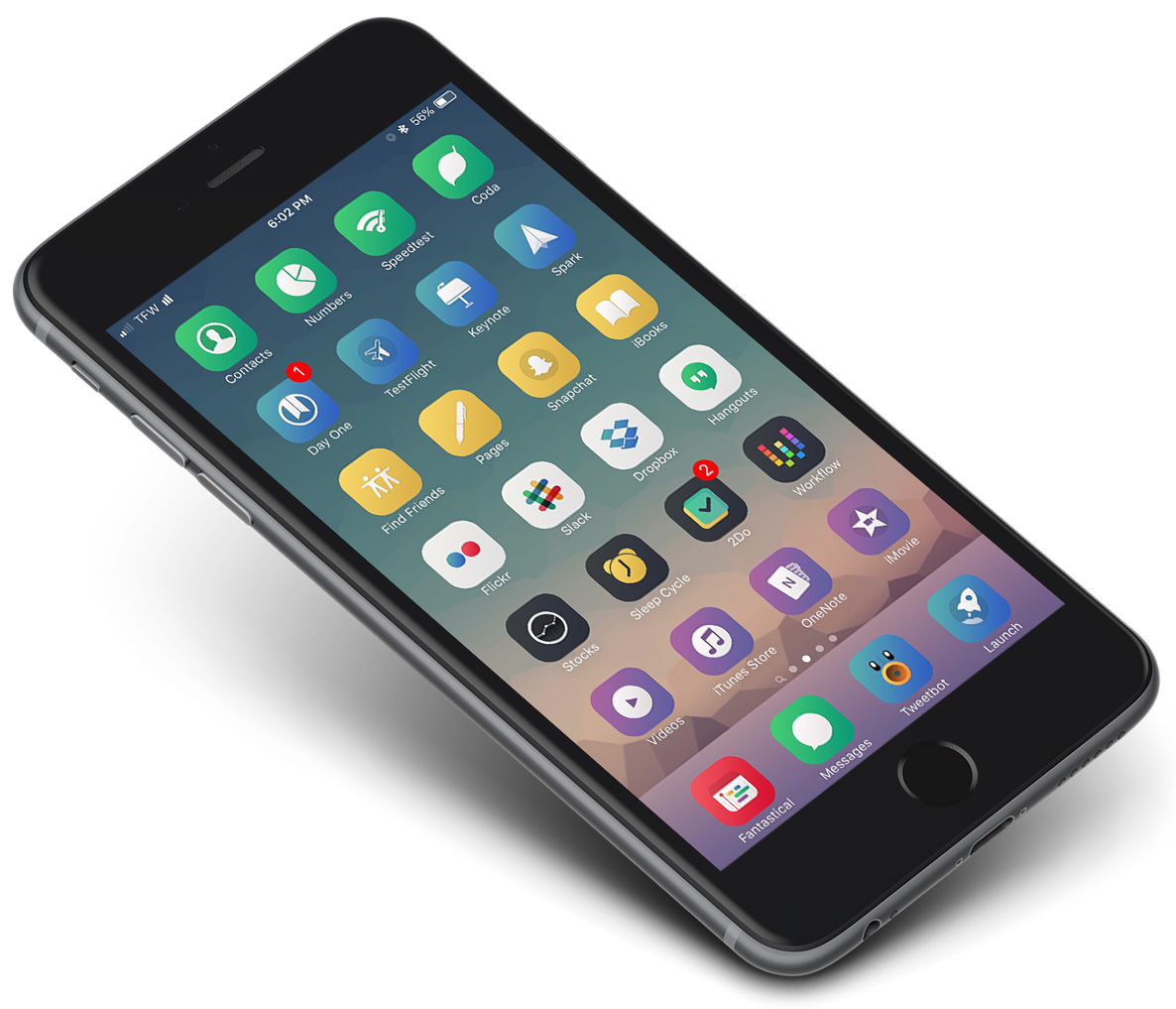
This is a theme of simple glyphs set in an even simpler background of color, blending from lighter to darker in a subtle gradient that traverses the icon from its top left to bottom right corners. There are seven total background colors, consisting of black, white, yellow, green, blue, red, and purple. Each of these are a specific shade used across all the icons of a given color. For example, Phone, Messages, and Evernote are all the same shade of green, while iMovie and OneNote share the same purple color.
This is helpful in two ways: first, using the same shade of a color provides a wonderful consistency among all the icons of that color, while each individual icon’s glyph keeps it unique, and second, the background color used in the theme hovers as closely as possible to that of the untamed icon – with Evernote remaining green and OneNote remaining purple, for instance – which makes finding a specific icon much less difficult than if it used a different color scheme than the original.
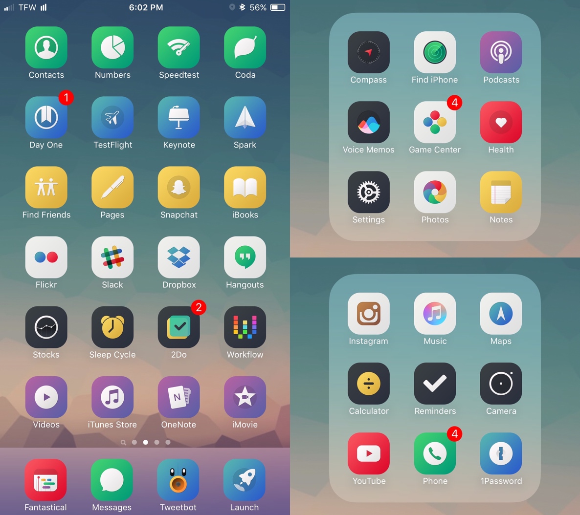
In theory, this could grow boring with a lot of icons looking the same, but in practice, the use of seven different colors for backgrounds provides enough variety to keep the qualities of a colorful Home screen without sacrificing uniformity and recognizability. It even opens the doors for various color-based patterns by placing icons of the same color vertically, horizontally, or diagonally on one’s Home screen or in folders, creating some nice effects.
While on the topic of uniformity, the question arises of whether Veexillum blends well with unthemed iOS apps. As with the case with any icon pack, some apps, particularly games, are always going to stick out, but when using Veexillum, many of the apps I’ve come across that lack a themed icon blend surprisingly well with the revamped apps. Although colors don’t usually match up and gradients come in from different angles, they still blend much better with Veexillum than with themes that use heavy shadows or candied colors and blurs, for example.
Overall, Veexillum is definitely the best theme I’ve used so far and has remained as my primary icon pack for months now. It keeps things simple without even a hint of boring, and with its themed icon count nearing 1000, it will more than likely cover most of the apps on your device. Veexillum is available for all iOS devices running iOS 7 or newer, including iPads, and it can be installed via WinterBoard or Anemone, although the latter is strongly recommended. Veexillum is available as a $2.49 purchase in Cydia.