The responses to the radical user-facing changes Apple has made in iOS 7 have been a mixed bag thus far. While some users welcome the new designs and like the way the software looks, others dislike the update so much they say it could kickstart Apple’s downfall.
But it looks like the voices in the latter camp are just the loudest, and don’t necessarily represent the majority. Because according to this online poll conducted by Input Factory’s Polar platform, most folks actually prefer the overall UI design of iOS 7 to that of iOS 6…
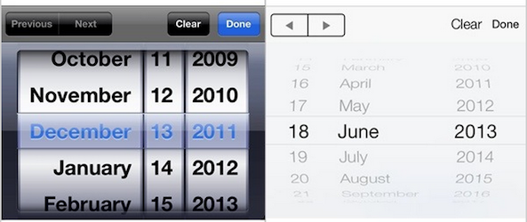
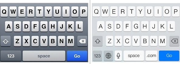
9to5Mac points to the Polar survey, which is actually a number of smaller surveys asking users which UI elements they prefer, those in iOS 6 or iOS 7. This includes on/off switches, pickers, alerts, sliders, search, the share sheet, the Lock screen, and the Notification Center.
And here’s how users have voted thus far:
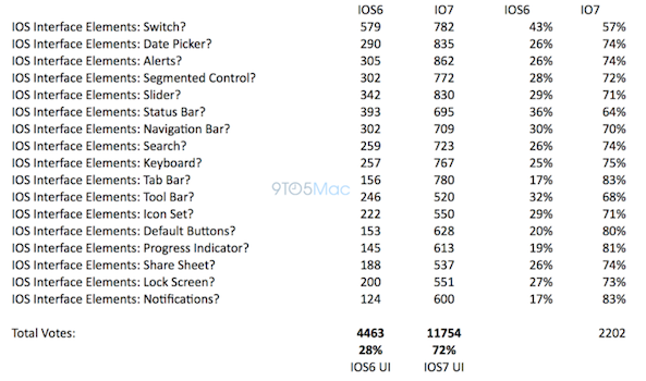
As you can see, an overwhelming majority of folks who voted preferred the look of iOS 7 UI elements to those in iOS 6: 72% to 28%.
Now, you can argue that these results aren’t indicative of how the general population feels—and you’d be right, iOS 7 isn’t publicly available yet. But in the same breath you could argue that it’s not just developers using the betas right now, which evens the playing field a bit.
It’s also worth pointing out that these results match up with those from a previous poll, also conducted by Polar, which asked users for their preferences on iOS 6/iOS 7 icons. In that survey, more than 50,000 people chimed in, and a majority of them voted for iOS 7’s images.
But it’s not the folks in these polls Apple will have to win over with its new design this fall. It’s the 300+ million other iOS users who will update their devices in a few months, unaware of the changes that lay ahead of them, that they’ll have to impress. Can they do it?
What’s your take on all of this?