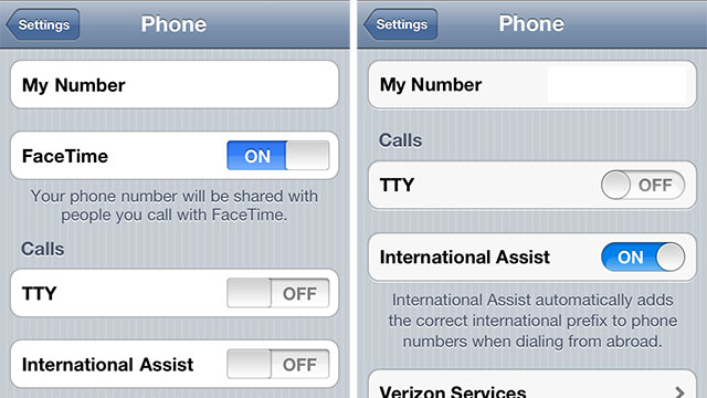
If you’re a fan of Apple’s decision to move to rounded toggle buttons in iOS 5, and prefer the new design over the square alternatives found in iOS 4, then you’re experiencing the outcome of pure science, according to UX Movement.
What at first glace appears to be a minor aesthetic change actually has a scientific reasoning behind it, with rounded objects being easier to look at, and in turn, process…
The move to rounded corners also helps us focus on the box’s contents, with the inward-pointing corners bringing our gaze towards the content. Square boxes, on the other hand, make our eyes focus on what’s outside them. Not much use when we need to choose the right toggle in a Settings window.
“Rounded corners also point inward and focus your eyes on the content inside an object. A squared edge is the exact opposite — it focuses your eyes on the stuff outside of the object. When you look at the rectangular buttons of iOS 4, you have to work harder to shift your gaze from the outside to the inside of the button. In iOS 5, there’s little work involved. You look at the round button, your eyes focus inward and you make your selection with ease. “
Who knew designing a user interface was so complicated?
[Gizmodo]