![]()
Spoiler alert! For folks who don’t want to ruin the surprises Apple has in store for us tomorrow, I recommend you stop reading now. The folks over at 9to5Mac say they’ve just been given a sneak peek at an early beta of iOS 7, and have described it in detail.
Contrary to a report from earlier today, it sounds like most of what we’ve heard about the next version of iOS is spot on. The entire UI has been completely redesigned with flat icons and other elements, and a new, Helvetica Nueue Ultra Light-like font…
No, those aren’t the actual icons you see above. But they are photoshop creations, by Michael Steeber, that are based on descriptions which closely match what the site believes we’ll end up seeing tomorrow. They’re quite a bit different from previous leaks.
According to 9to5, the iTunes icon is purple-ish with white iSync-like arrows instead of a music note. The Camera icon is done in a gray gradient and the icon is the same shape as the Lock screen grabber. Also, the Maps icon location is in a different place.
Here’s more from the site:
“Perhaps most interesting: There are two color schemes for many of these apps – one black-ish and one white-ish. We’re not sure if they are A/B decoys, if white iPhones and Black iPhones will have their own color schemes or as someone else suggested, the different color schemes might be invoked by the amount of ambient light or the time of day. But it is super-interesting, especially since we’ve heard whispers that the whole UI might shift slightly based on external factors similar to the way the music volume icon switches based on how you hold the iPhone.”
The report goes on to say that when a user is in ‘Black mode,’ the keyboard is black with gray letters. And when it’s in ‘white mode,’ it has gray keys with white letters, similar to the stock Android keyboard. It’s going to be quite the departure from the current version.
And they just posted a full screenshot mockup:
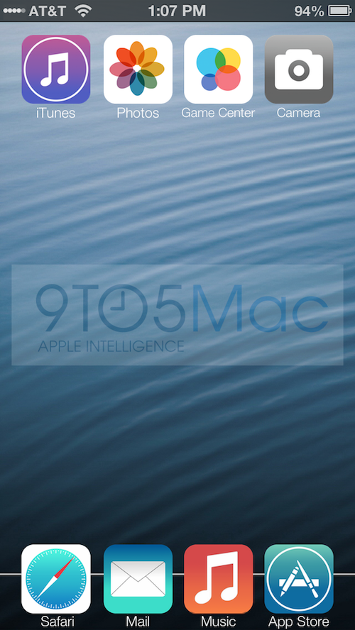
There’s a couple of things of note here. For one, notice how the signal bars in the top lefthand corner have been replaced by tiny white dots. And checkout the dock. The standard transparent, shelf-like graphic has been replaced by a simple straight white line.
Of course, there’s always the chance that the iOS 7 Apple shows off tomorrow could look nothing like this. But given 9to5Mac’s excellent track record in Apple intel, and the slew of matching reports we’ve seen over the months, we wouldn’t bet our money on it.