
Apple’s online store has over time implemented a bunch of tweaks aimed at improving navigation and browsing product pages on Apple’s mobile devices like the iPhone and iPad.
For instance, I’ve always liked the ability to swipe through teaser images on landing pages for specific products.
Here’s an example: fire up Safari on your iPhone or iPad, visit www.apple.com/iphone and swipe through those big, beautiful product shots at the top. But the company isn’t stopping there.
Having recently hired dozens of engineers, visual designers and web developers, Apple has now introduced a fresh set of tweaks to the online Apple Store, including the touch-friendly navigation bar which appears right below the main product sections (iPod, iPad etc.)…
Like before, the main product pages such as www.apple.com/mac or www.apple.com/ipad produce the menu bar on desktop computers. But when viewed on your iPhone, iPod touch or iPad, this navigation feature is also touch-friendly, letting you easily swipe through the subsections.
Jordan Kahn of 9to5Mac, who appears to have first noticed these changes, notes that other touch-friendly elements on iOS devices include “minor tweaks, such as larger grid-style search results for certain products.”
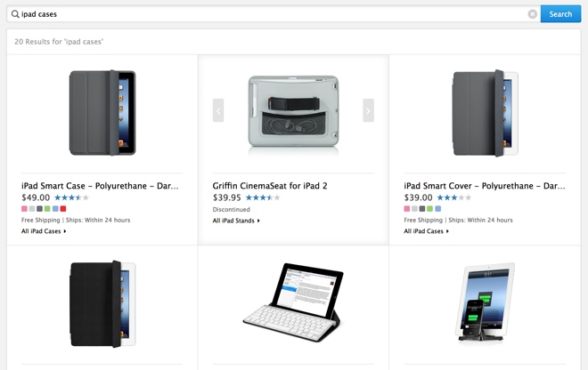
Screenshot via AppleInsider.
Whereas previously using the search field would produce results in standard list view, you will now get large product thumbnails in a nice grid view. This makes finding needle in a haystack a lot easier.
And, in addition to tapping on an individual image to load the product’s web page, you can also swipe through them on your iPhone or iPad rather than tap on links to load a separate web page.
Hopefully, these tweaks are just a sign of bigger things to come for the online Apple Store.
How do you like the new iOS touch-friendly navigation?