Controlling your smart home from your iPhone and iPad is simple with the Home app. And with iOS 14, iPadOS 14, and macOS Big Sur, you have a clearer way to see and manage your HomeKit accessories.
What used to be written summary section at the top of the Home app is now a visual summary of your connected devices. This allows you to quickly take action or more easily control your accessories. Here’s the scoop on using the visual status section for devices in the Home app.
What you’ll see in the Home app
With the improvement to the status section, you’ll see your active HomeKit accessories more clearly. This means you don’t have to read what each device is doing, fish through your Favorites, or visit a room to control an accessory. Instead, you have a nice visual that lets you glance at your device statuses. You’ll also see those accessories that need your attention.
Here’s how Apple sums up this handy area of the Home app:
A new visual status at the top of the Home app gives you a summary of accessories that require your attention, have important status changes to share, or can be quickly controlled.
What makes it different
Before the update, you were able to see the status for an accessory, but it was in written form. With the Home app update, you’ll see the device icons instead, which lets you simply take a peek.
Here’s a before and after view of the Home tab with the visual status section.
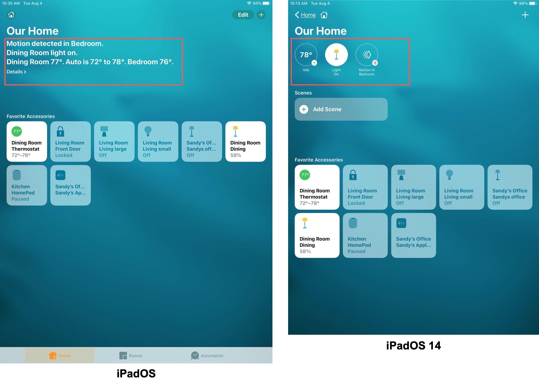
Each room that contains a connected accessory also has that handy visual summary at the top. So not only can you see the statuses of all devices on the Home tab, but you can see those inside each room as well.
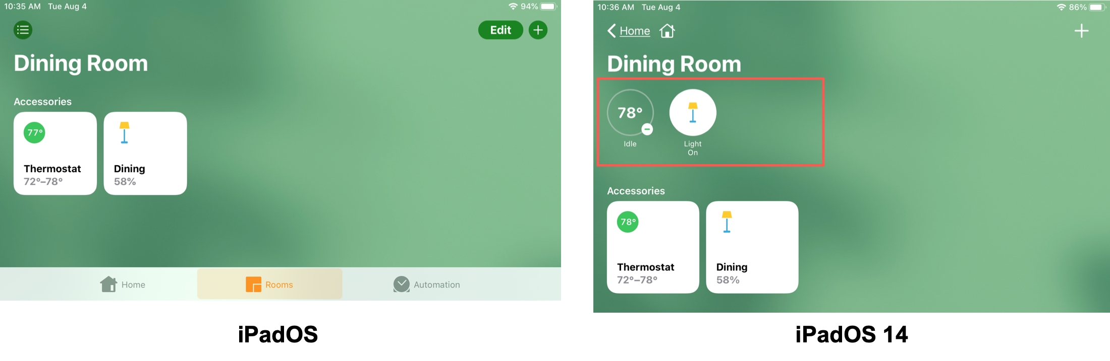
Each icon in the visual status section is interactive just like before. You can tap to control an accessory or press and hold to adjust one.
Wrapping it up
Hopefully you find the updated Home app accessory status section an improvement. But we’d love to know your thoughts on it. Do you prefer the written words over device icons? Let us know below!