Learn how to create and work with Interactive Charts in the Numbers app on Mac, iPad, and iPhone to display your data in a chart that you can control.

Creating a chart or graph in Numbers is a great way to display your data visually. And Numbers offers several different types so that you can use the best style to show your data. One of those types is an Interactive Chart.
An Interactive Chart in Numbers is convenient for displaying groups of data for comparison or changes over time. Your data stays intact, and you simply adjust the chart to show it differently.
If you haven’t tried this type of chart before, we’re here to help. Here’s how to create and use Interactive Charts in Numbers on Mac, iPad, and iPhone.
Create an Interactive Chart on Mac
Like the other graphs and charts in Numbers, you can insert a blank chart and add your data to it later or select your data and then insert the chart to populate it. From experience, it’s easier to start with a data set, select it, and build your chart from there, and that’s what we’re going to do in this tutorial.
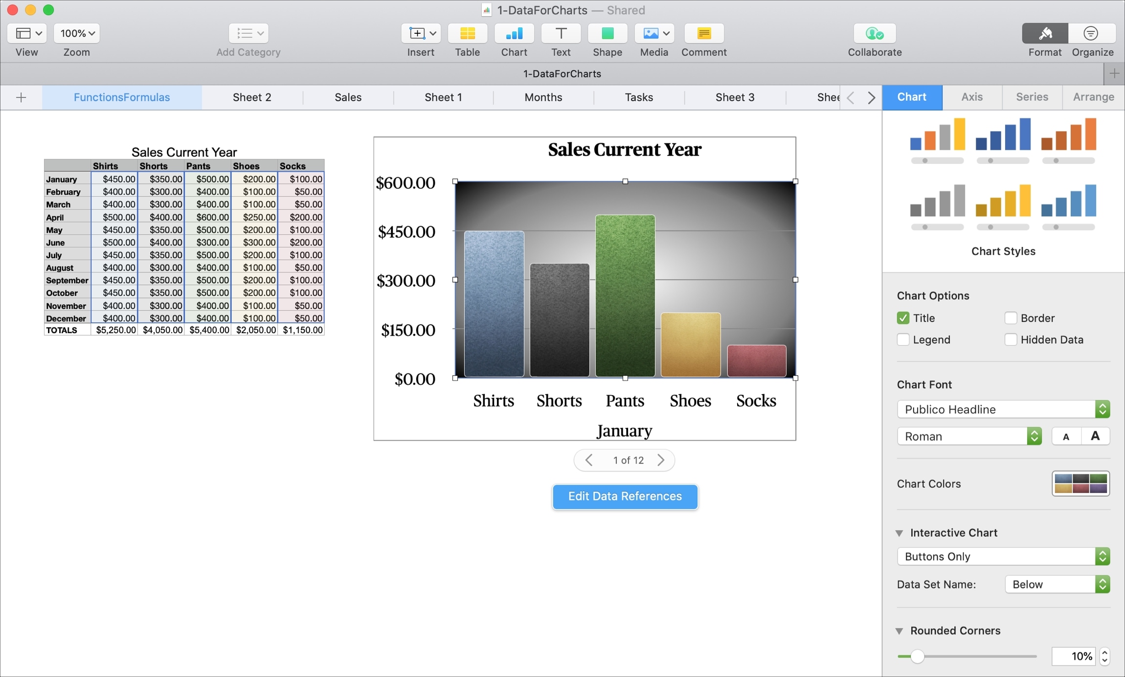
To easily see how an Interactive Chart can be beneficial, we’re going to use data for product sales over 12 months. This will let us use the chart to view each month’s sales, one month at a time.
1) Select your data set by dragging through the cells.
2) Click Chart > Interactive in the toolbar or Insert > Chart from the menu bar.
Tip: It’s good to use the Chart button in the toolbar here because you can see the options and color schemes rather than the menu bar option because that just gives you a list of Interactive Chart types.
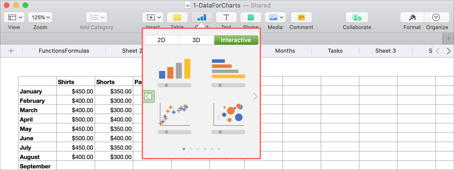
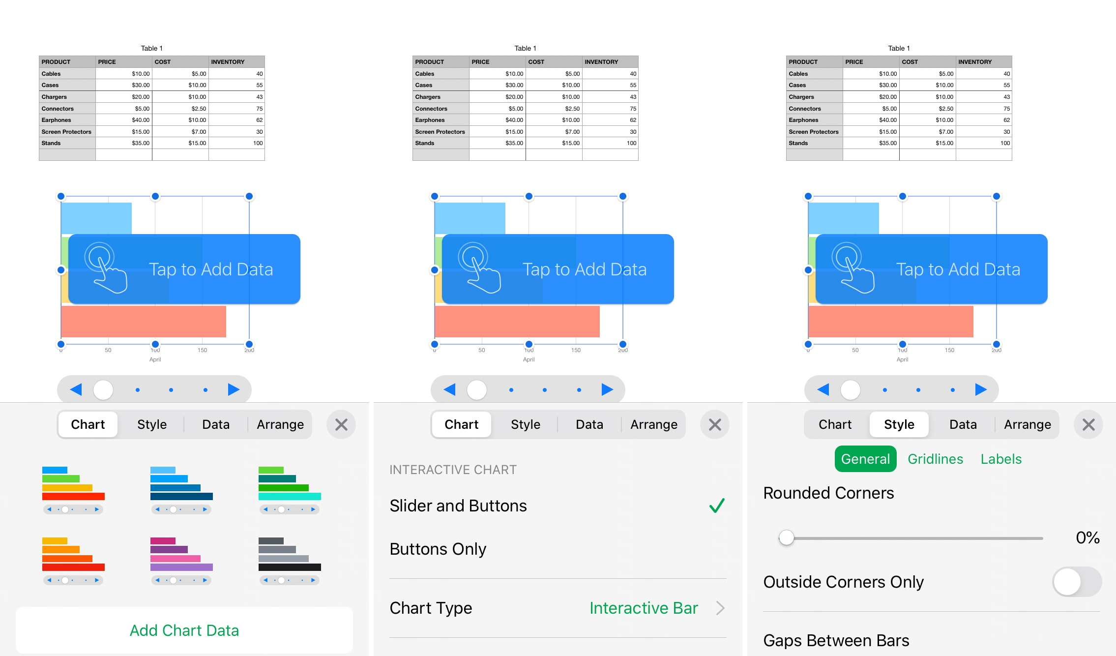
3) Choose the type and color of the Interactive Chart you want to use. You can pick from a column, bar, scatter, or bubble chart. And you have six color schemes for each, which you can still change later.
4) Your Interactive Chart will pop onto your sheet populated with the data set you selected in Step 1.
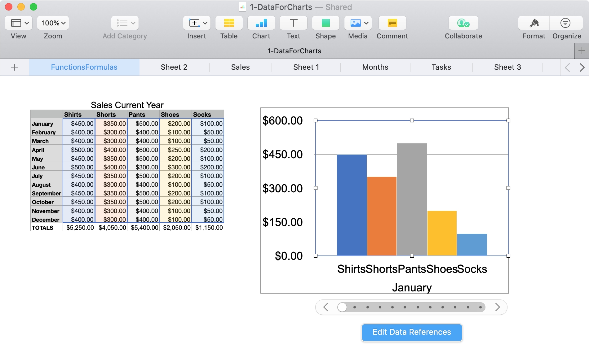
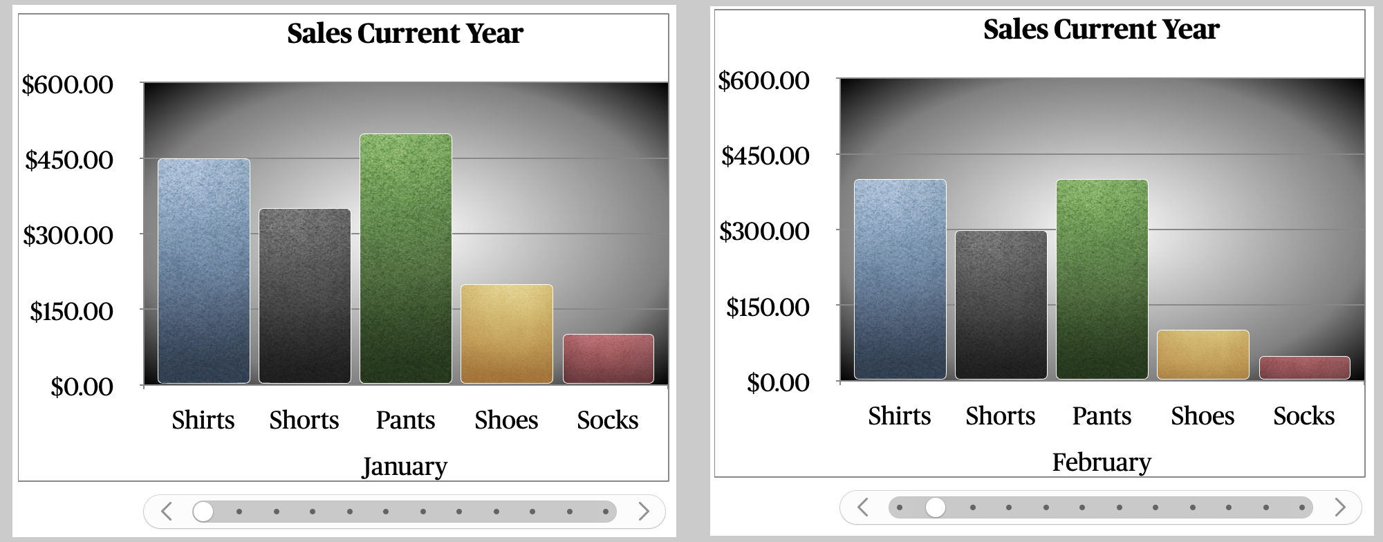
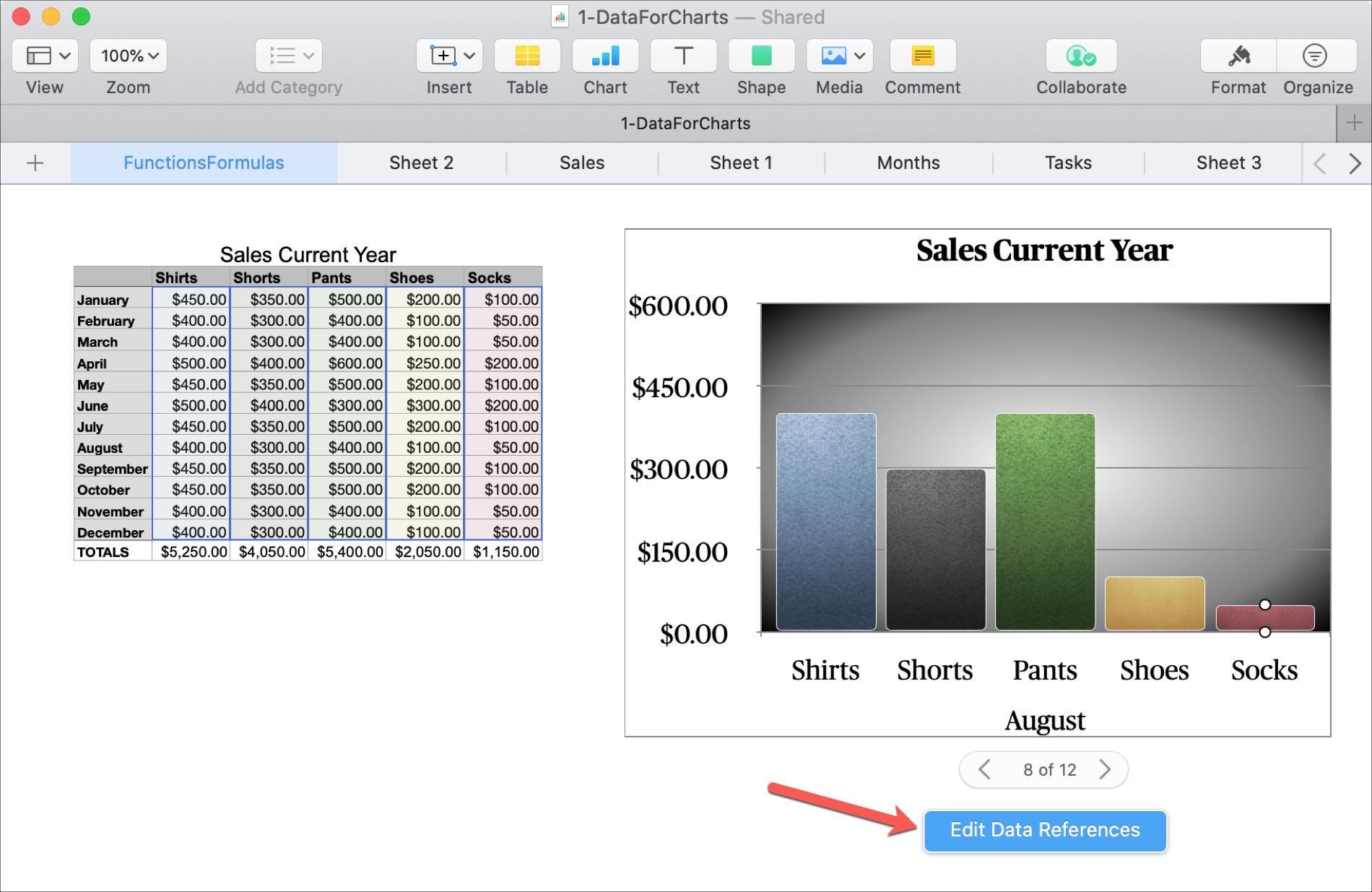
The key to an Interactive Chart is its name; it’s interactive. So you’ll notice at the bottom of the chart, you have a slider and buttons. Using these controls, you can move through your data set, displaying different groups or, in our case, each month of the year.
You have the option to use a slider with buttons or buttons only to control your chart. These options can be found in the Format sidebar, which we’ll discuss next.
Format your Interactive Chart
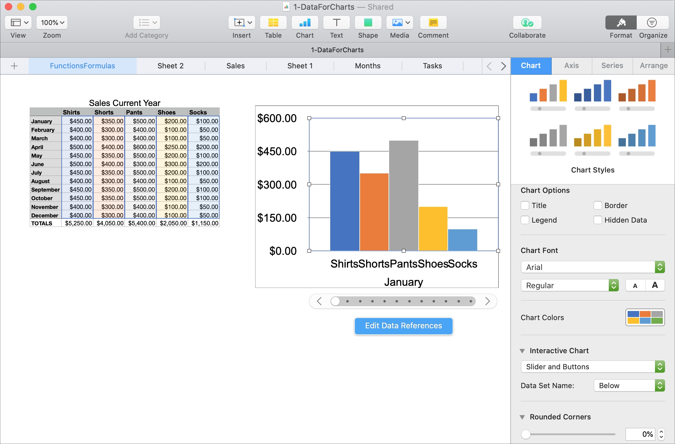
Like with other objects in Numbers, you can change elements of formatting for the Interactive Charts. Select the chart in your sheet and then click the Format button on the top right to open the sidebar.
There’s a healthy number of settings you can adjust in the sidebar, like style, colors, controls, corners, gaps, background, border, and chart type.
Let’s take a look at how we can change our column chart.
Just by changing things like the chart colors, font style, controls, corners, gaps, and adding a background and chart title, you can make your Interactive Chart look exactly as you want.
Adjust your data display
If you want to change the data that is displayed in the chart, for example, maybe you want to remove a certain series from the chart; this is simple.
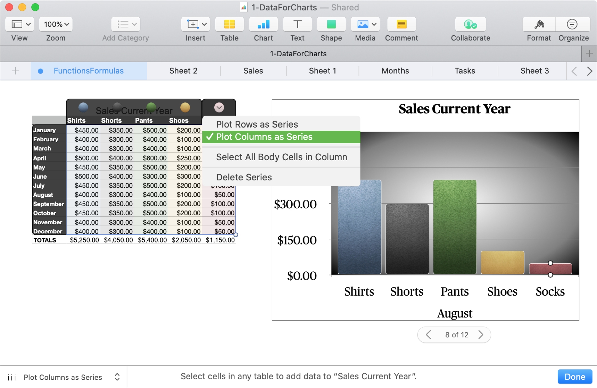
1) Select the chart and then click the blue Edit Data References button that appears below the chart.
2) You can then select the row or column in your data set for additional options. So, if you want to remove a series, click Delete Series. Note: This won’t remove the data from your table or sheet; it will only remove it from the chart.
You can also reverse the data. For instance, you can have the data from your rows and columns swapped using the Plot Rows/Columns as Series settings.
3) Click Done at the bottom when you finish editing your data references.
Create an Interactive Chart on iPhone and iPad
It can be a lot easier to work with charts on Mac, but if your only Apple device is an iPhone or iPad, don’t worry! You can create an Interactive Chart on iOS, and you have the same types of formatting options as macOS.
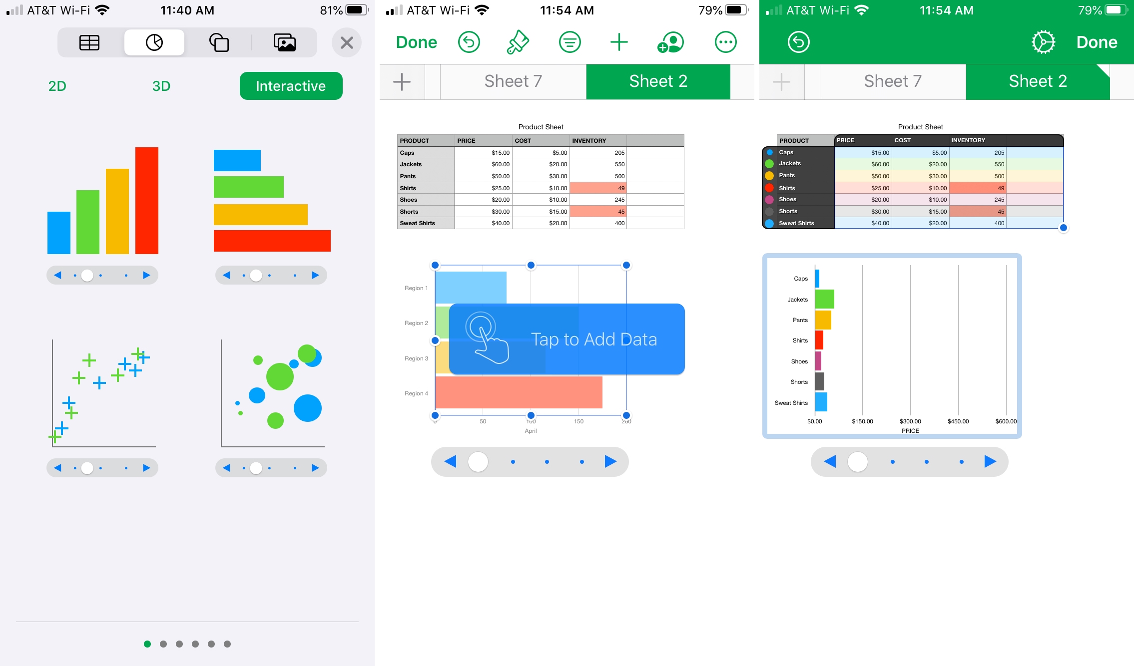
1) Open your sheet in Numbers on your iPhone or iPad and tap the plus sign at the top.
2) Select the second tab for Charts and then choose Interactive.
3) Pick the style and color scheme for your chart, and it will pop onto your sheet.
4) You should then see a blue Tap to Add Data button on the chart. Tap it, select your data set, and tap Done. If you don’t see this, tap and pick Edit References from the thin menu strip.
Format your Interactive Chart
To apply different formatting to your Interactive Chart, select it and then tap the Style button (brush icon) at the top.
You can then move between the Chart and Style tabs to adjust things like the color, controls, font, corners, gaps, and other elements.
Adjust your data display
To change the way your data set displays in the chart, you can do this one of two ways.
- Select the chart and tap it. In the shortcut menu, use the arrow to move to the right until you see the Edit References and Edit Series choices.
- Alternatively, you can select the chart and tap the Style button. Make sure the Chart tab is selected, and then pick either Edit Series or Edit References.
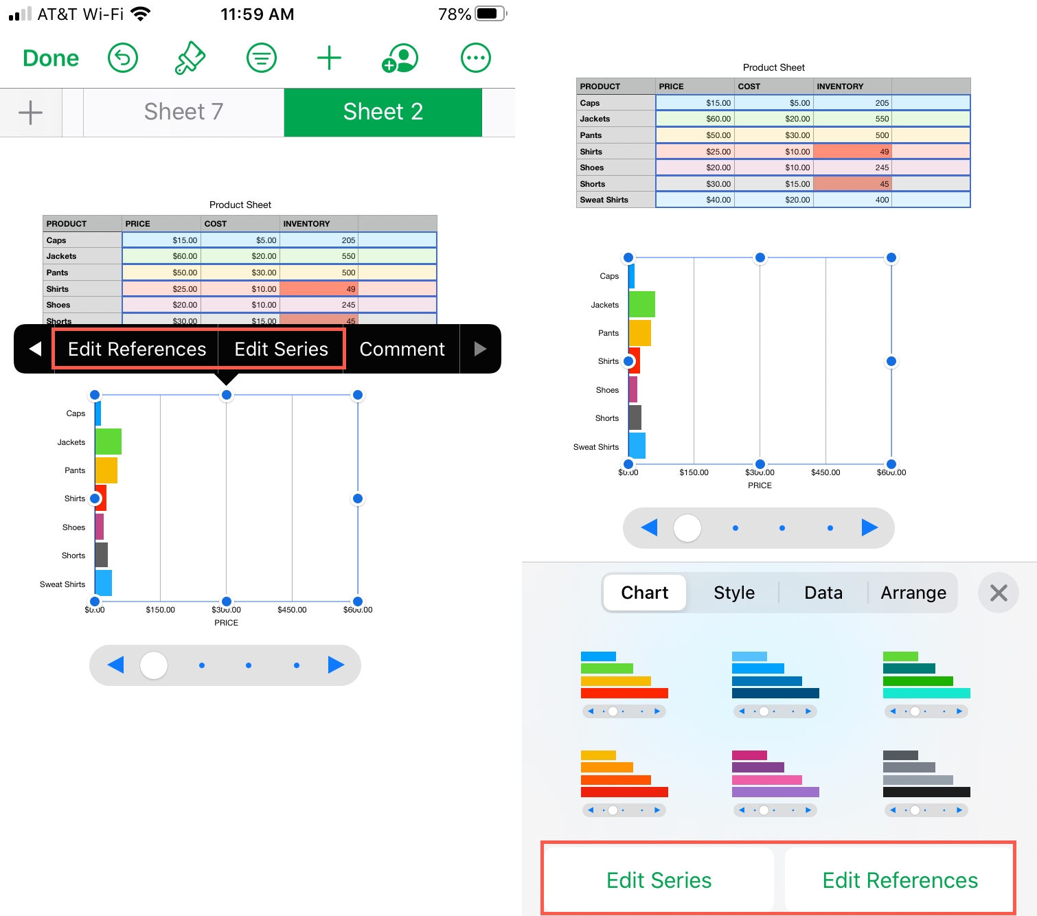
When you finish making your changes, tap Done to apply them.
Interactive Charts in Numbers give you a unique and helpful way to display your data. So whether you’re viewing the chart for yourself or sharing it with others, it can be more useful than a static chart or graph.
Are you going to give the Interactive Charts in Numbers a try?
On the same note: