Apple will preview iOS 13 next Monday, but that’s not stopping various concepts from hitting our inbox. Today, we feature the latest concept from Michael Calcada, a Toronto-based UI/UX designer who has some nice ideas for how Apple could address some of the longest-standing user paint points, like lacking notification features and limited customization.
Michael told me in an email:
Last year, I uploaded my iOS AR concept video that showcased new designs/ideas. The new iOS 13 video expands on that concept, showcasing many new innovations and improvements along with the power of augmented reality in your pocket.
His newly published iOS 13 concept video, embedded below, imagines the intersection of augmented experiences, new features and deep personalization which, in Michael’s own words, could “completely revolutionize” how we use our Apple smartphones.
He continued:
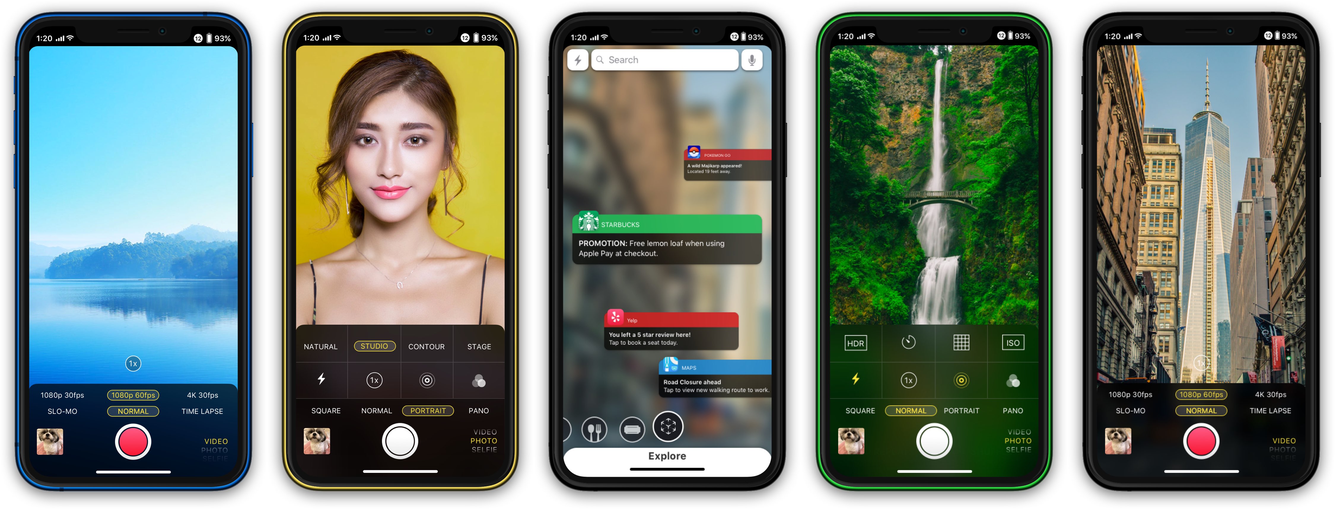
Everyone uses their iPhone differently. Every customer has different apps, needs and ways they use and interact with their digital content on iOS devices. As I believe augmented reality is a technology that will be fundamental to the future of digital interaction, I integrated augmented reality into the core OS experience, providing new innovative and intuitive ways to interact with your digital and physical worlds at once.
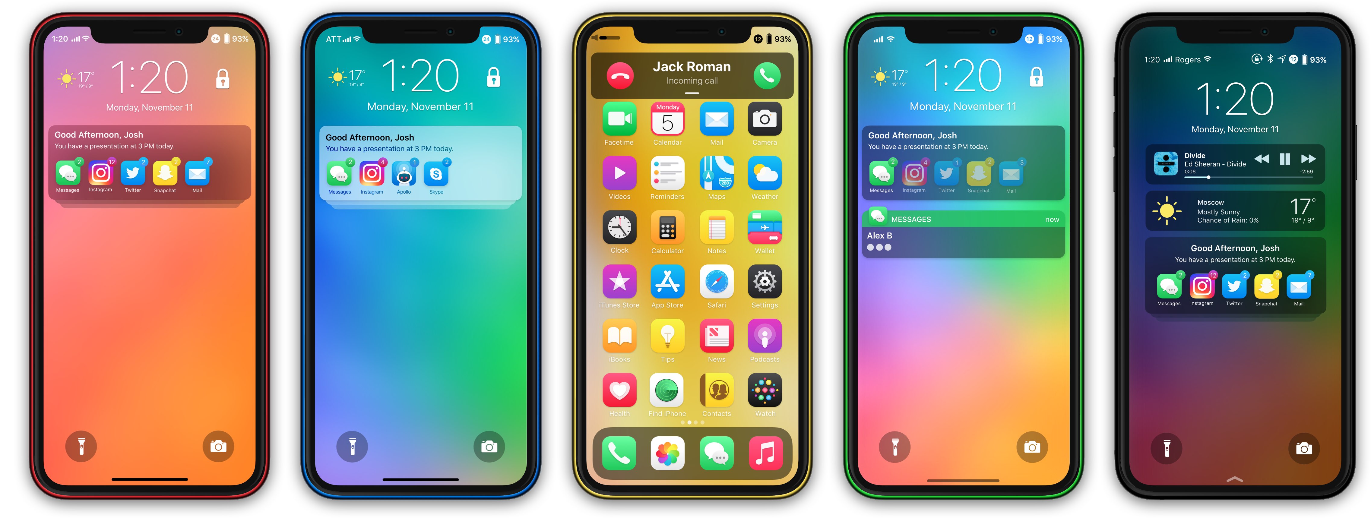
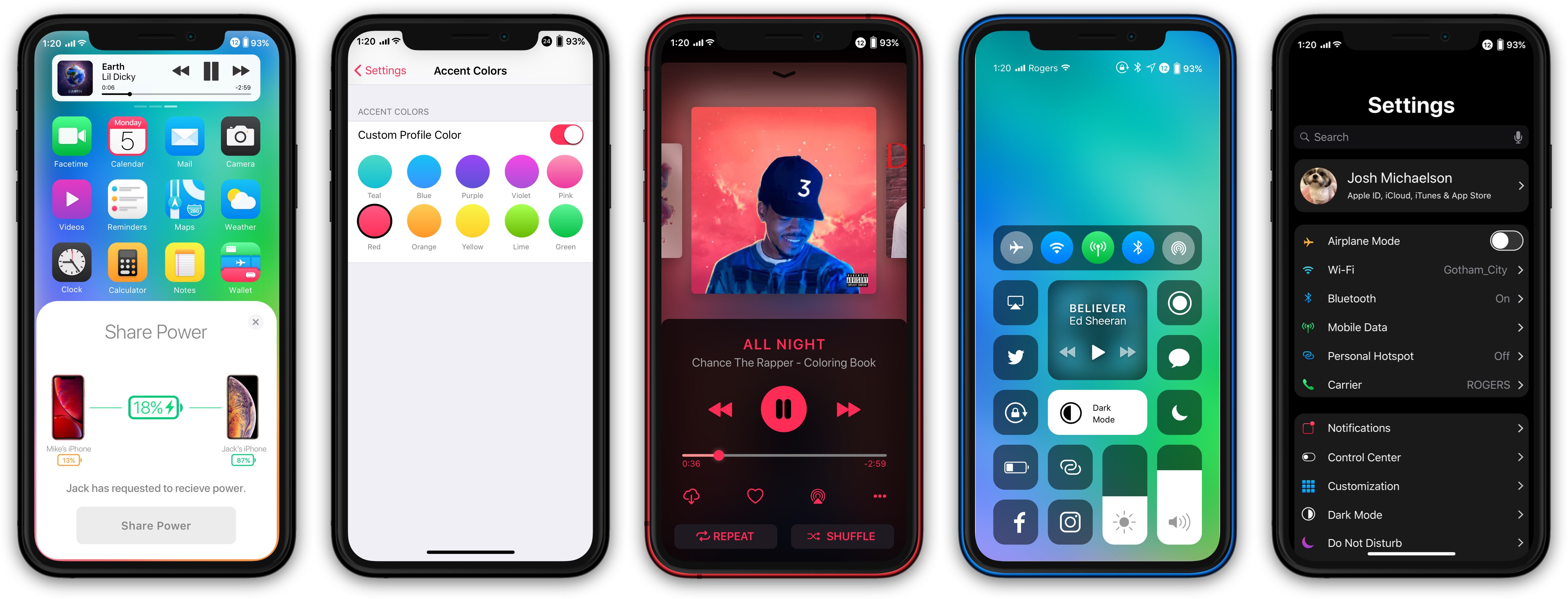
He’s imagined a better Notification Center with notification colors, inline typing indicators in messaging notifications and a handy dot in the status bar denoting unread alerts.
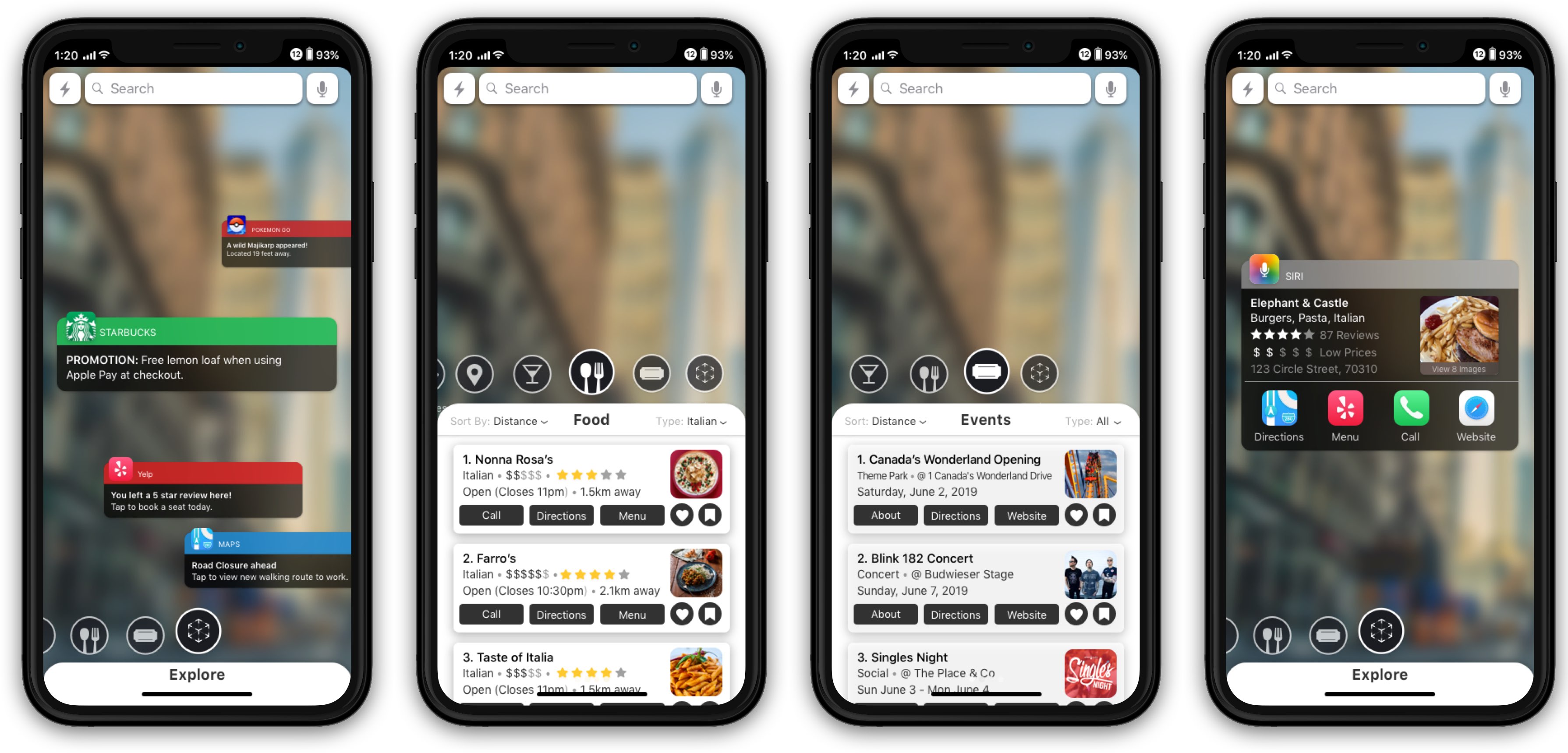
Dynamic Dock is another long overdue feature because people have been asking for ages for the ability to keep more than four icons in the Dock on iPhone. As you can see for yourself, his Control Center mockup calls for instant customization by way of drag and dropping—and those augmented reality features are pretty great, especially an AR Maps app.
To learn more about the concept, visit Michael’s personal website.
Conceptual artists and designers continue to envision what iOS 13 could look like. Last week, we featured one particular iOS 13 concept that focuses on productivity and apps like Mail.
How do you like Michael’s iOS 13 concept?
Let use now by chiming in with your thoughts in the comments down below.